


공식 공급 업체
200 이상의 소프트웨어 개발처와 판매 계약을 맺은 공인 디스트리뷰터로서 합법적인 라이선스를 제공합니다.
모든 브랜드 보기.
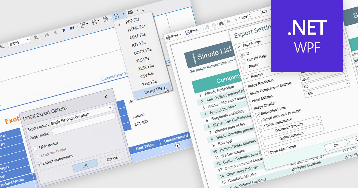
The export to image feature in reporting tools allows users to save a static visual representation of their reports in common image formats such as PNG or JPEG. This functionality offers numerous benefits, including simplified sharing across diverse platforms without requiring specific software, ensuring the consistent presentation of data by preserving formatting and visualizations, and enabling offline access for users who may not have continuous network connectivity. Example use cases include easily embedding key performance indicator dashboards into presentations or emails for broad dissemination, archiving reports for historical record-keeping, and providing accessible versions of data insights for individuals who prefer or require visual formats.
Several .NET WPF reporting controls offer image exporting including:
For an in-depth analysis of features and price, visit our WPF Reporting controls comparison.
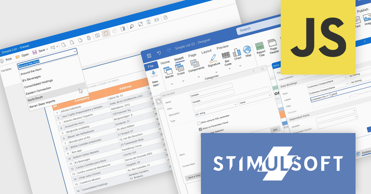
Stimulsoft Dashboards.JS is a JavaScript-based tool for creating interactive dashboards within web applications. Designed for developers and businesses, it provides customizable charts, graphs, and tables to visualize complex data from various sources. It supports popular JavaScript frameworks such as React, Vue.js, and Node.js, enabling seamless integration into modern web projects. With an intuitive interface and responsive design, it suits use cases like business intelligence, performance monitoring, and data-driven decision-making. Stimulsoft Dashboards.JS enhances user engagement and simplifies data analysis for industries such as finance, marketing, and logistics.
Stimulsoft Dashboards.JS includes the capability to filter variable values within the parameters panel of the viewer. This enhancement allows developers to provide end-users with a more refined and efficient parameter selection experience. By implementing expression-based filtering in the variable editor or Items window, only relevant data options are presented during report or dashboard viewing. This targeted presentation of variable values reduces visual clutter and improves the process of specifying report parameters, ultimately leading to improved usability and more focused data exploration for the end-user.
Stimulsoft Dashboards.JS is licensed per developer and is available as a Perpetual license with 1 year support and maintenance. See our Stimulsoft Dashboards.JS licensing page for full details.
Stimulsoft Dashboards.JS is available individually or as part of Stimulsoft Ultimate.
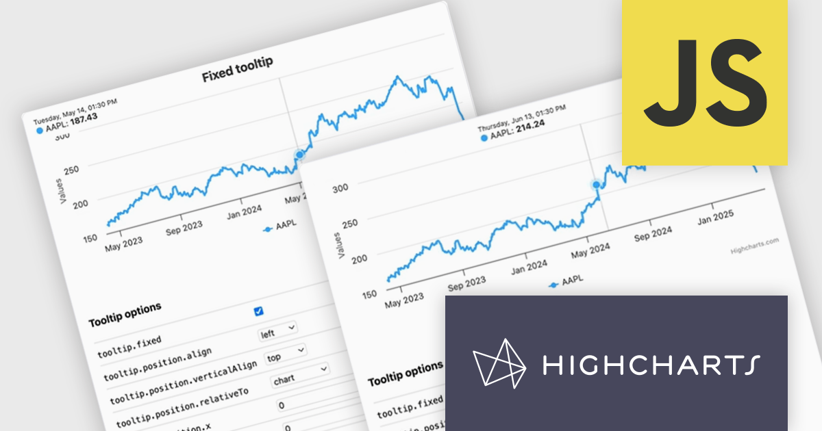
Highcharts is a JavaScript charting framework that allows web developers and data analysts to generate dynamic, visually appealing charts and graphs for websites and web applications. It can display a variety of chart types, including line, spline, area, column, bar, pie, scatter, and many more. Highcharts is well-known for its ease of use, rich documentation, and ability to handle huge datasets efficiently. Features include responsive design, accessibility support, and cross-browser compatibility. Its customization capabilities allow users to create bespoke data visualizations that increase engagement and provide insightful data presentations.
The Highcharts v12.2.0 release introduces a new Tooltip Positioning capability that lets you control tooltip placement directly through configuration, without writing any custom JavaScript. With the new tooltip.fixed and tooltip.position options, you can easily set fixed positions for tooltips and define exactly where they should appear on the chart. This enhancement simplifies layout management, reduces implementation time, and ensures a cleaner, more consistent user experience across your data visualizations.
To see a full list of what's new in v12.2.0, see our release notes.
Highcharts Core is licensed on an annual or perpetual basis, OEM licenses, and Advantage Renewals. It is licensed per Developer and has several license options including Internal, SaaS, SaaS+, and Self Hosted. See our Highcharts Core licensing page for full details.
Learn more on our Highcharts Core product page.
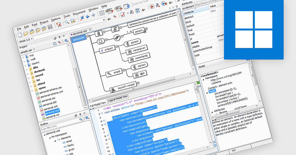
XML Schema (XSD) to DTD conversion refers to the process of transforming XML Schema Definition (XSD) documents, which define the structure and data types of XML files using XML-based syntax, into Document Type Definitions (DTD), which use a more limited, non-XML syntax for similar purposes. This conversion capability allows developers to bridge compatibility gaps between systems or tools that rely on different schema formats, particularly when integrating with legacy systems or validating XML documents against older standards. By automating this conversion, XML tools simplify workflow, reduce manual errors, and enhance interoperability across XML-based applications.
Several Structured Document Tools offer XML Schema (XSD) to DTD conversion including:
For an in-depth analysis of features and price, visit our comparison of Structured Document Tools.
High contrast charts use distinct and contrasting color palettes within data visualizations to improve clarity, particularly for individuals with visual impairments. This involves choosing colors with noticeably different hues and brightness for elements such as lines, bars, labels, and backgrounds, so that differences in data are easy to spot. These charts improve data understanding, make information accessible to more people, reduce eye strain for some users, and support accessibility standards. They are useful in many areas, such as financial reports, scientific papers and public health dashboards that must be clear and designed for a everyone regardless of visual ability.
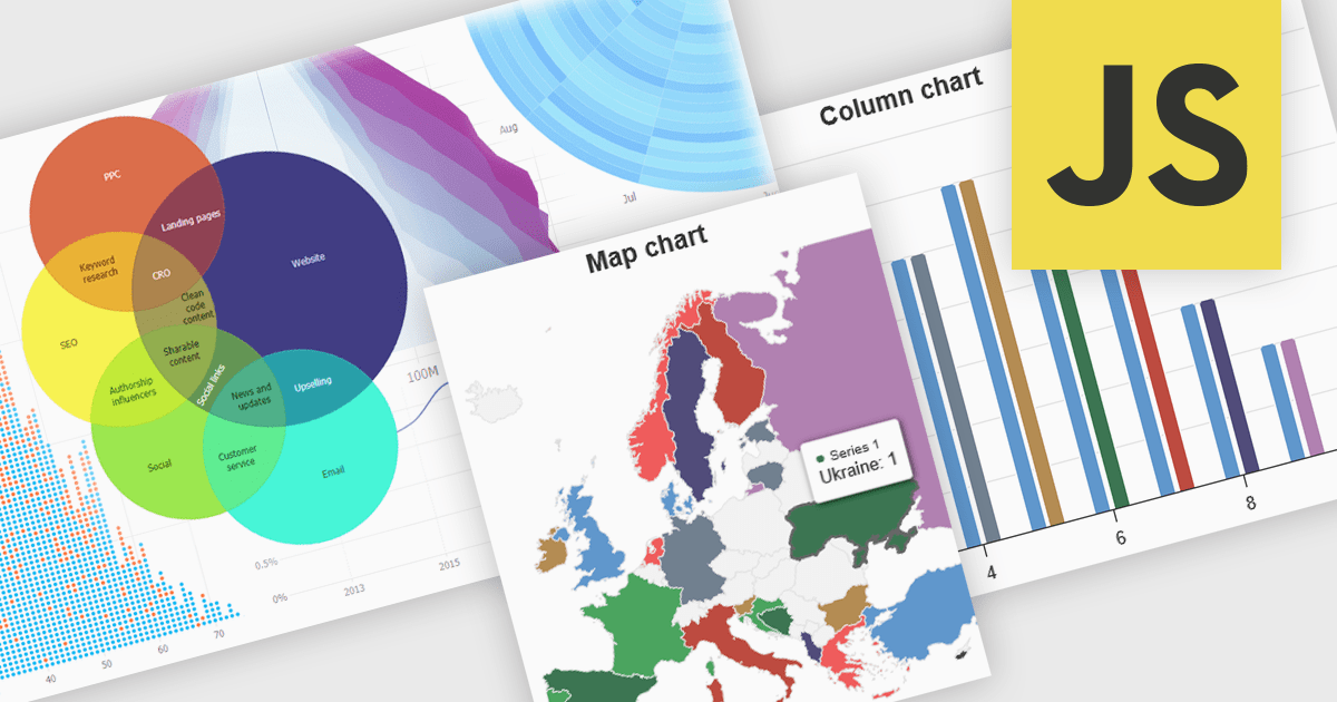
Several JavaScript charting components provide accessible high contrast features, including:
For an in-depth analysis of features and price, visit our JavaScript chart components comparison.
전화 : 00798 14 800 6332
팩스 : +1 770 250 6199


