


Fornecedor oficial
Como distribuidores oficiais e autorizados, nós fornecemos licenças legítimas diretamente de mais de 200 editores de software.
Ver todas as nossas marcas.
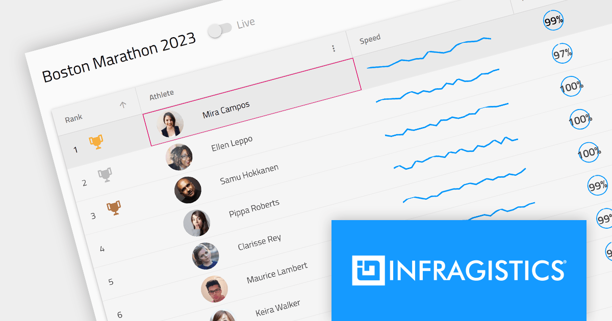
Infragistics Ignite UI for Angular is a comprehensive library of Angular-native UI controls and Material-based UI components, which includes a high-performance data grid and over 60 charts. Its WYSIWYG app builder helps you streamline your development process and deliver cutting-edge Angular solutions in a fraction of the time.
The 23.1 (17.0.0) release adds support for Angular 17, which offers enhanced performance through deferrable views, more intuitive syntax with built-in control flow, and accelerated builds for hybrid and client-side rendering.
To see a full list of what's new in version 23.1 (17.0.0), see our release notes.
For more information, visit our Infragistics Ignite UI for Angular product page.

ComponentSource celebrates two decades of collaboration with Rebex, a leading provider of Internet components for .NET. This enduring partnership has been instrumental in empowering businesses across various industries to streamline their data exchange processes and achieve seamless communication with their partners.
Rebex is a software company based in Prague, Czech Republic. Founded in 1995, the company has been developing .NET applications and components since Microsoft first released the .NET Framework in 2002. Rebex products are used by thousands of developers at more than 10,000 ISVs, corporations, and educational, governmental, and non-profit organizations around the globe.
Over the past 20 years, ComponentSource and Rebex have worked together to support businesses of all sizes, from small startups to large enterprises. Customers have consistently praised the reliability, performance, and ease of use of Rebex's components, highlighting their significant contribution to streamlining their business operations and enhancing their data exchange processes. By leveraging ComponentSource's vast global network and unparalleled expertise in software distribution, Rebex has achieved an expanding customer base worldwide.
Explore the Rebex product range.
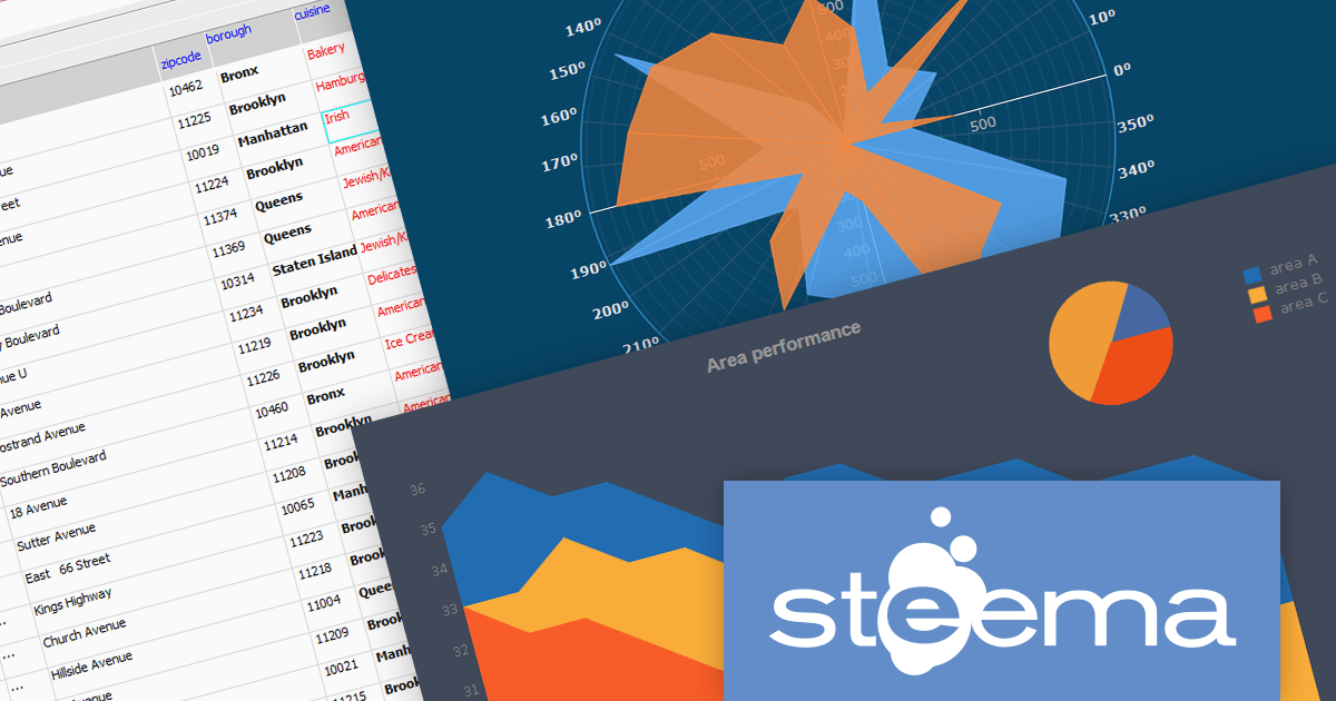
TeeChart Pro is a comprehensive charting component library that empowers you to create visually stunning and informative data visualizations. With its vast array of chart types, including line, bar, pie, and scatter charts, and extensive customization options, TeeChart Pro caters to a wide spectrum of visualization needs.
TeeGrid VCL/FMX is a powerful and versatile grid component library for Delphi, C++Builder, and RAD Studio. It seamlessly handles tabular data presentation and management, offering flexible cell formatting, data binding, and extensive customization. Its lightweight and efficient nature makes TeeGrid VCL an ideal choice for a diverse array of applications.
Steema Software has announced that its TeeChart 2023.39.x and TeeGrid VCL v1.14 releases are now fully compatible with RAD Studio 12 Athens (Delphi and C++Builder), the latest release from Embarcadero. Both products are easy to use and integrate seamlessly into RAD Studio development environments.
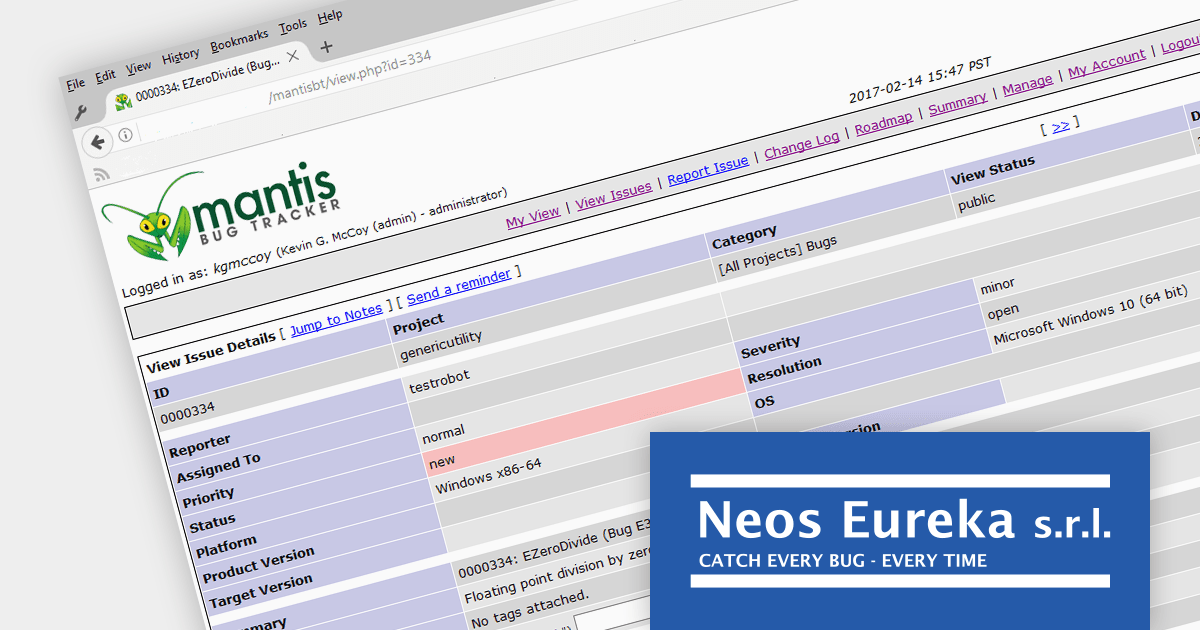
EurekaLog is a comprehensive exception and memory leak tracking tool designed for Delphi and C++Builder. It helps developers find and resolve bugs in their code including exceptions, leaks, and hangs. EurekaLog catches all exceptions and generates a detailed log with the call stack which includes unit, class, method, and line number information.
EurekaLog v7.12 by Neos Eureka adds RAD Studio 12 Athens compatibility, supporting the latest iterations of Delphi and C++Builder. RAD Studio 12 brings Visual Assist integration for C++Builder, SKIA support for UI design in FireMonkey, modernized C++ compilers, and expanded platform support. The latest release of EurekaLog allows developers working with RAD Studio 12 to benefit from its powerful bug resolution capabilities.
To see a full list of what's new in v7.12, see our release notes.
For more information, see our EurekaLog product page.

Spread.NET helps you create spreadsheets, grids, dashboards, and forms. It includes a powerful calculation engine with 450+ functions and the ability to import and export Microsoft Excel spreadsheets. Developers can leverage the extensive .NET spreadsheet API and powerful calculation engine to create analysis, budgeting, dashboard, data collection and management, scientific, and financial applications.
In this blog, MESCIUS Product Manager Kevin Ashley takes you through all the steps required to import and export data in CSV files using Spread.NET, including:
He also demonstrates how to use the Spread Designer tool to give users the ability to edit Excel spreadsheet instances inside your running application.
Read the full blog and start integrating CSV data import/export into your Windows applications.
Tel: (888) 850 9911
Fax: +1 770 250 6199


