


官方供应商
我们作为官方授权经销商,直接提供超过200家开发厂家所发行超过1000个的产品授权给您。
查看我们的所有品牌。
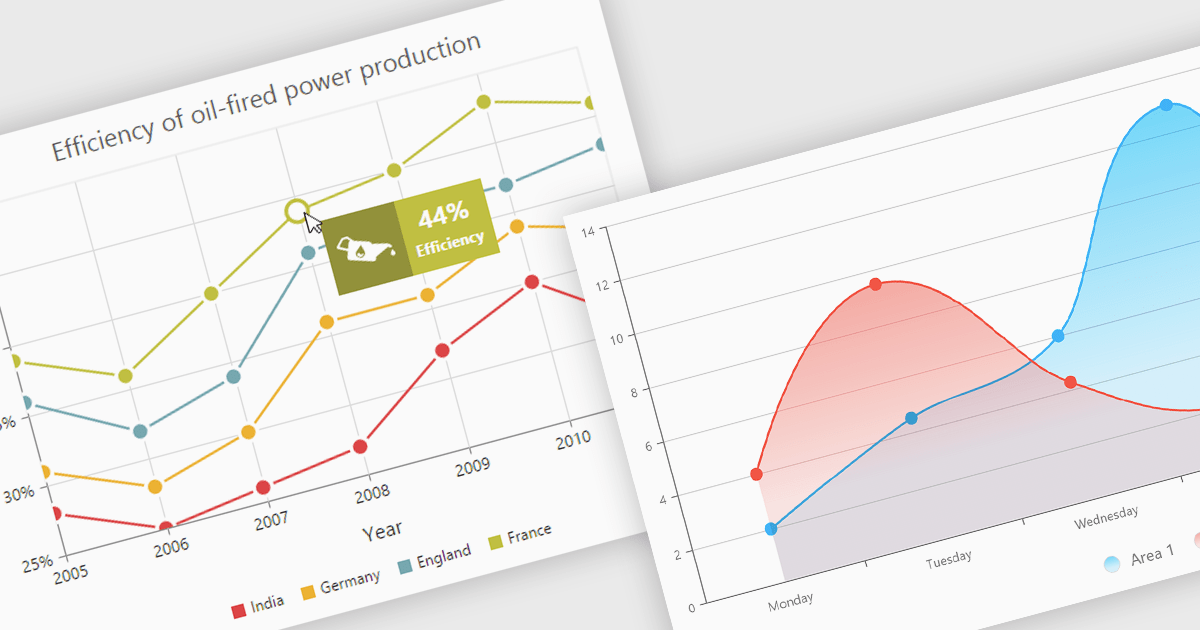
Chart tooltips provide interactive, on-demand insights by displaying detailed information about specific data points when users hover or click on them. They play a crucial role in improving data clarity, enhancing user engagement, and maintaining a clean, uncluttered chart layout. The benefits of tooltips include simplifying the exploration of complex datasets and offering customizable content, such as values, comparisons, or additional context. For example, tooltips can display product sales figures on a business dashboard or detailed stock breakdowns in financial reports. This functionality makes tooltips an indispensable feature for creating intuitive, data-driven applications that empower users to make informed decisions.
Several Angular chart controls offer tooltip support including:
For an in-depth analysis of features and price, visit our Angular chart controls comparison:
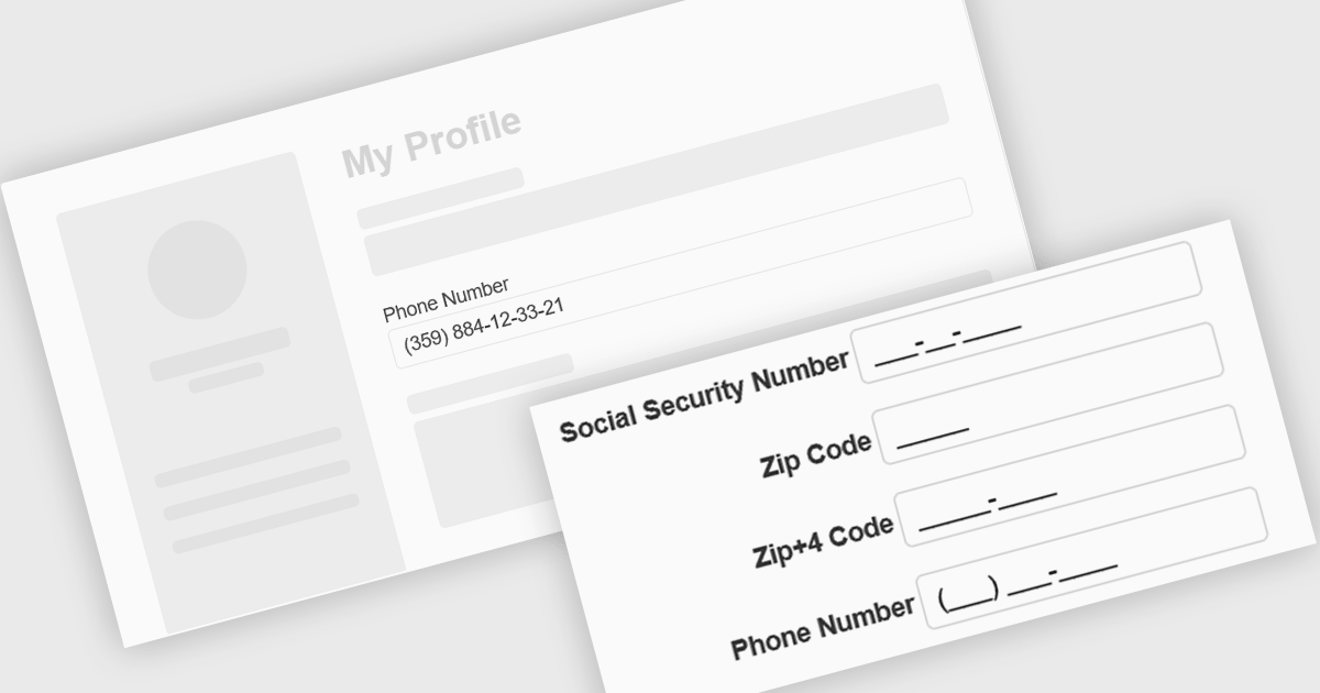
Input masking is a technique used in data editor components to format and restrict user input to specific patterns. By defining a predefined structure with placeholders, input masks guide users to enter data in a consistent and accurate manner. This approach significantly reduces data entry errors, improves data quality, and streamlines data processing. Input masks also enhance user experience by providing clear visual cues and automatically formatting input as it is typed, reducing the cognitive load on the user.
Several Angular data editors offer support for input masking including:
For an in-depth analysis of features and price, visit our Angular data editors comparison.
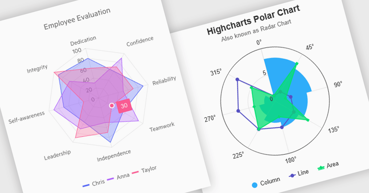
Polar and radar charts provide an intuitive way to visualize multidimensional and circular data. These chart types plot data points relative to a central axis, with polar charts ideal for showcasing proportional relationships, such as seasonal trends or directional metrics, and radar charts excelling at comparing multiple variables, such as performance metrics or skill assessments. Angular’s interactivity enhances engagement with features like tooltips, zooming and real-time updates, making these charts ideal for dashboards and reports. Use cases include analyzing skill assessments, market segmentation, and cyclic trends, delivering clear, actionable insights in a visually compelling format.
Several Angular chart controls offer visual polar and radar chart support including:
For an in-depth analysis of features and price, visit our Angular chart controls comparison:
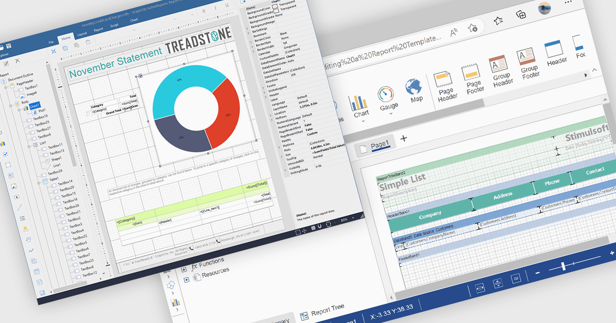
A Visual Report Designer in a reporting control enables users to create and customize data-rich reports through an intuitive, drag-and-drop interface. With ready-to-use templates, interactive elements, and direct data binding, it simplifies report creation while maintaining professional quality. Key benefits include real-time data updates, brand customization, and interactive filters, making it ideal for business intelligence tasks like financial dashboards, performance reports, and analytics summaries. This feature empowers teams to generate insights quickly and make data-driven decisions with ease.
Several Angular reporting controls offer visual report designer support including:
For an in-depth analysis of features and price, visit our Angular Reporting Controls comparison.

Charts in a dashboard component transform raw data into clear, actionable visuals, making it easy to monitor trends, track performance, and spot critical insights in real time. These interactive tools support various use cases, from sales forecasting and KPI tracking to project progress monitoring and customer behavior analysis. By offering a centralized, intuitive view of essential metrics, charts help teams make faster, data-driven decisions, optimize operational efficiency, and respond proactively to emerging opportunities or issues.
Several JavaScript products offer chart components with dashboard support including:
Explore our range of JavaScript dashboard components.
Need help to find the right software license, upgrade or renewal? Call, Email, or Live Chat with our experts.
联系电话: (888) 850 9911
传真: +1 770 250 6199


