













官方供应商
我们作为官方授权经销商,直接提供超过200家开发厂家所发行超过1000个的产品授权给您。
查看我们的所有品牌。
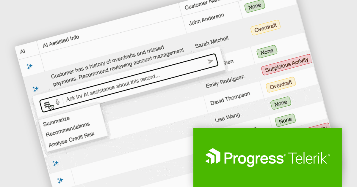
KendoReact by Telerik is a comprehensive library of UI components designed for building modern, feature-rich React applications, enabling developers to create intuitive, responsive, and visually appealing interfaces with ease. It includes robust components like data grids, charts, form elements, and navigation tools, optimized for high performance with features such as virtualization for large datasets and adherence to accessibility standards. Ideal for dashboards, enterprise apps, and data-driven applications, KendoReact empowers teams to accelerate development, ensure design consistency, and deliver inclusive user experiences.
KendoReact provides software developers with a Smart AI Data Grid that allows end users to interact with application data using natural language or voice prompts to filter, group, sort, and analyze information in real time. This reduces the need for complex custom UI controls and lowers the learning curve for end users, while still leveraging the full power of the grid. By embedding conversational interactions and row-level AI analysis directly into the data grid, developers can deliver more efficient, user-friendly data experiences without sacrificing control, predictability, or integration with existing application logic and security requirements.
KendoReact is licensed per developer and has two licensing models: an annual Subscription License and a Perpetual License. The Subscription license provides access to the latest product updates, technical support, and exclusive benefits for a flat annual fee, and must be renewed to continue using the software. The Perpetual license is a one-time purchase granting access to the current released version and includes a one-year subscription for product updates and technical support. After this initial period, users can choose to renew the subscription element to continue receiving updates and support; otherwise, they may continue using the installed version available during their active subscription term but will forgo future updates and support. See our KendoReact licensing page for full details.
KendoReact is available individually or as part of the following products:

Calendar controls are a fundamental component in modern UI suites, providing users with an intuitive way to view, select, and manage dates within applications. They are commonly used in scenarios such as scheduling, booking, reporting, and data filtering, offering consistent date interaction patterns, localization support, and easy integration with other input and data-driven components.
Several Angular UI suites offer calendar components including:
For an in-depth analysis of features and price, visit our Angular UI suites comparison.
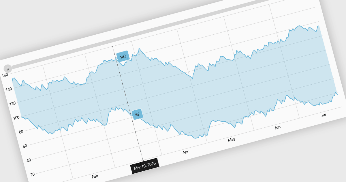
Range charts visualize financial data based on fixed price movements rather than time intervals, grouping activity into consistent ranges to highlight meaningful price action. By filtering out minor fluctuations and market noise, they make trends, volatility, support, and resistance levels easier to identify, especially in fast-moving or irregular markets. Common use cases include technical analysis for trading platforms, monitoring price volatility in equities or cryptocurrencies, and analyzing high-frequency financial data where understanding true market behavior is more important than tracking time-based changes.
Several React charting components provide you with range charts, including:
For an in-depth analysis of features and price, visit our React chart controls comparison.
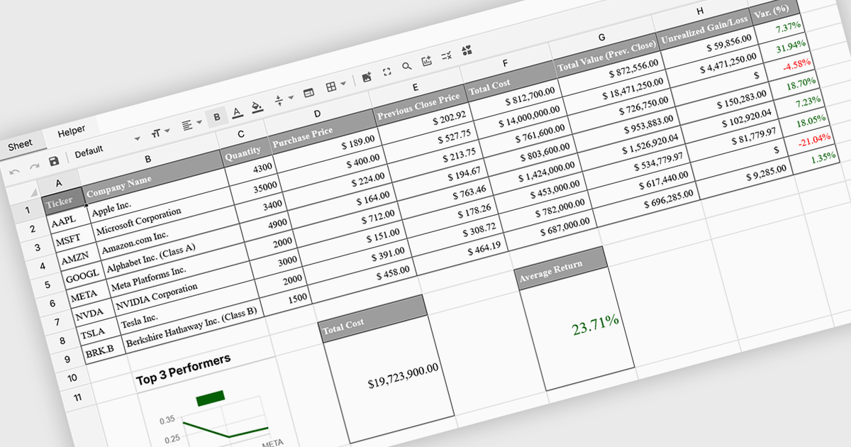
Formula and function support in spreadsheets enables users to perform mathematical, statistical, financial, and logical calculations directly within cells, transforming raw data into meaningful results. By automating calculations and ensuring consistent logic across datasets, this capability improves accuracy, saves time, and supports real-time updates as data changes. It allows users to analyze trends, validate data, and model scenarios without relying on external tools. Common use cases include financial forecasting, budgeting, statistical analysis, performance reporting, and operational planning, making spreadsheets a powerful and flexible platform for data-driven decision-making across business, finance, and technical teams.
Several Vue spreadsheet controls offer formula and function support including:
For an in-depth analysis of features and price, visit our Vue spreadsheet controls comparison.
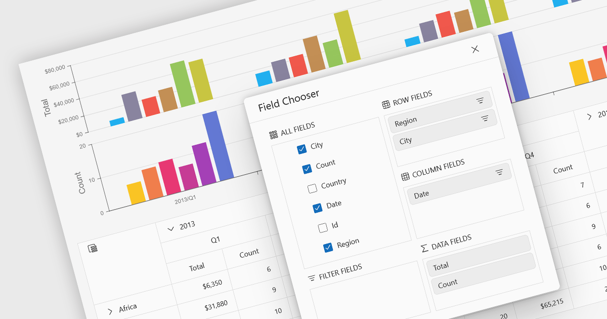
A pivot chart is a dynamic data visualization tool that works in conjunction with a pivot table to present summarized data in a graphical format. It allows users to interactively explore and analyze large datasets by adjusting dimensions such as categories, series, and filters without modifying the underlying data. By visually representing trends, comparisons, and patterns, pivot charts help users make data-driven decisions more efficiently. They are especially useful in business intelligence and reporting scenarios where clarity and flexibility in viewing aggregated data are essential.
Several JavaScript UI suites provide you with pivot chart functionality, including:
For an in-depth analysis of features and price, visit our comparison of UI suites.
联系电话: (888) 850 9911
传真: +1 770 250 6199


