


官方供应商
我们作为官方授权经销商,直接提供超过200家开发厂家所发行超过1000个的产品授权给您。
查看我们的所有品牌。

Trend lines are essential tools in data visualization and financial analysis, used to identify and interpret the direction and strength of trends in data sets. A trend line is a line that best represents the data on a chart, highlighting the general direction over a specified period. This is beneficial for making informed decisions, predicting future price movements, and validating the strength of ongoing trends. In stock market analysis, a trend line can help investors determine optimal entry and exit points, while moving averages can signal buy or sell opportunities, enhancing the effectiveness of trading strategies.
Several .NET WinForms chart controls offer trend lines and indicators including:
For an in-depth analysis of features and price, visit our comparison of .NET WinForms chart controls.
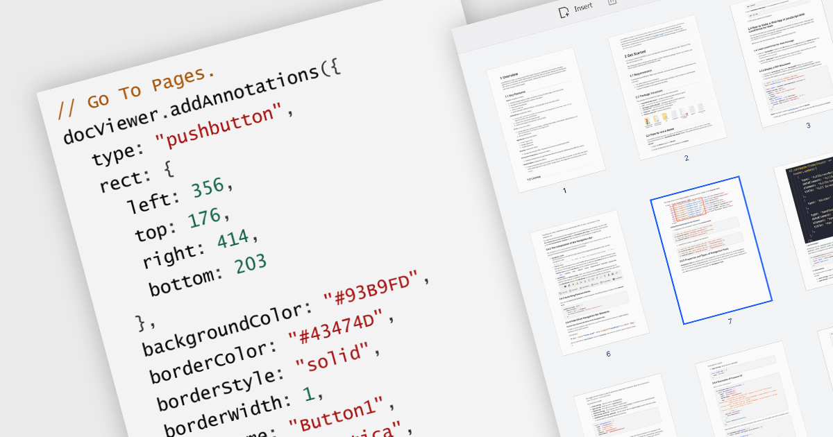
A GoTo action in a PDF component is a clickable link or button that directs users to a specific destination within the same PDF or even a different one. This feature enhances user experience by offering quick jumps to designated parts of the document, references, or connected information. For instance, a table of contents with GoTo actions lets readers instantly access the desired chapter by clicking on the relevant entry. Benefits of the GoTo Action include streamlined document navigation, improved content accessibility, and enhanced interactivity, making it an ideal feature for developing dynamic, user-friendly PDF applications.
Several .NET WPF PDF Components offer GoTo Action including:
For an in-depth analysis of features and price, visit our comparison of .NET WPF PDF Components.
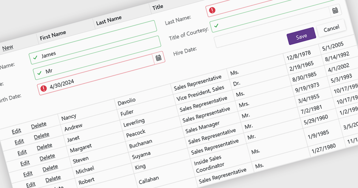
Data validation ensures the accuracy and integrity of information entered by users. It involves implementing rules to verify data against specific criteria, such as data type, format, or range. This helps prevent errors during data entry, improves data consistency, and safeguards against invalid information skewing analysis or downstream processes. Data validation is crucial in various scenarios, including managing financial records, maintaining customer databases, and ensuring data quality for scientific research.
Several Blazor grid controls offer data validation support including:
For an in-depth analysis of features and price, visit our Blazor Grid controls comparison.
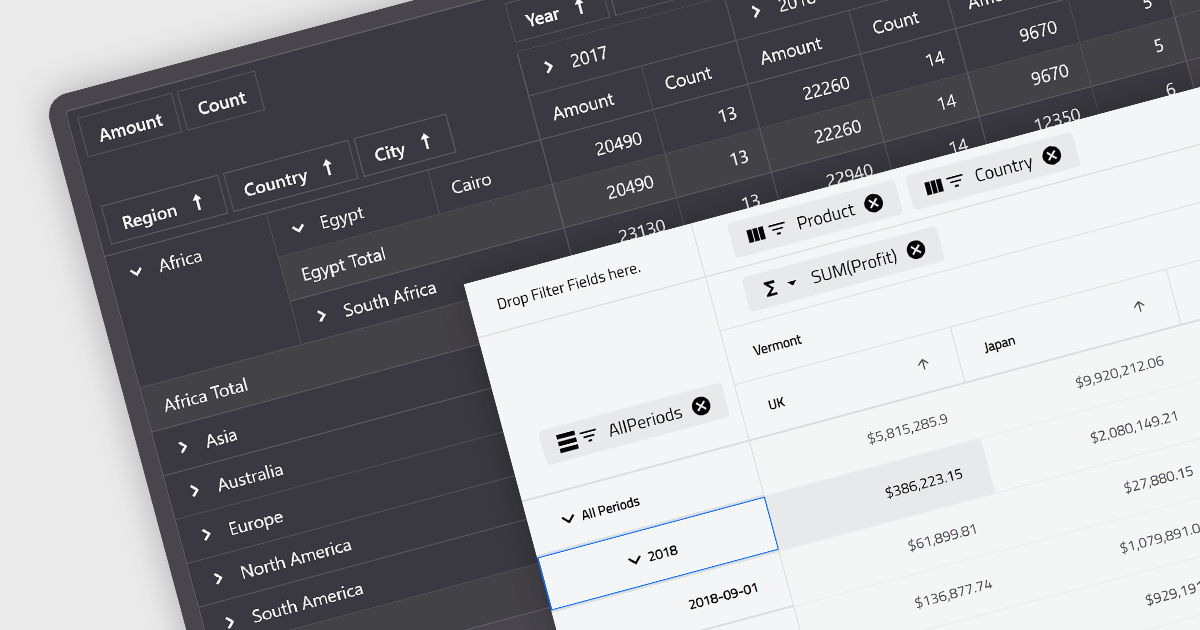
A pivot grid is a powerful data analysis tool that allows you to dynamically summarize and reorganize large datasets. By dragging and dropping fields, you can quickly create a new table that groups and calculates values based on different categories, revealing trends and patterns within your data. This interactive functionality makes pivot grids ideal for gaining insights and informing data-driven decisions. Common use cases include financial analysis, marketing campaign evaluation, and sales performance exploration.
Several Blazor UI suites feature a pivot grid control including:
For an in-depth analysis of features and price, visit our Blazor UI suites comparison.
DevExpress .NET MAUI is a UI component library specifically designed to enhance the development of native mobile applications for iOS and Android using .NET MAUI and C#. It offers a rich set of pre-built controls like data grids, charts, schedulers, and various data editors, allowing developers to focus on application logic and deliver feature-rich mobile experiences with a faster development cycle.
In this blog post, DevExpress technical writer Anthony Sameishchev shows you how to use DevExpress .NET MAUI to implement Material Design 3 themes in your mobile applications. Detailed sample code is included, demonstrating how to:
Material Design 3 principles help you deliver mobile solutions with a consistent and modern appearance. The 10 built-in Material Design 3 color themes included in DevExpress .NET MAUI enable you to easily support these themes in applications using DevExpress or standard MAUI controls.
Read the complete blog and learn how to create stunning UIs with balanced colors and enhanced usability.
DevExpress .NET MAUI is included as part of DevExpress Universal which is licensed per developer and is available as a Perpetual License with a 12 month support and maintenance subscription. See our DevExpress Universal licensing page for full details.
For more information, visit our DevExpress .NET MAUI product page.
联系电话: (888) 850 9911
传真: +1 770 250 6199


