






官方供应商
我们作为官方授权经销商,直接提供超过200家开发厂家所发行超过1000个的产品授权给您。
查看我们的所有品牌。
KendoReact by Telerik is a professional UI kit of more than 120 responsive and customizable native UI and DataViz components for React developers. Designed to save time building powerful high performance React apps, it helps ensure a modern, consistent look-and-feel across your app's UI.
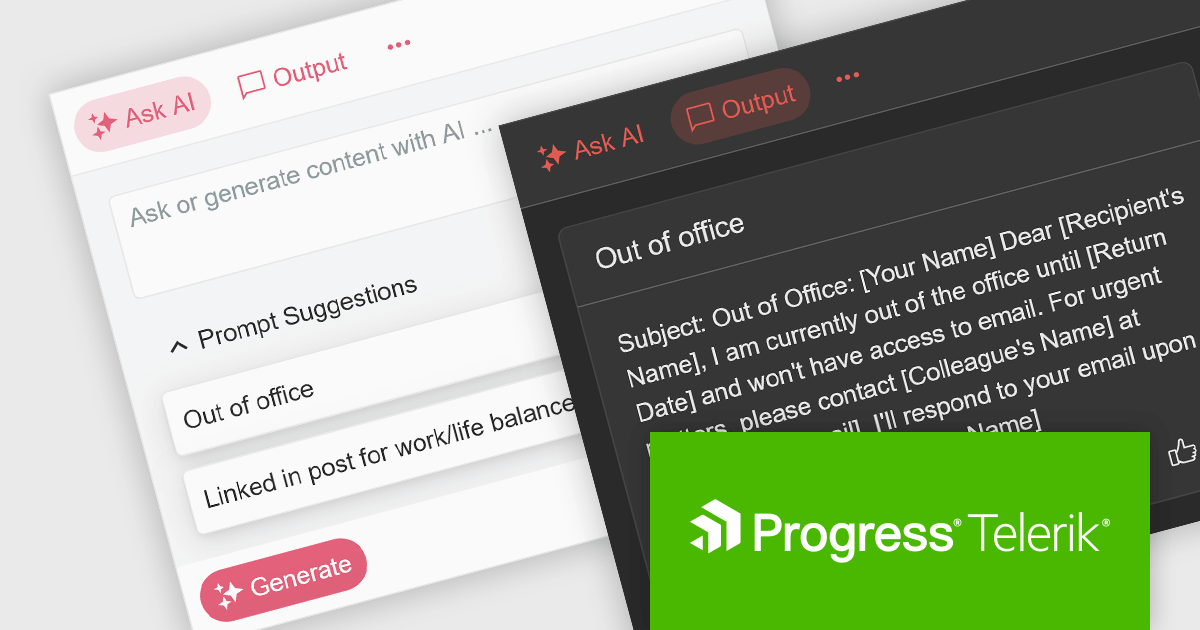
KendoReact v7.1.0, which is part of the 2024 Q1 release, introduces an "AIPrompt" component which allows React developers to integrate generative AI services into their applications. With it you can set up custom suggestions to actively guide users, customize the generate button and prompt input field, and define custom prompt commands so it will do a certain action when a specific command is given. This component also enables you to adapt its behaviour based on user interaction, to ensure it responds smoothly, as it emits several user triggered events. This will help to give your application a modern, customizable and seamless UI.
To see a full list of what’s new in 2024 Q1 (v7.1.0), see our release notes.
KendoReact is licensed per developer and is available as a perpetual license with a 1 year support subscription, which is available in 3 tiers: Lite, Priority or Ultimate. See our KendoReact licensing page for full details.
KendoReact is available to buy in the following products:
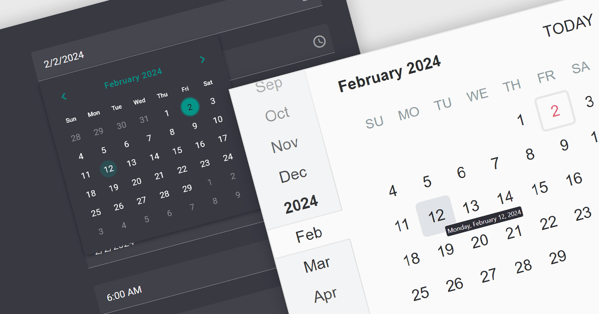
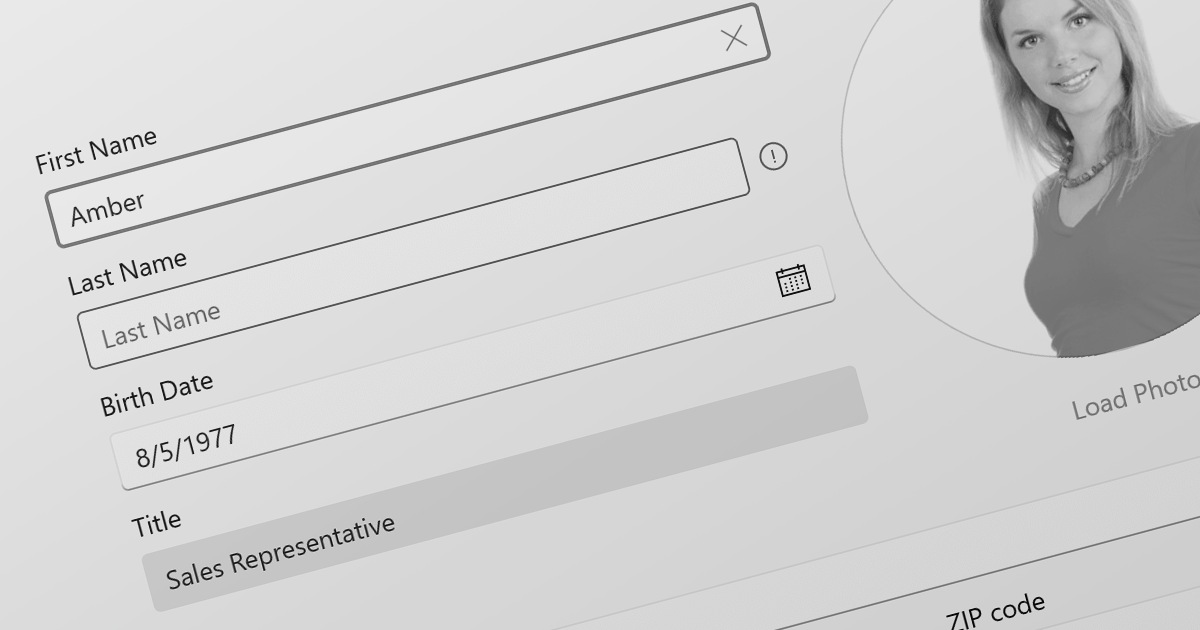
A date editor control is a user interface element designed for selecting and entering dates. It typically combines a text field for manual input with a calendar popup for visual selection. Beyond basic date picking, many controls offer features like time selection, range definition, drop-down lists for pre-defined dates, and even input masks for enforcing specific date formats. Commonly found in applications like forms, booking systems, and calendars, date editor controls streamline date input, improving user experience and data accuracy.
Several React data editor collections provide date editors including:
For an in-depth analysis of features and price, visit our React Data Editors comparison.
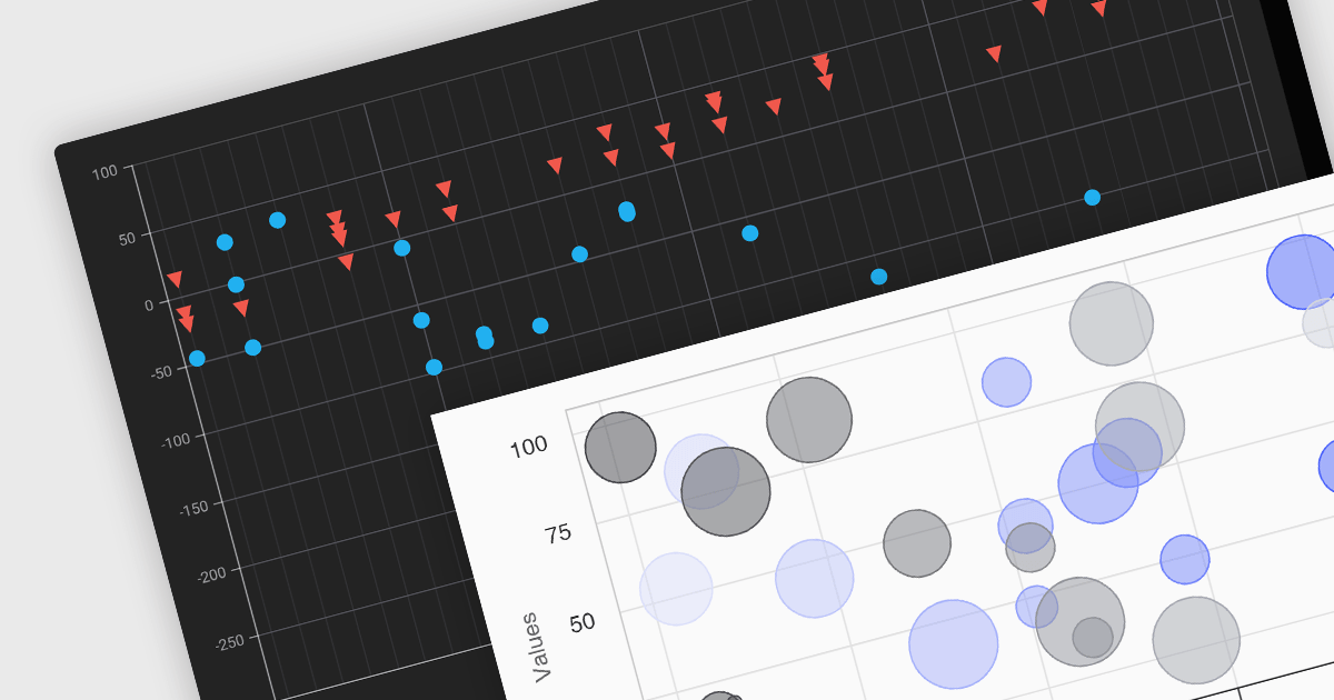
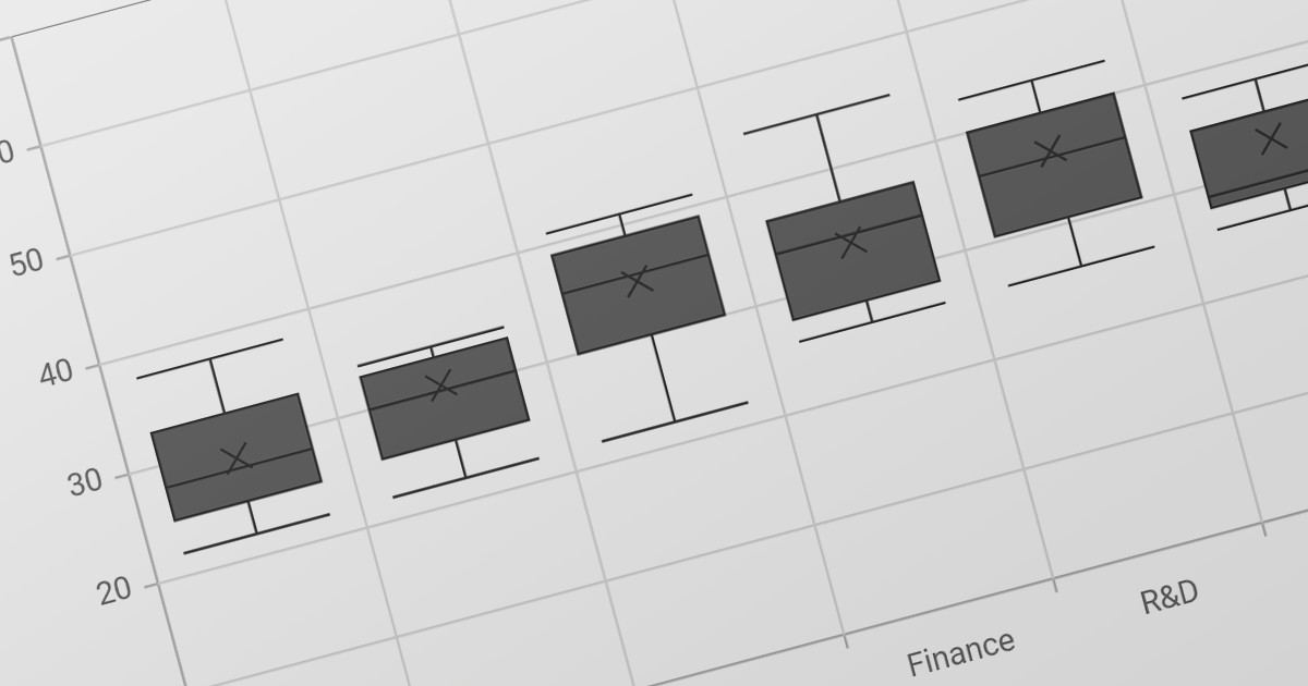
Scatter and bubble charts are used to display data points on a two-dimensional graph. While scatter charts use dots to represent data points, bubble charts add an additional dimension by varying the dot size, often representing volume or intensity. These charts are useful for showing relationships between variables and for identifying patterns or trends in data.
Several Angular chart controls offer scatter and bubble charts including:
For an in-depth analysis of features and price, visit our Angular chart controls comparison.
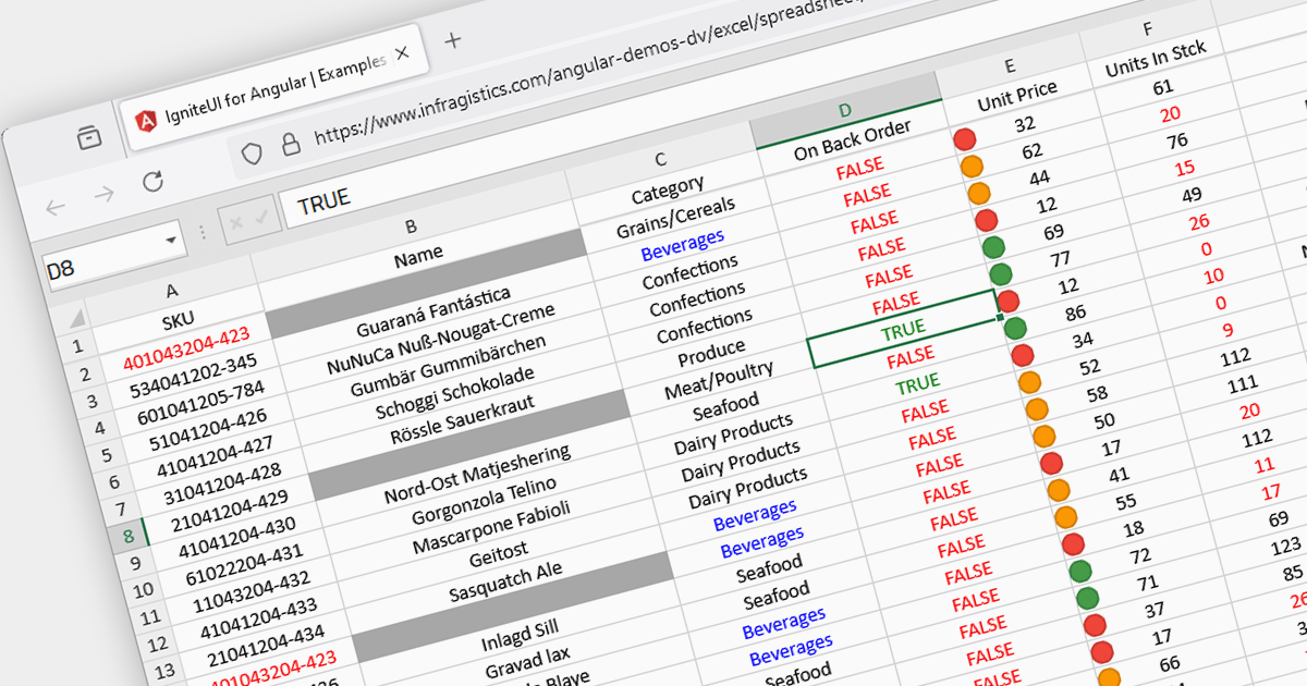
Conditional formatting in spreadsheets automates the visual highlighting of cells or ranges based on predefined criteria. This functionality aids data analysis by rapidly drawing attention to specific values, ranges, or text entries. By employing color scales, gradients, or text changes, conditional formatting helps users identify patterns, exceptions, and trends within large datasets, streamlining the interpretation and communication of key insights.
Several JavaScript spreadsheet controls offer conditional formatting including:
For an in-depth analysis of features and price, visit our comparison of JavaScript spreadsheets.
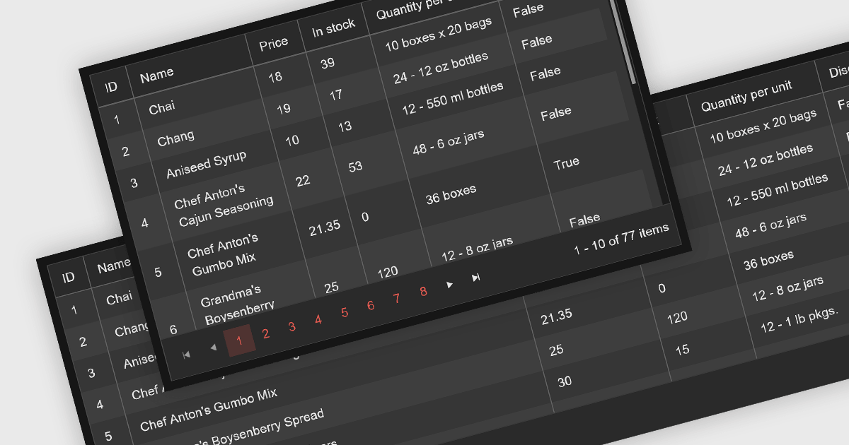
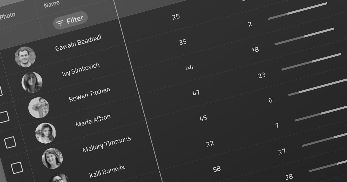
Leveraging a Blazor grid control with responsive layout empowers your application with optimal data visualization across diverse screen sizes and orientations. This enhances the user experience by ensuring seamless navigation, readability, and interaction with grid content, regardless of whether it's being accessed from a desktop computer, tablet, or mobile phone. This flexibility fosters wider accessibility, improves user engagement, and ultimately strengthens the overall value proposition of your Blazor application.
Several Blazor grid controls offer responsive layouts including:
For an in-depth analysis of features and price, visit our Blazor grid controls comparison.
联系电话: (888) 850 9911
传真: +1 770 250 6199


