


官方供应商
我们作为官方授权经销商,直接提供超过200家开发厂家所发行超过1000个的产品授权给您。
查看我们的所有品牌。
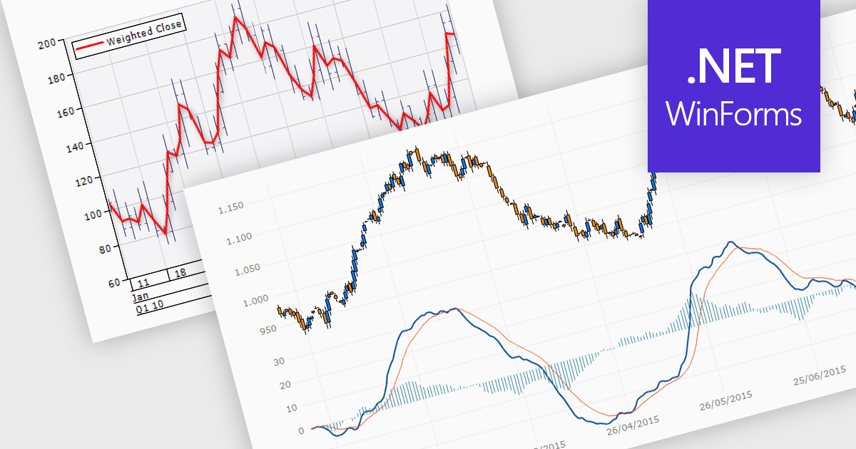
Trend lines are essential tools in data visualization and financial analysis, used to identify and interpret the direction and strength of trends in data sets. A trend line is a line that best represents the data on a chart, highlighting the general direction over a specified period. This is beneficial for making informed decisions, predicting future price movements, and validating the strength of ongoing trends. In stock market analysis, a trend line can help investors determine optimal entry and exit points, while moving averages can signal buy or sell opportunities, enhancing the effectiveness of trading strategies.
Several .NET WinForms chart controls offer trend lines and indicators including:
For an in-depth analysis of features and price, visit our comparison of .NET WinForms chart controls.
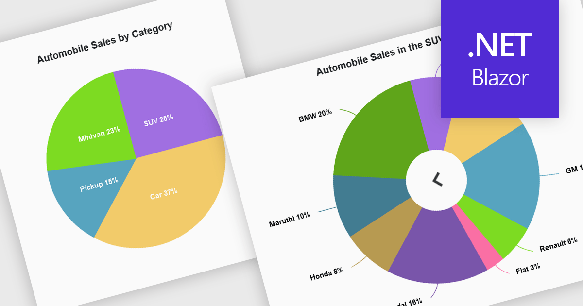
Developers can leverage drill down charts to create interactive data visualizations for exploring hierarchical information. These charts allow users to click on data points, drilling down to progressively more detailed breakdowns. This functionality is often paired with breadcrumb navigation, enabling users to easily track their exploration path and return to higher levels. Drill down charts empower users to gain deeper insights from complex datasets.
Several Blazor Chart controls offer drill down support including:
For an in-depth analysis of features and price, visit our Blazor Chart controls comparison.
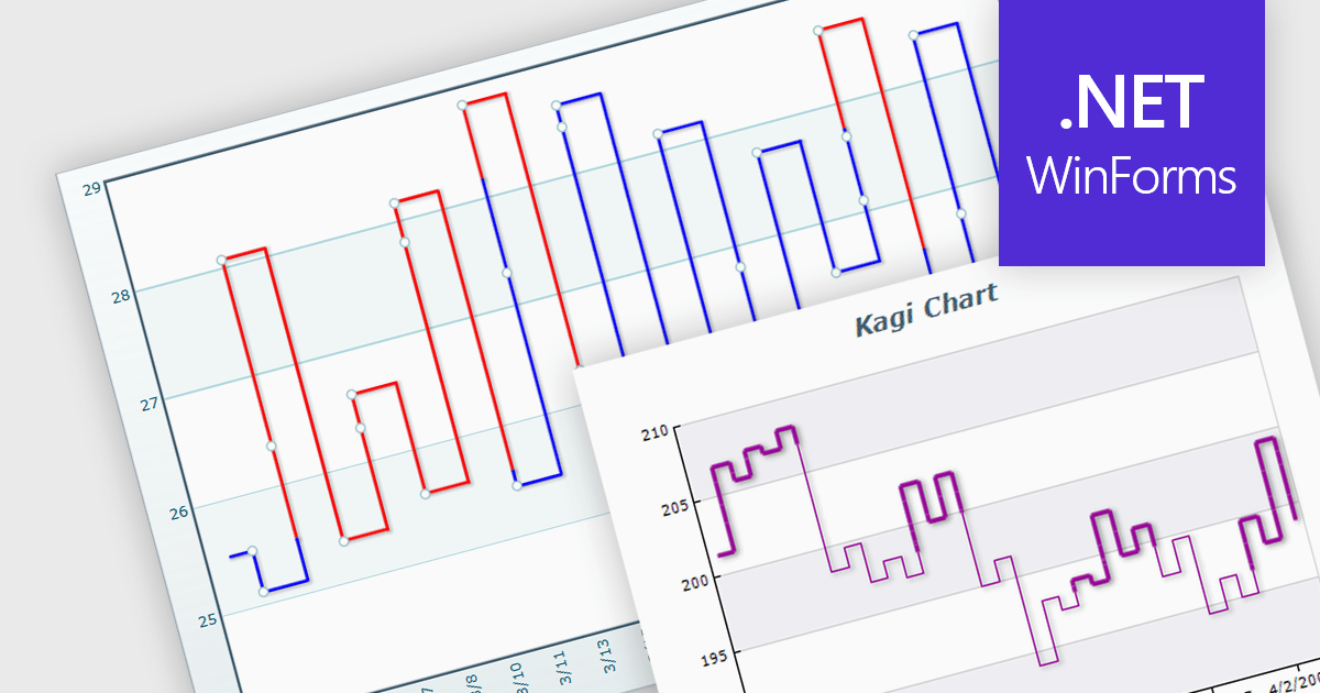
A Kagi chart is a type of financial chart used to track price movements, with a focus on significant trends and reversals rather than minor fluctuations, to inform stock purchasing decisions. It features a series of vertical lines that reflect changes in price. The direction of these lines shifts only when the price moves by a predetermined amount, known as the reversal amount. Thin lines indicate that the price has fallen below the previous low while thick lines indicate that the price has surpassed the previous high. By filtering out minor price fluctuations it emphasises substantial price movements, offering a clearer perspective on market trends.
Several WinForms chart components provide Kagi charts, including:
For an in-depth analysis of features and price, visit our WinForms charts comparison.
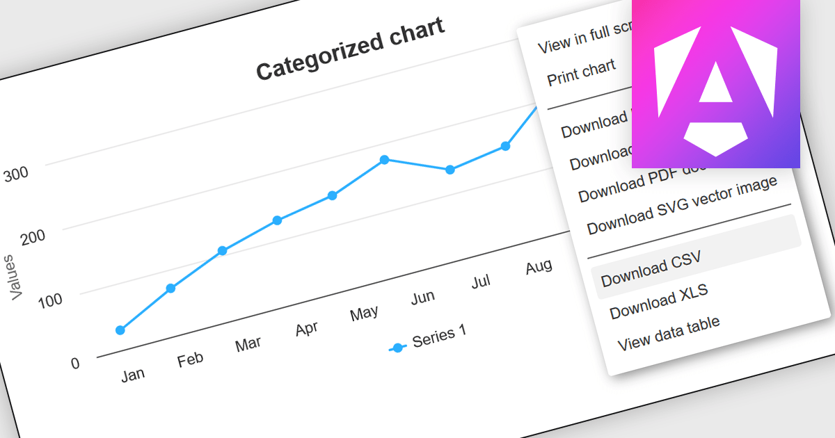
CSV export functionality in Angular chart components enables users to download the data represented in chart form as a CSV (comma-separated values) file directly from Angular-based web applications. This feature is particularly useful for developers who need to provide end-users with the flexibility to manipulate, analyze, or store chart data independently from the web interface. By integrating CSV export, applications can enhance data accessibility and user satisfaction, allowing for data transfer and offline analysis. This functionality also supports better data management practices and can be vital in environments where data needs to be shared across different platforms or systems, thereby increasing the interoperability and practical utility of the application.
Several Angular chart controls offer export to CSV including:
For an in-depth analysis of features and price, visit our comparison of Angular chart controls.
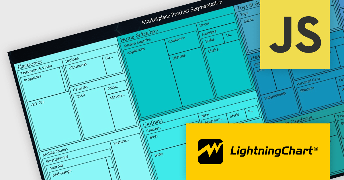
LightningChart JS is a high-performance JavaScript charting library that utilizes WebGL rendering and GPU acceleration to deliver exceptional performance for a wide range of data visualization needs. It is designed to handle large datasets and complex visualizations with ease, enabling developers to create interactive and visually appealing charts for various applications.
The LightningChart JS v5.2.0 update adds Treemap charts with built-in drill-down functionality, enabling developers to visualize hierarchical data within nested rectangles representing larger or smaller values, depending on their size. This simplifies the complexities involved in understanding large datasets by providing a clear and immediate visual hierarchy of data categories and their relative importance, with the ability to display more depth. This is particularly useful in scenarios such as financial analysis, asset distribution, and organizational structure mapping, where understanding the proportionate distribution of data elements is crucial.
To see a full list of what's new in v5.2.0, see our release notes.
LightningChart JS is licensed based on method of deployment with options including SaaS Developer Licenses, Application Developer Licenses, and Publisher Developer Licenses. Each license is perpetual and includes 1 year subscription for technical support and software updates. See our LightningChart JS licensing page for full details.
Learn more on our LightningChart JS product page.
联系电话: (888) 850 9911
传真: +1 770 250 6199


