













官方供应商
我们作为官方授权经销商,直接提供超过200家开发厂家所发行超过1000个的产品授权给您。
查看我们的所有品牌。

Pie charts are a useful and easily understood tool for visualizing data breakdowns at a glance, particularly when representing percentages of a whole. Their strength lies in highlighting the relative proportions between a small number of categories within a dataset. While less effective for complex comparisons or trends over time, pie charts can be an effective choice to communicate compositions and dominance within a dataset.
Several Blazor Chart controls offer Pie charts including:
For an in-depth analysis of features and price, visit our Blazor Chart controls comparison.
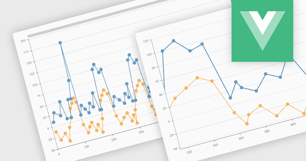
Zooming functionality in a chart component empowers users to delve deeper into complex datasets. By allowing for magnified views of specific areas, users can identify trends, outliers, and patterns that might be obscured in a broader, more generalized view. This interactivity fosters a richer understanding of the data and facilitates more informed decision-making for end users.
Several Vue.js chart controls support zooming including:
For an in-depth analysis of features and price, visit our comparison of Vue.js Charts.
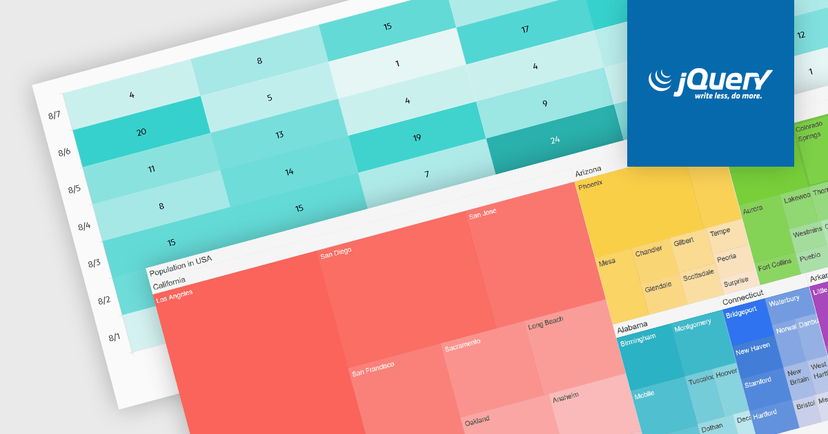
Heatmaps and treemaps are powerful data visualization tools that offer specific advantages when examining large datasets. A heatmap colorizes data values in a matrix, allowing for intuitive observation of trends, patterns, and outliers over two dimensions, making it helpful for spatial data analysis and correlation assessment. Treemaps exhibit hierarchical data as nested rectangles, with size and color variations indicating distinct quantitative values, allowing for effective use of space and fast comparison of proportions and relationships within hierarchical structures. Together, these chart types provide significant tools for visualizing and interpreting complex data, improving decision-making processes by presenting underlying data insights in a clear and actionable manner.
Several jQuery chart controls support the Heat and Treemap chart types, including:
For an in-depth analysis of features and price, visit our comparison of jQuery chart controls.
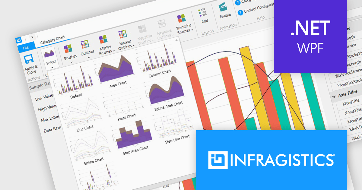
Infragistics Professional includes 100+ beautifully styled, high-performance grids, charts, & other UI controls, plus time-saving productivity tools for developers. In addition to controls for Angular, React, jQuery, Web Components, Blazor, ASP.NET MVC, ASP.NET Core, Windows Forms, and Xamarin, it also includes the powerful Infragistics Ultimate UI for WPF which encompasses a wide range of fast, touch-friendly WPF controls designed to help you bring modern, engaging apps for desktop and touch-screen devices.
Infragistics Professional empowers you to create informative and visually appealing data visualizations within your WPF applications. Its chart component library offers a vast selection of chart types, from bar and line charts to pie and scatter charts, ensuring you can effectively communicate your data insights. This functionality goes beyond aesthetics, featuring intelligent data binding, customizable styles, and interactive elements like callouts and crosshair lines for a truly comprehensive charting experience.
Infragistics Professional is licensed per developer and is available as a Perpetual License with a 1, 2 or 3 year support and maintenance subscription. See our Infragistics Professional licensing page for full details.
The Infragistics WPF Chart Components are available in the following products:
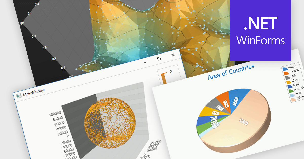
3D charts excel at showcasing complex datasets with three variables. By adding depth, they allow viewers to grasp intricate relationships between these variables that might be difficult to decipher in a flat, 2D format. This enhanced visualization can reveal patterns and trends that would otherwise remain hidden, leading to a deeper understanding of the data.
Several WinForms Chart controls offer 3D charts including:
For an in-depth analysis of features and price, visit our WinForms Chart controls comparison.
联系电话: (888) 850 9911
传真: +1 770 250 6199


