


官方供应商
我们作为官方授权经销商,直接提供超过200家开发厂家所发行超过1000个的产品授权给您。
查看我们的所有品牌。

AnyChart JS is a lightweight and robust JavaScript charting library that enables you to create stunning and interactive charts, dashboards, and maps. It provides a wide range of chart types, including line charts, bar charts, pie charts, scatter plots, and more. You can also customize the appearance of your charts using a variety of options, such as colors, fonts, and themes.
The AnyChart JS 8.12 release adds a suite of interactivity events to the Circle Packing chart, allowing you to attach event listeners to any chart element and create dynamic visualizations that respond to user interactions such as mouse movements, hovers, and clicks. This new feature enables you to add or modify information and reshape chart behavior in real-time, enhancing data exploration experiences.
To see a full list of what's new in version 8.12.0, see our release notes.
AnyChart JS offers a range of Annual and Perpetual licensing options including Website, Internal, Saas, Enterprise, OEM, and Next Unicorn Licenses. For more information visit our AnyChart JS licensing page.
For more information, visit our AnyChart JS product page.
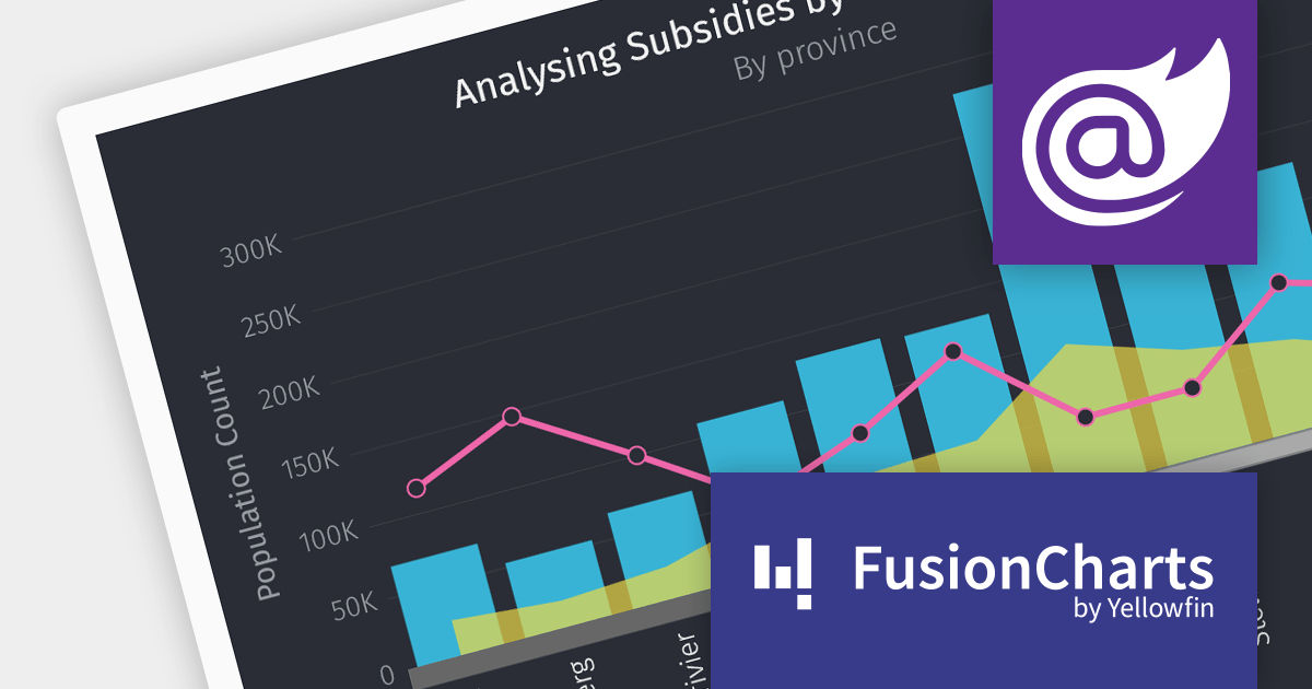
FusionCharts Suite XT is a powerful collection of charting and mapping tools that helps developers create interactive and data-driven dashboards for their web and mobile applications. It provides a wide range of features, including over 100 chart types, data-driven maps, and a variety of customization options. FusionCharts Suite XT helps you visualize and present data in a clear and engaging way.
The FusionCharts Suite XT v3.22 release introduces seamless integration with Blazor, allowing you to create visually appealing and informative data visualizations that enhance the overall user experience. These visualizations offer feature-rich configuration options that boost charting performance, enabling efficient client-side rendering and fast chart display, even with large datasets.
To see a full list of what's new in v3.22, see our release notes.
For more information, visit our FusionCharts Suite product page.
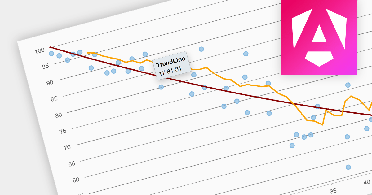
Trend lines are a chart feature used to indicate patterns or trends in data over time. Common examples include linear, exponential, polynomial, logarithmic, and moving average. Trend lines are crucial for making predictions or understanding the direction of data points in scatter plots and line charts, helping make data-driven decisions.
Several Angular chart components provide trend line support including:
For an in-depth analysis of features and price, visit our Angular Chart Component comparison.
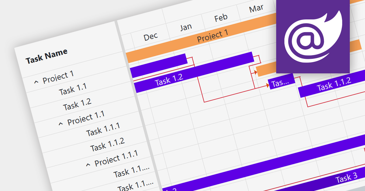
Gantt charts are a type of bar chart designed to illustrate project schedules. They display the start and end dates of different elements of a project and are essential for project management. These charts are useful for tracking project progress and for planning by showing how project tasks overlap and relate to each other.
Several Blazor chart components provide Gantt charts including:
For an in-depth analysis of features and price, visit our Blazor Charts comparison.
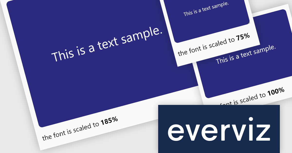
everviz is a cloud-based data visualization platform that empowers users to create visually appealing interactive charts, maps, and other visuals.
The October 2023 update of everviz adds a new dynamic font scaling feature. This allows chart text to be intelligently resized to fit your publishing destination, whether it's intended for print, video, or the web. It is particularly useful when exporting visualizations in video format, where the text size requirements are significantly different from those of an online article. Dynamic font scaling helps maintain a consistent visual quality across your visualizations.
To see a full list of what's new, see our release notes.
For more information, see our everviz product page.
联系电话: (888) 850 9911
传真: +1 770 250 6199


