


官方供应商
我们作为官方授权经销商,直接提供超过200家开发厂家所发行超过1000个的产品授权给您。
查看我们的所有品牌。
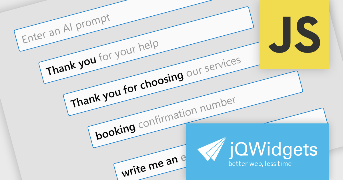
jQWidgets is a comprehensive JavaScript UI framework offering a robust collection of over 60 widgets, themes, and utilities for building professional-grade, cross-platform web applications. Built on jQuery, HTML5, and CSS, it provides extensive functionality including data grids, charts, navigation, input validation, and more. jQWidgets simplifies web development, ensuring your applications work seamlessly across desktop browsers, tablets, and smartphones.
The jQWidgets v20.0.0 release introduces AI-powered sentence completion in its input component, enhancing user efficiency by suggesting autocompletions for full sentences based on context and how it has been configured.
To see a full list of what's new in v20.0.0, see our release notes.
jQWidgets is licensed per developer and is available as a Perpetual license 1 year support and maintenance. See our jQWidgets licensing page for full details.
Learn more on our jQWidgets product page.
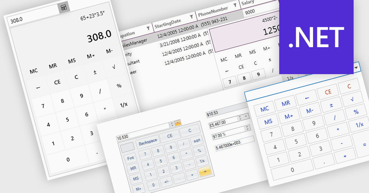
A dropdown calculator is a user interface element that allows users to quickly perform calculations. This streamlines the input process, making it more efficient and user-friendly, particularly in scenarios where options are predefined. By limiting the range of inputs, dropdown calculators minimize errors and provide more accurate results, while also improving the speed and ease with which users can interact with the tool. This approach is beneficial in environments where consistent, standardized inputs are required, such as in financial applications or forms.
Several .NET data editor collections provide dropdown calculator controls, including:
For an in-depth analysis of features and price, visit our comparison of .NET data editors.
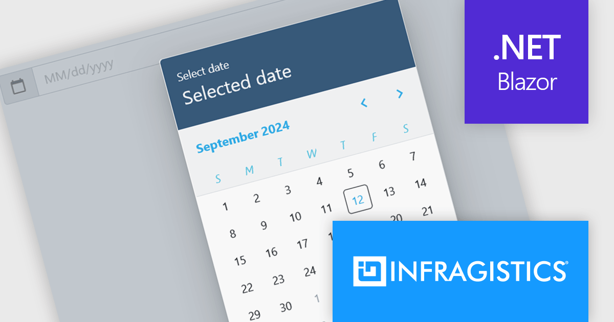
Infragistics Ignite UI for Blazor is a comprehensive UI component library designed specifically for .NET developers building modern web applications with Blazor. It offers a rich set of over 60 components, including performant data grids, interactive charts, and essential UI elements. This allows developers to craft visually appealing, feature-packed Blazor applications with a focus on data visualization, user interaction, and a variety of design themes.
The Ignite UI for Blazor 24.1.46 release adds a new date picker component. Designed to streamline date input processes, it offers a user-friendly interface that allows users to either manually type in a date or select a specific date from a convenient calendar popup. The component's lightweight design and straightforward implementation make it easy to integrate into Blazor applications. The date picker provides multiple view options, including month, year, and decade, enabling users to navigate effortlessly to their desired date. Additionally, it supports essential validation features like minimum and maximum date constraints and required field checks, ensuring data integrity and accuracy.
To see a full list of what's new in version 24.1.46, see our release notes.
Infragistics Ignite UI for Blazor is available as part of Infragistics Ignite UI which is licensed per developer and is offered as a Perpetual License with a 1, 2 or 3 year support and maintenance subscription. See our Infragistics Ignite UI licensing page for full details.
Infragistics Ignite UI for Blazor is available in the following products:
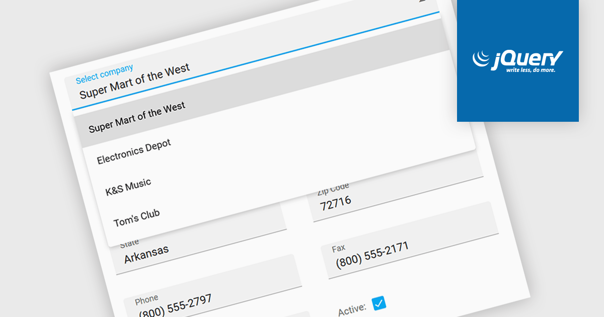
Listboxes are graphical user interface elements that display a list of items from which a user can select one or more. They are commonly used to present options, choices, or data in a compact and organized manner. Their utility lies in their ability to simplify user interaction by providing a clear and visually appealing way to navigate and choose from a predefined set of items, making them essential components in various applications, from simple forms to complex data management systems.
Several jQuery data editor collections can provide you with a listbox including:
For an in-depth analysis of features and price, visit our jQuery data editors comparison.
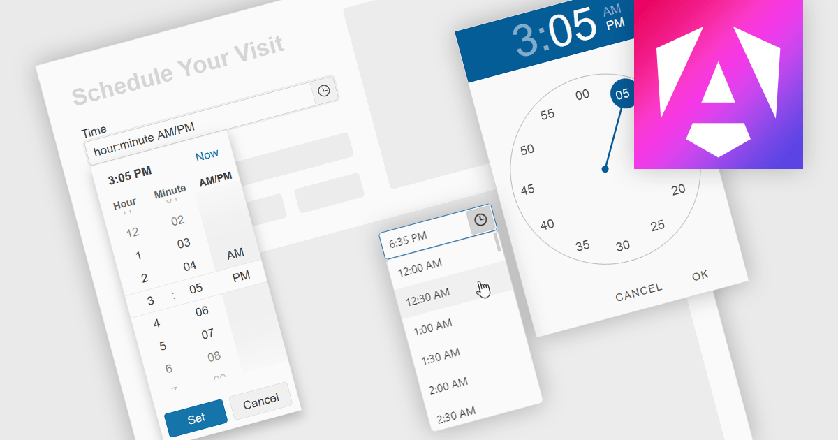
A time picker is an input component that provides users with the ability to edit or select a specific time value from a visual dropdown or input field, typically presented in the form of a clock face or a digital time display. This user interface element provides a standardized and intuitive method for capturing time input, ensuring that the data is consistent, accurate and correctly formatted. Particularly valuable in applications involving scheduling tools, booking systems or simply managing time-based data, it enhances the overall user experience and helps to ensure accurate and efficient data entry.
Several Angular data editor collections provide time picker components, including:
For an in-depth analysis of features and price, visit our comparison of Angular data editors.
联系电话: (888) 850 9911
传真: +1 770 250 6199


