





官方供应商
我们作为官方授权经销商,直接提供超过200家开发厂家所发行超过1000个的产品授权给您。
查看我们的所有品牌。
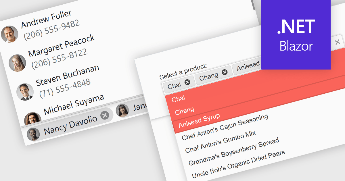
Token or tag boxes provide a user-friendly interface for selecting multiple items from a list. These controls present each selected item as a visually distinct "tag" or "token" within the input area, allowing for quick recognition and easy removal. Ideal for scenarios like multi-category selection or user input of discrete values such as emails or keywords, token boxes enhance both the user experience and data clarity, particularly in web applications that require dynamic form entry or filtering.
Several Blazor Data Editors offer support for token boxes including:
For an in-depth analysis of features and price, visit our Blazor data editors comparison.
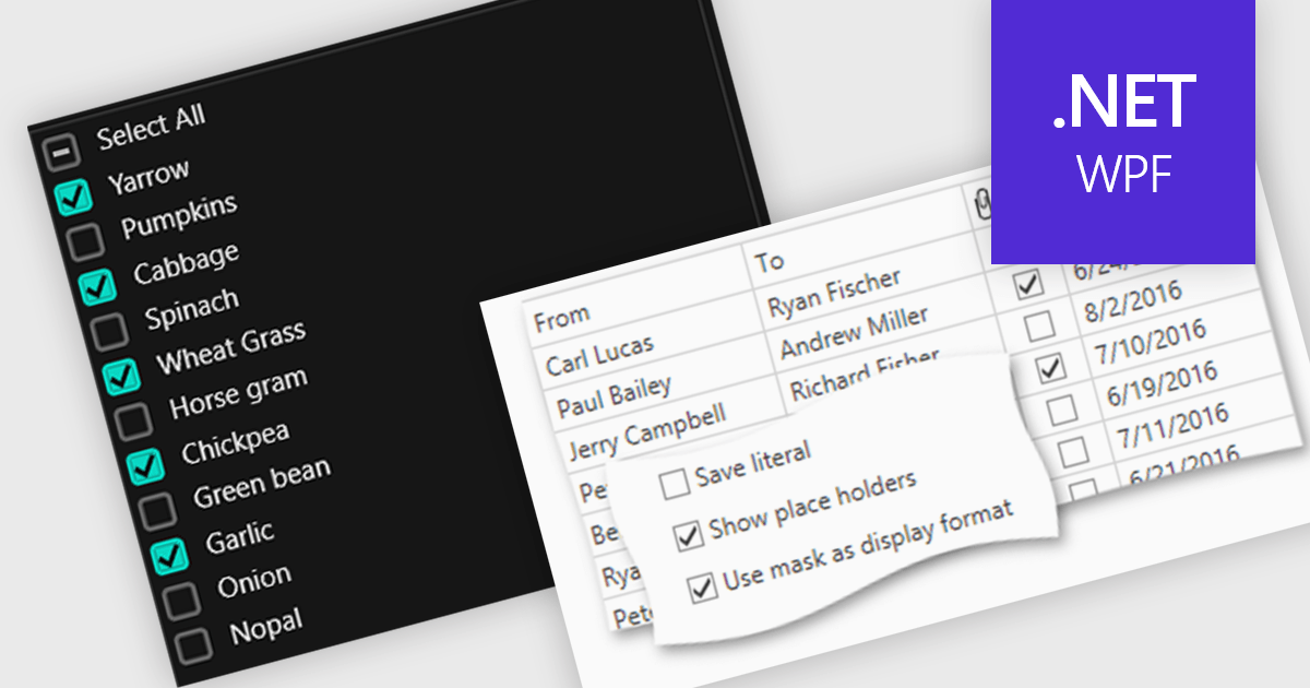
Checkboxes enable user manipulation of boolean values within a data interface. This feature improves user interactions by allowing quick toggling of options without the need for dropdowns or manual entry, reducing the risk of data entry errors. It is especially valuable in scenarios where multiple items need to be selected, enabled, or flagged, such as managing settings, permissions, or multi-select workflows.
Several .NET WPF components offer checkbox data editors, including:
For an in-depth analysis of features and price, visit our comparison of .NET WPF data editors.
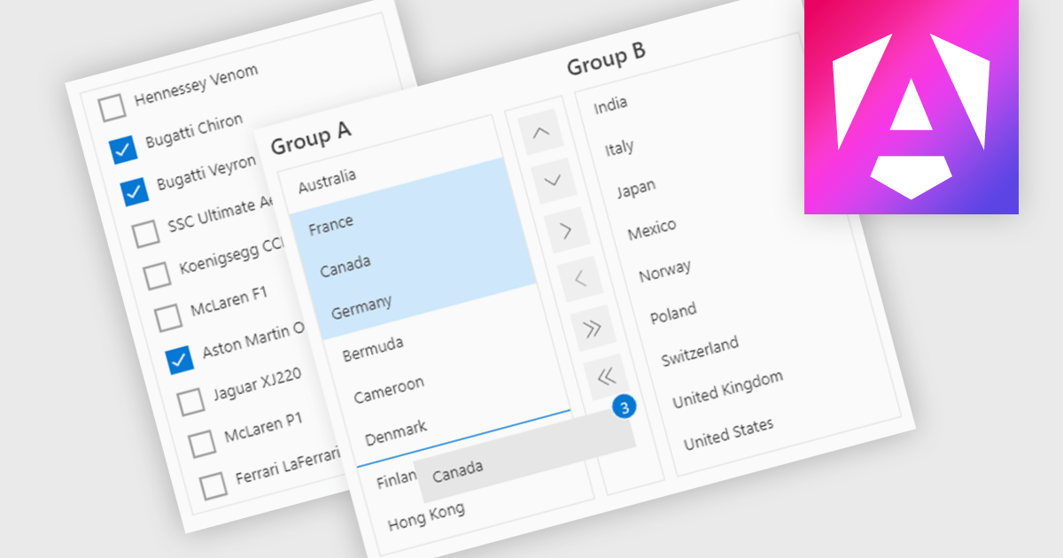
ListBoxes are user interface components in data editors that enable users to select one or more values from a predefined list. They help improve data entry by reducing manual input, ensuring consistent data, and minimizing errors. Commonly used in forms, data grids, and configuration panels, ListBoxes support both static and dynamic data sources, allowing for context-aware filtering and responsive interfaces that adapt to user selections.
Several Angular data editors support listboxes, including:
For an in-depth analysis of features and price, visit our Angular data editors comparison.
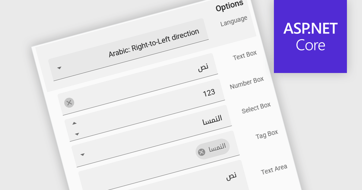
Right to Left (RTL) support in ASP.NET Core Data Editor controls ensures that text, layout, and user interface elements are properly aligned for languages that are read from right to left, such as Arabic, Hebrew, and Persian. This functionality automatically adjusts text direction, input fields, alignment, and other visual components to provide a seamless user experience for RTL users. By enabling RTL support, developers can create more inclusive web applications that cater to a global audience without requiring extensive customization. This improves usability, enhances accessibility, and ensures compliance with localization requirements for multilingual applications.
Several ASP.NET Core Assembly data editors offer right-to-left (RTL) support including:
For an in-depth analysis of features and price, visit our comparison of ASP.NET Core Assembly data editors.
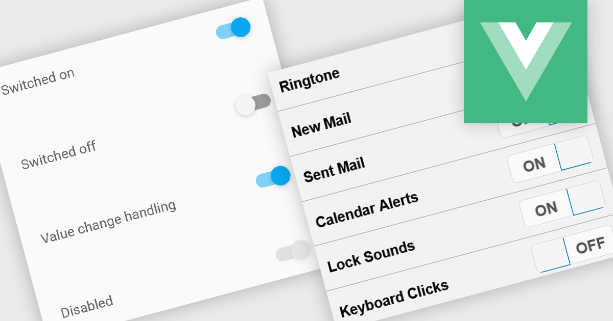
Toggle switches in data editor components provide a user-friendly way to manage boolean values, offering a clear on/off representation that enhances usability. These switches replace traditional checkboxes with a more modern and intuitive interface, making them particularly useful for mobile and web applications where quick interactions are essential. By improving clarity and reducing user errors, toggle switches contribute to a smoother and more efficient data entry experience.
Several Vue.js data editor collections offer toggle switch controls including:
For an in-depth analysis of features and price, visit our Vue.js data editors comparison.
联系电话: (888) 850 9911
传真: +1 770 250 6199


