








官方供应商
我们作为官方授权经销商,直接提供超过200家开发厂家所发行超过1000个的产品授权给您。
查看我们的所有品牌。
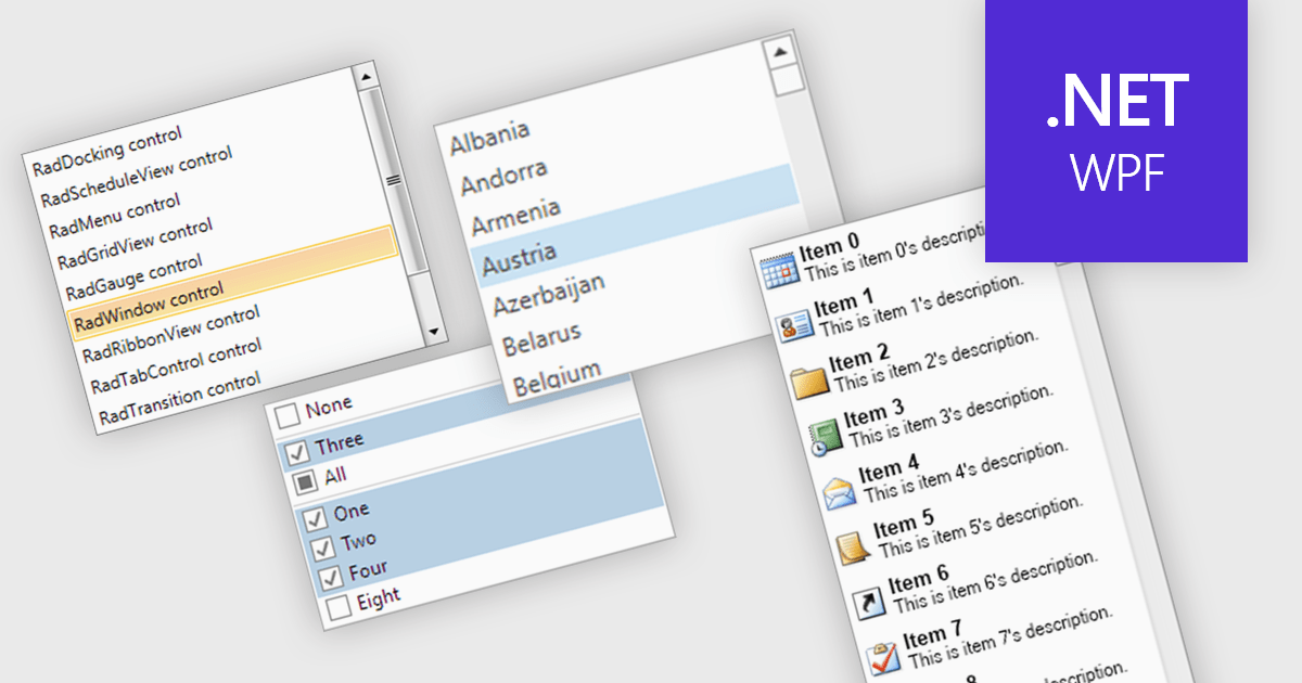
A listbox is a user interface component that displays a collection of items from which a user can select one or more options. It is commonly used in forms, settings panels, or data entry screens to present predefined values in a scrollable format. For developers, a listbox offers a simple way to enforce valid input by limiting user choices, reduces the need for manual data entry, and improves UI consistency across applications. It also supports keyboard and mouse interaction, which helps enhance accessibility and usability without requiring complex custom controls.
Several .NET WPF data editor collections provide listbox controls including:
For an in-depth analysis of features and price, visit our .NET WPF Data Editors comparison.
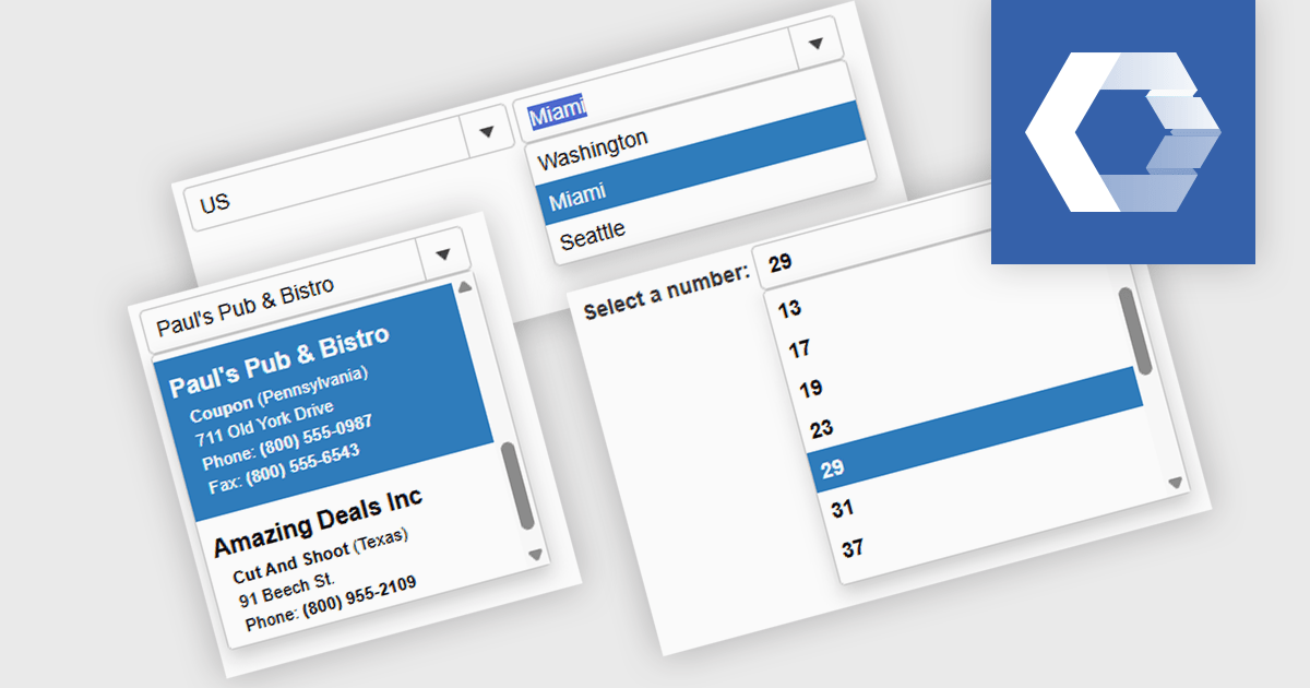
A combobox Web Components control is a user interface element that combines an input field with a dropdown list, allowing users to either type a value directly or select from predefined options. It is commonly used to simplify data entry, particularly when the input must match a set of known values. By supporting features such as filtering, autocomplete, and keyboard navigation, a combobox enhances accessibility and improves the user experience in forms or interactive components. It also helps maintain consistency and validation in data-driven applications by reducing the likelihood of input errors.
Several Web Components Data Editors offer a combobox including:
For an in-depth analysis of features and price, visit our comparison of Web Components Data Editors.
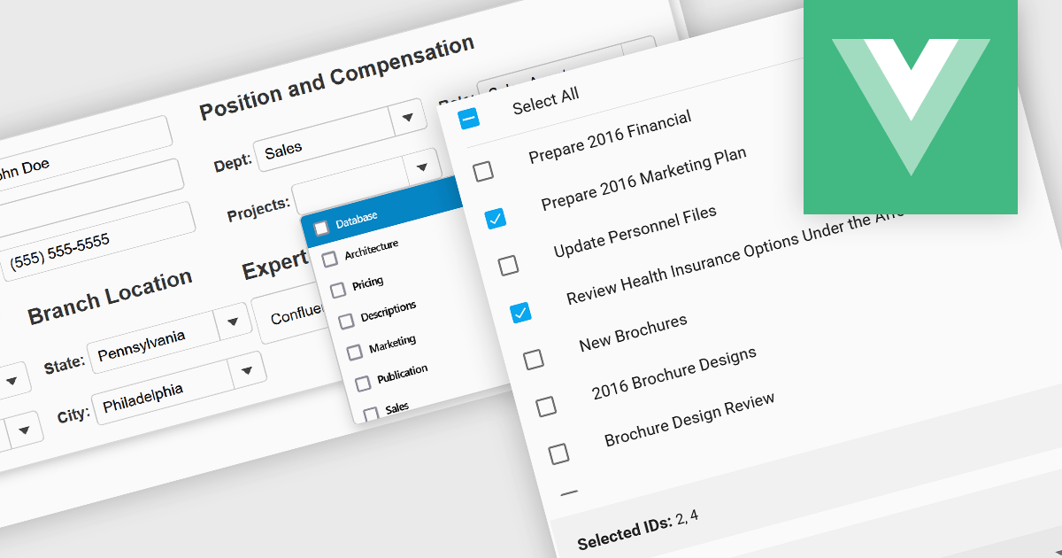
Checked listboxes provide users with a convenient interface for selecting multiple items within data editor controls. They enhance user workflows by combining the visual clarity of list presentations with the functionality of checkboxes, enabling intuitive multi-selection capabilities. Typically data-bound, these controls support both manual and programmatic manipulation of items, including checking, unchecking, and layout customization, facilitating dynamic and interactive list management in enterprise-grade applications.
Several Vue.js data editor collections include a checked listbox, including:
For an in-depth analysis of features and price, visit our Vue.js data editors comparison.
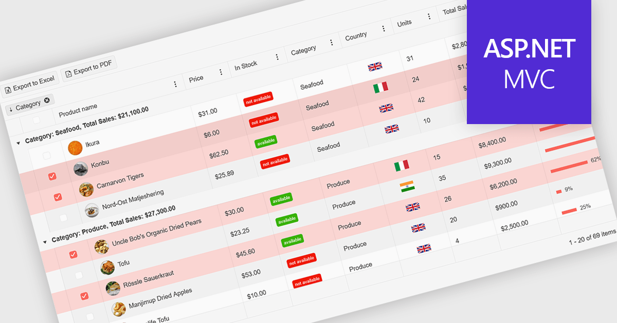
A ListBox is a user interface control that displays a collection of items, allowing users to select one or multiple entries. It supports seamless data binding, customizable item templates, and efficient performance with built-in scrolling and virtualization for large datasets. With keyboard, mouse, and accessibility support, it delivers an intuitive experience for all users. Common use cases include product catalogs, settings management, filtering datasets, and multi-item selection in forms or dashboards.
Here are some examples of ASP.NET MVC data editors collections that include a ListBox:
For an in-depth analysis of features and price, visit our comparison of ASP.NET MVC data editors.
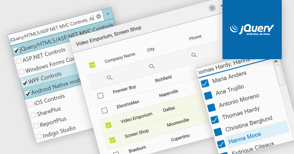
A checked combobox is a data editor component used in user interfaces that consists of a text box with a drop-down panel. This panel displays a predefined list of items, in a clean and organized layout, from which users can input data by making a singular or multiple selections using the adjacent checkboxes. The values are then typically displayed as a comma-separated summary in the collapsed field. This type of control provides developers with a convenient way to implement multi-select functionality within their applications, and is especially effective in scenarios such as filtering datasets or configuring settings, without consuming additional space on the interface.
Several jQuery data editor collections include checked comboboxes, including:
For an in-depth analysis of features and price, visit our comparison of jQuery data editors.
联系电话: (888) 850 9911
传真: +1 770 250 6199


