


官方供应商
我们作为官方授权经销商,直接提供超过200家开发厂家所发行超过1000个的产品授权给您。
查看我们的所有品牌。
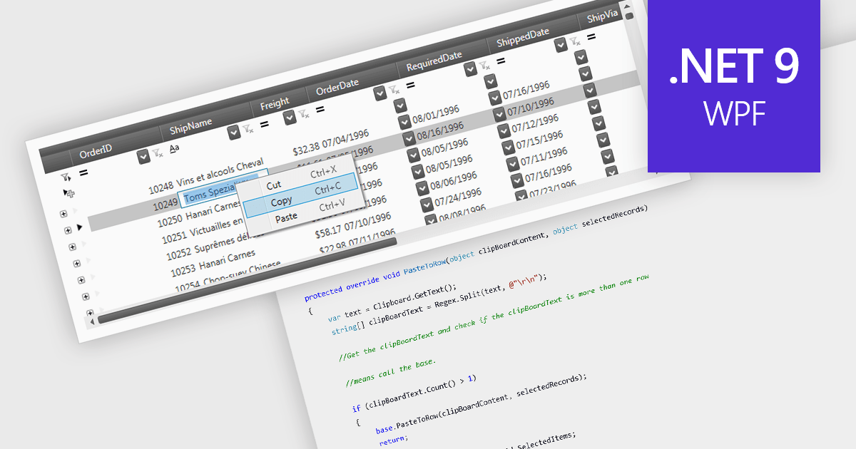
The ability to perform clipboard operations enables users to copy and paste data between the grid and external applications or within different parts of the same grid. This functionality allows users to select one or multiple cells, rows, or columns, copy their content to the system clipboard, and then paste it elsewhere. It supports efficient data manipulation by reducing manual entry, enabling quick data migration, and streamlining the transfer of structured information. Clipboard operations save time in repetitive data handling tasks, ensuring that the movement of grid data is both fast and reliable.
Several .NET 9 WPF grid components support clipboard operations, including:
For an in-depth analysis of features and price, visit our comparison of .NET 9 WPF grid components.
Kendo UI by Telerik is a comprehensive suite of JavaScript UI components designed to accelerate web application development. Offering pre-built, customizable elements for grids, charts, schedulers, and more, it streamlines UI creation across popular frameworks like jQuery, Angular, React, and Vue. Key features include responsive design, accessibility, and high performance, enhancing user experience. Developers benefit from reduced development time, consistent UI patterns, and the ability to build feature-rich applications faster.
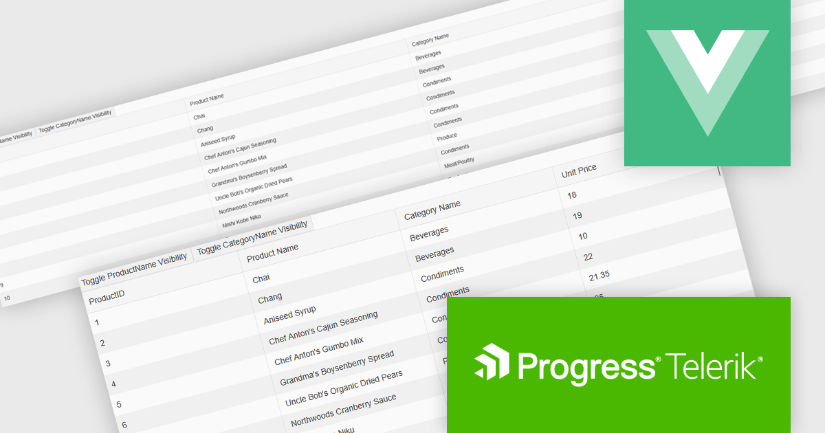
The Kendo UI for Vue 2025 Q1 update enhances grid responsive design, enabling automatic column visibility adjustments based on viewport width. This improvement ensures that data remains accessible and well-structured across different screen sizes without requiring manual configuration. By dynamically toggling columns and adapting height settings to fit their container, the grid provides a seamless and efficient user experience across desktops, tablets, and mobile devices. These enhancements help developers create more adaptive and user-friendly applications with minimal effort, ensuring consistent and optimized data presentation in any environment.
To see a full list of what's new in 2025 Q1 (v6.1.0), see our release notes.
Kendo UI is licensed per developer and has two licensing models: an annual Subscription License and a Perpetual License. The Subscription license provides access to the latest product updates, technical support, and exclusive benefits for a flat annual fee, and must be renewed to continue using the software. The Perpetual license is a one-time purchase granting access to the current released version and includes a one-year subscription for product updates and technical support. After this initial period, users can choose to renew the subscription element to continue receiving updates and support; otherwise, they may continue using the installed version available during their active subscription term but will forgo future updates and support. See our Kendo UI licensing page for full details.
Kendo UI is available individually or as part of the following products:
Wijmo by MESCIUS is a comprehensive JavaScript library offering a suite of high-performance UI components and data grids specifically designed to streamline the development of modern enterprise applications. It emphasizes reduced development time and improved maintainability, along with a focus on performance through its efficient design and small module size. Wijmo integrates seamlessly with popular JavaScript frameworks like Angular, React, and Vue.js, and supports cutting-edge technologies like TypeScript, making it a versatile solution for building complex web applications.
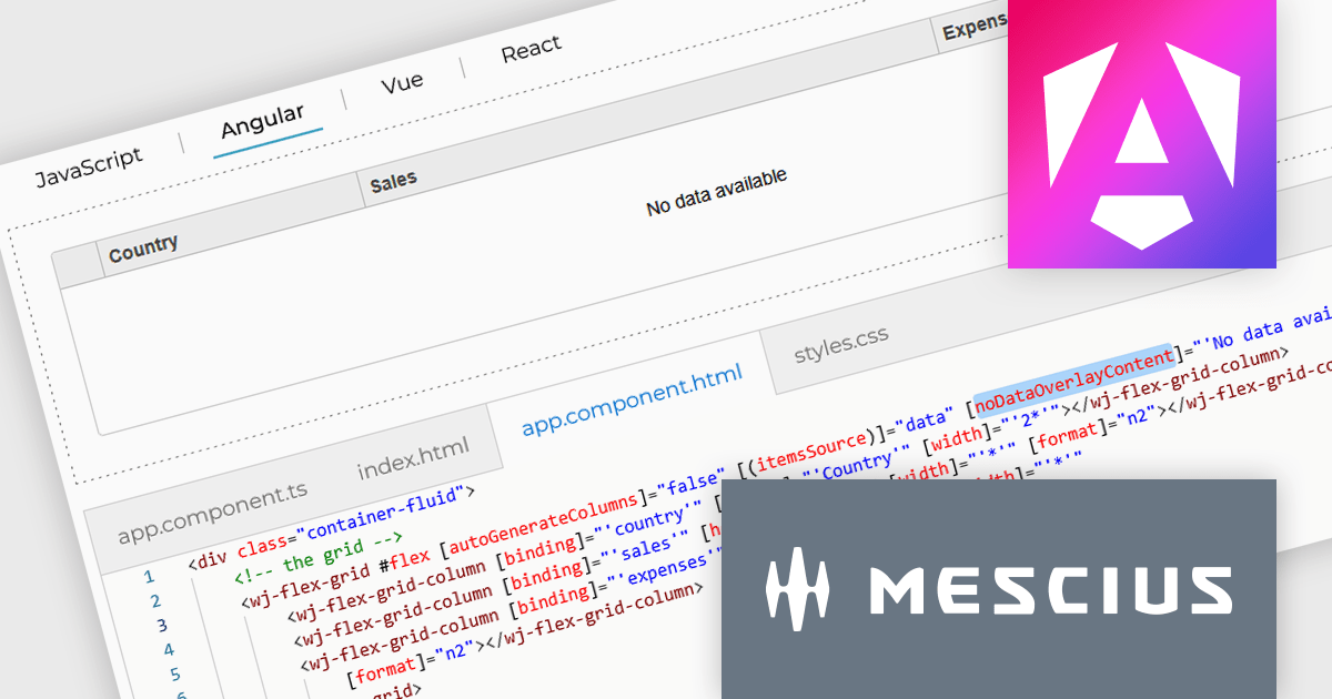
The Wijmo 2025 v1 update introduces a customizable noDataOverlayContent property, enabling developers to display tailored HTML messages when grid data is empty. This improves user experience by replacing blank grid views with informative content, while the new overlayManager allows advanced control over how overlays are rendered and managed. The release also expands framework support, adding compatibility with Angular 19 and Next.js 15 to help developers stay current with modern web development tools.
To see a full list of what's new in 2025 v1 (Build 5.20251.34), see our release notes.
Wijmo is licensed per developer. Developer Licenses are perpetual and include 1 year Subscription which provides upgrades, including bug fixes and new features. See our Wijmo licensing page for full details.
Learn more on our Wijmo product page.
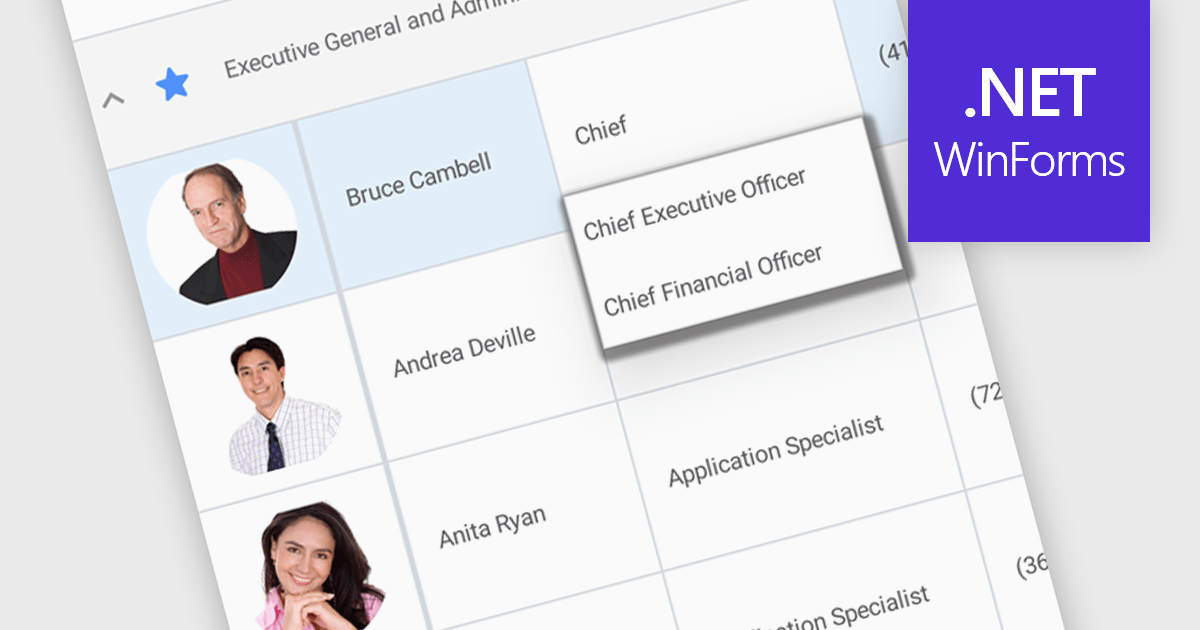
An AutoComplete cell type in a grid control facilitates efficient data entry by providing predictive suggestions as users type, drawing from a predefined data source to minimize errors and enhance user experience. This functionality, often implemented via lookup editors, custom cell editors, or event handling, streamlines data input by displaying a dropdown list of matching values, allowing for quick selection and reducing typing effort, ultimately contributing to faster and more accurate data management within the application.
Several .NET WinForms grid controls enable the AutoComplete cell type including:
For an in-depth analysis of features and price, visit our WinForms grid controls comparison.
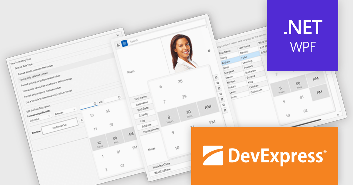
DevExpress WPF is a powerful suite of controls that enhances your WPF development toolkit. It offers data grids, ribbon menus, rich text editors, spreadsheets, charts, and more – all with beautiful themes and touch-friendly interfaces. DevExpress WPF empowers you to build professional-looking, responsive applications that meet modern user expectations, saving you time and effort while adding polish and functionality.
The DevExpress WPF v24.2 update enhances data handling in Grid, TreeList, and Property Grid by introducing automatic support for DateOnly and TimeOnly properties. This improvement ensures that the appropriate data editors are automatically assigned to cells, filters, and conditional formatting dialogs without requiring manual configuration. By streamlining the editing experience, the update provides a more intuitive approach to working with date and time values while reducing development effort. Users can now rely on built-in editor selection, improving efficiency and ensuring a seamless user experience across their applications.
To see a full list of what's new in version 24.2, see our release notes.
DevExpress WPF is licensed per developer and is available as a Perpetual License with a 12 month support and maintenance subscription. We can supply new subscriptions, subscription renewals, and additional licenses. See our DevExpress WPF licensing page for full details.
DevExpress WPF is available to buy in the following products:
联系电话: (888) 850 9911
传真: +1 770 250 6199


