


官方供应商
我们作为官方授权经销商,直接提供超过200家开发厂家所发行超过1000个的产品授权给您。
查看我们的所有品牌。
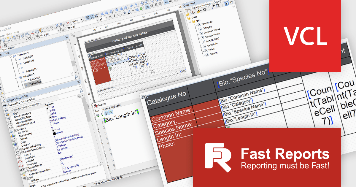
FastReport VCL is a library for creating documents and reports in Embarcadero C++Builder, Delphi, RAD Studio, and Lazarus. It is an add-on component that includes all of the tools needed to create reports, such as a visual report designer, a reporting core, and a preview window, allowing you to add functionality to your application for efficient report generation.
The FastReport VCL v2025.1 release introduces a new Word-style interactive table editor that offers a streamlined, user-friendly approach to designing and editing tables directly within reports. The new editor is particularly valuable for users creating financial reports, invoices, and data-driven documents where clarity and visual appeal are essential. By simplifying the table creation process, it reduces design time, enhances readability, and ensures consistency across reports, making it an ideal tool for professionals who need efficient, high-quality reporting.
To see a full list of what's new in v2025.1, see our release notes.
FastReport VCL is licensed per named user and is available as a Perpetual license with 1 year of technical support and product updates. See our FastReport VCL licensing page for full details.
For more information, see our FastReport VCL product page.
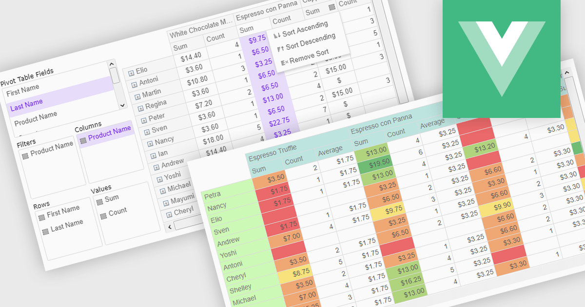
Pivot grids or tables are dynamic tools that allow users to organize and analyze large datasets interactively by allowing them to group, filter, and summarize data across multiple dimensions. This functionality makes it easier to spot patterns and insights, supporting faster decision-making and data processing. Common use cases include help to identify trends in product performance or customer demographics, or financial applications, where users can analyze and forecast expense patterns. Pivot grids empower users with an adaptable and user-friendly interface, offering both high-level overviews and detailed insights with minimal effort.
Several Vue.js UI suites offer pivot grid components including:
For an in-depth analysis of features and price, visit our comparison of Vue.js UI suites.
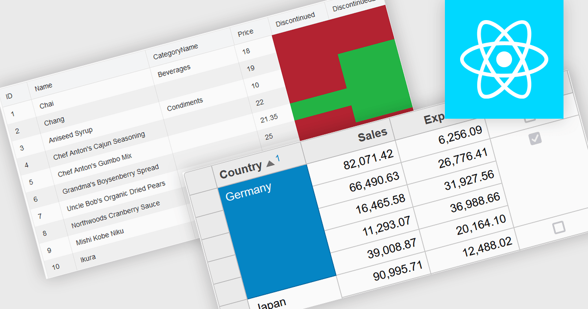
Cell merging in a grid allows developers to combine adjacent cells, creating a single, unified cell that spans multiple rows or columns. This feature enhances readability by allowing headers or labels to encompass related data fields, reducing redundancy and making complex data layouts more visually coherent. It enables efficient organization, supporting custom layouts that align with specific reporting needs and enhancing the grid's overall aesthetic. Cell merging helps streamline the user experience by condensing information into easily digestible sections, enabling users to focus on key insights without distraction.
Several React grid controls offer cell merge support including:
For an in-depth analysis of features and price, visit our React grid controls comparison.
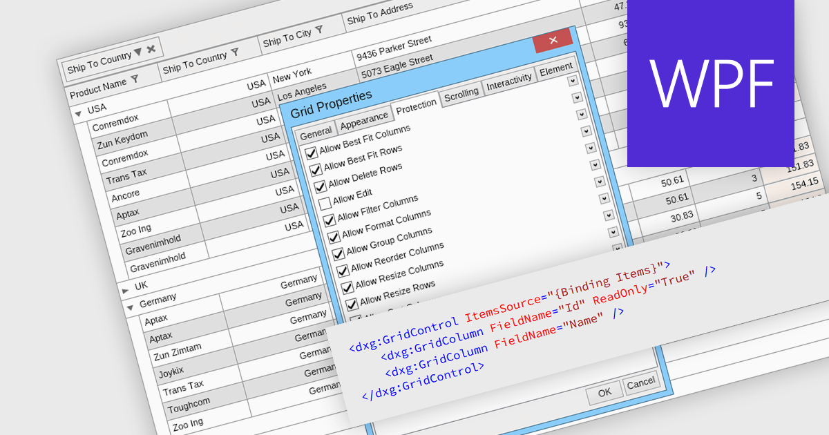
Read-only columns in a data grid are vertically displayed fields that are not editable by users, but can still be viewed. These columns typically display information that is derived from other data or is considered static and should not be altered. By stopping users from directly modifying certain content, developers can ensure data integrity and consistency while still providing full visibility. This feature prevents accidental or intentional changes that might disrupt the system's functionality. Such restrictions streamline workflows by distinguishing between editable and non-editable data, reducing the risk of errors and improving overall system reliability.
Several WPF grid components allow you to display read-only columns, including:
For an in-depth analysis of features and price, visit our comparison of .NET WPF grid components.
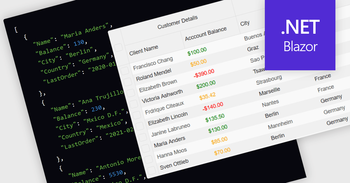
Support for JSON as a data source in .NET Blazor Grid controls allows developers to efficiently populate grid components with structured data, leveraging JSON's lightweight and easy-to-parse format. This approach enhances flexibility and scalability, as JSON is widely used for data interchange in web applications and can seamlessly integrate with various back-end services and APIs. By utilizing JSON, developers can dynamically bind data to the grid, enabling real-time updates and responsive user interactions. Moreover, JSON's hierarchical structure supports complex data representations, which simplifies the manipulation of nested objects and arrays, ultimately improving data handling within the Blazor framework.
Several .NET Blazor Grid controls offer JSON data source support including:
For an in-depth analysis of features and price, visit our comparison of NET Blazor Grid controls.
联系电话: (888) 850 9911
传真: +1 770 250 6199


