


공식 공급 업체
200 이상의 소프트웨어 개발처와 판매 계약을 맺은 공인 디스트리뷰터로서 합법적인 라이선스를 제공합니다.
모든 브랜드 보기.
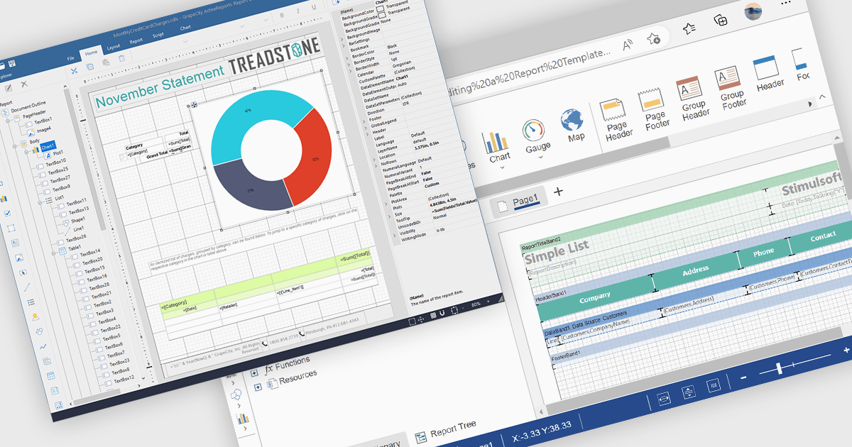
A Visual Report Designer in a reporting control enables users to create and customize data-rich reports through an intuitive, drag-and-drop interface. With ready-to-use templates, interactive elements, and direct data binding, it simplifies report creation while maintaining professional quality. Key benefits include real-time data updates, brand customization, and interactive filters, making it ideal for business intelligence tasks like financial dashboards, performance reports, and analytics summaries. This feature empowers teams to generate insights quickly and make data-driven decisions with ease.
Several Angular reporting controls offer visual report designer support including:
For an in-depth analysis of features and price, visit our Angular Reporting Controls comparison.

Gantt controls are invaluable tools for project management, particularly in visualizing and tracking the timeline of tasks, dependencies, and progress. These controls are ideal for illustrating project schedules, resource allocation, and critical paths. By providing a clear and concise overview of project milestones, Gantt controls facilitate effective planning, communication, and monitoring, ultimately helping organizations achieve project goals efficiently and on time.
Several React UI suites offer Gantt controls including:
For an in-depth analysis of features and price, visit our React UI suites comparison.
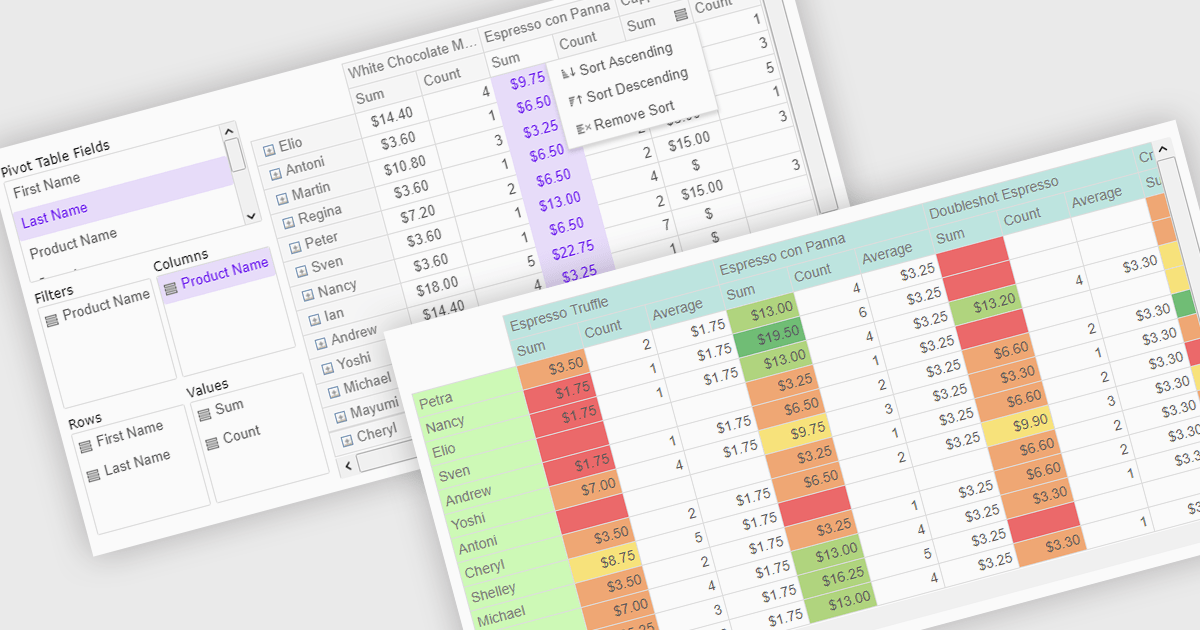
Pivot grids or tables are dynamic tools that allow users to organize and analyze large datasets interactively by allowing them to group, filter, and summarize data across multiple dimensions. This functionality makes it easier to spot patterns and insights, supporting faster decision-making and data processing. Common use cases include help to identify trends in product performance or customer demographics, or financial applications, where users can analyze and forecast expense patterns. Pivot grids empower users with an adaptable and user-friendly interface, offering both high-level overviews and detailed insights with minimal effort.
Several Vue.js UI suites offer pivot grid components including:
For an in-depth analysis of features and price, visit our comparison of Vue.js UI suites.
Wijmo is a complete collection of extensible, fast, flexible JavaScript UI components written in TypeScript. The framework-agnostic Wijmo components include first-class support for top frameworks including Angular, React, Vue and Web Components. Wijmo Enterprise has over 100 dynamic UI components to help cut your development time in half, allowing you to build lightweight, high-performance JavaScript applications using your favorite JavaScript framework.
Wijmo's dynamic dashboard sample allows users to create customizable, interactive dashboards, similar to those seen in Google Analytics. The new version of the dashboard, now built with React, offers a range of key features including touch-screen support, drag-and-drop functionality, and pre-defined tile types, making it an ideal solution for users looking to create personalized, data-rich visualizations.
In this blog post, MESCIUS Product Marketing Specialist Grant Katanick takes you through the steps for creating a dynamic dashboard for your JavaScript web applications. Key features of the React-based dashboard include:
Detailed sample source code is included that you can use as a starting point for your actual dashboard applications.
Read the complete blog to get started building dynamic dashboards with React and Wijmo.
Wijmo is licensed per developer. Developer licenses are perpetual and include 1 year subscription which provides upgrades, including bug fixes and new features. See our Wijmo licensing page for full details.
For more information, visit our Wijmo product page.

Cell merging in a grid allows developers to combine adjacent cells, creating a single, unified cell that spans multiple rows or columns. This feature enhances readability by allowing headers or labels to encompass related data fields, reducing redundancy and making complex data layouts more visually coherent. It enables efficient organization, supporting custom layouts that align with specific reporting needs and enhancing the grid's overall aesthetic. Cell merging helps streamline the user experience by condensing information into easily digestible sections, enabling users to focus on key insights without distraction.
Several React grid controls offer cell merge support including:
For an in-depth analysis of features and price, visit our React grid controls comparison.
전화 : 00798 14 800 6332
팩스 : +1 770 250 6199


