


官方供应商
我们作为官方授权经销商,直接提供超过200家开发厂家所发行超过1000个的产品授权给您。
查看我们的所有品牌。
DevCraft by Telerik is a comprehensive AI-powered suite of more than 1,250 UI components and development tools designed for building modern web, desktop, and mobile applications using .NET and JavaScript frameworks. It includes reporting and report management solutions, automated testing and mocking tools, and document processing libraries, as well as a wide range of professionally designed user interface controls from the Telerik and Kendo UI suites. DevCraft enables developers to create feature-rich, high-performance applications with consistent design and user experience, delivering enterprise-level, scalable, and maintainable software solutions.
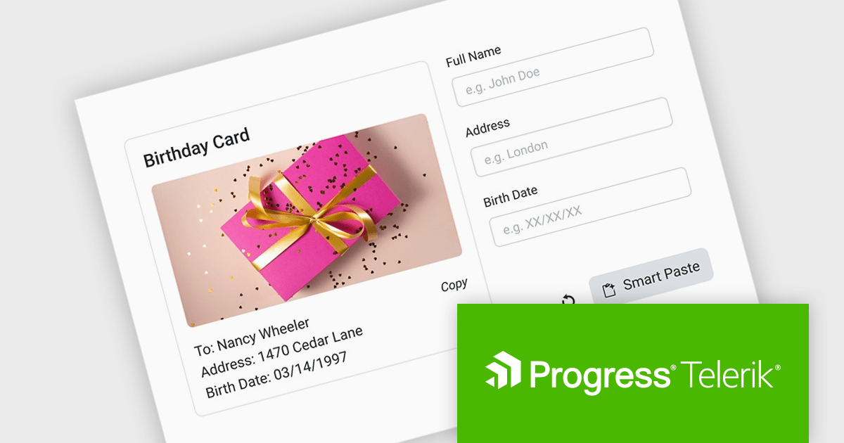
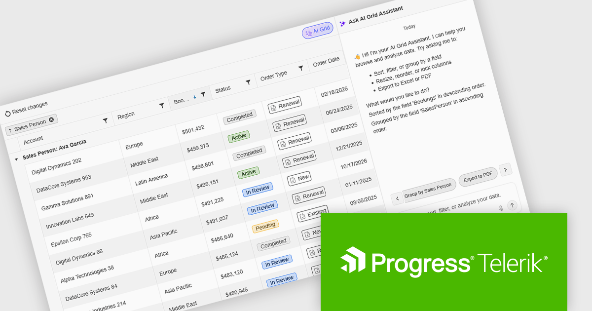
The Telerik DevCraft 2026 Q1 update introduces an AI-powered Smart Paste component that turns unstructured text into ready-to-use form data instantly by extracting structured information from clipboard content and automatically populating the appropriate fields. Instead of requiring users to manually copy and paste data into multiple inputs, the SmartPasteButton sends pasted text from emails, documents, or other sources to an AI endpoint that interprets the content and returns mapped field values for the form. This improves data entry, reduces repetitive input, and improves accuracy, enabling developers to deliver more efficient, intelligent form experiences within their applications.
To see a full list of what's new in DevCraft 2026 Q1, see our release notes.
Telerik DevCraft is licensed per developer and has two licensing models: an annual Subscription License and a Perpetual License. The Subscription license provides access to the latest product updates, technical support, and exclusive benefits for a flat annual fee, and must be renewed to continue using the software. The Perpetual license is a one-time purchase granting access to the current released version and includes a one-year subscription for product updates and technical support. After this initial period, users can choose to renew the subscription element to continue receiving updates and support; otherwise, they may continue using the installed version available during their active subscription term but will forgo future updates and support. See our Telerik DevCraft Ultimate licensing page for full details.
For more information, see our product pages:
ONLYOFFICE Docs is a comprehensive online editor, allowing users to create text documents, spreadsheets, presentations, and forms. It enables your users to edit, share, and collaborate on documents online in their preferred browser, within your own application. It is fully compatible with OOXML (Office Open XML) formats and supports popular Microsoft Office and other document formats such as CSV, DOC, DOCX, EPUB, HTML, ODP, ODS, ODT, PDF, PPT, PPTX, RTF, TXT, XLS, and XLSX.
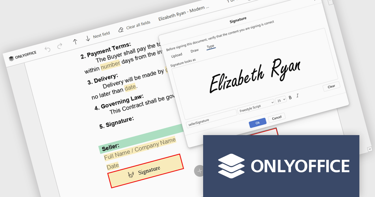
The ONLYOFFICE Docs v9.3 update includes an improved PDF Forms signature field which now allows users to draw their signature directly on screen using a mouse or touch-enabled device. This option provides a more personal and natural signing experience, particularly in scenarios where uploading an image or typing a name is not practical. By supporting freehand input within the form itself, it helps maintain document authenticity while keeping the signing process intuitive and accessible across devices.
To see a full list of what's new in v9.3, see our release notes.
ONLYOFFICE Docs Developer Edition is licensed by the number of simultaneous document connections and is available as an annual license with 1 year support and upgrades. See our ONLYOFFICE Docs Developer Edition licensing page for full details.
For more information, see our ONLYOFFICE Docs Developer Edition product page.
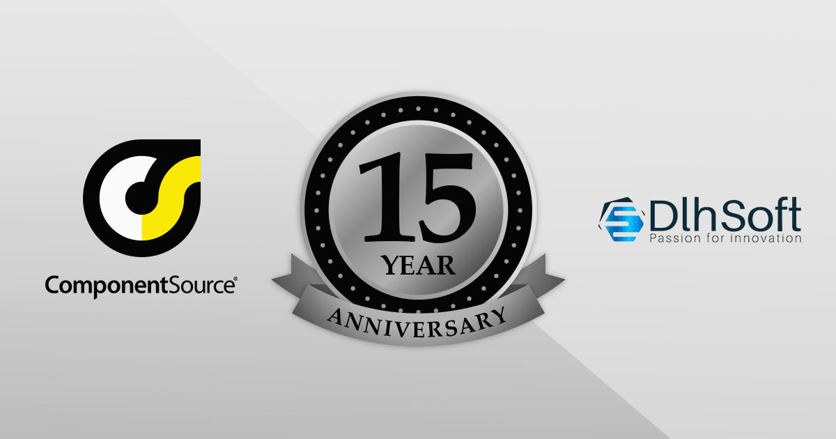
For 15 years, DlhSoft and ComponentSource have partnered to deliver powerful scheduling and project management solutions to developers around the globe. This long-standing collaboration has enabled ComponentSource to extend DlhSoft’s reach into international markets, ensuring customers can easily access robust, high-quality components backed by trusted distribution and service. Together, they have supported development teams building sophisticated business applications across a wide range of industries.
DlhSoft specializes in advanced Gantt chart and scheduling components for Microsoft platforms, providing developers with the tools needed to integrate rich project visualization and planning capabilities into their applications. A key product in this portfolio is DlhSoft Gantt Chart Library for WPF Standard Edition, which helps developers create powerful Gantt charts featuring customizable grid columns, summarized hierarchical data, draggable bars and dependency lines, copy-paste and undo-redo functionality, filtering and hierarchical sorting, and detailed item change events.
This 15-year partnership enhances ComponentSource’s ability to differentiate its product offering by including specialized, enterprise-ready scheduling components within its extensive catalog of developer tools. By delivering DlhSoft products worldwide through its established ecommerce infrastructure, multilingual support, and global marketing reach, ComponentSource ensures customers everywhere can confidently evaluate, purchase, and implement these solutions in their projects.
Learn more about DlhSoft.
MCP SDK (included in Red Carpet Subscription) is a developer-focused library that reduces the complexity of implementing MCP (Model-Context-Protocol) servers and clients. Built around an event-driven API, it enables large language models (LLMs) to interact with your application logic - retrieving data, invoking tools, executing predefined operations, or following structured prompts.
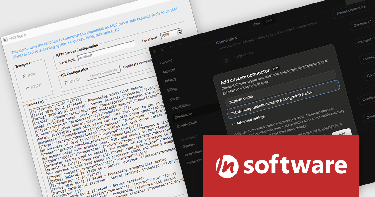
The latest MCP SDK release adds full support for HTTP and HTTPS transport, giving developers more options for deploying MCP servers in modern, distributed architectures. With network-based connectivity, Large Language Model (LLM) clients can securely connect to MCP servers across environments, making it easier to integrate AI capabilities into cloud-native and multi-service systems. The included MCPServer component simplifies the process of building servers that link LLMs such as Claude to custom data sources, internal services, and application logic, helping teams extend AI functionality into real-world processes with minimal friction.
To see a full list of what's new in Red Carpet Subscription Vol. 1 2026, see our release notes.
MCP SDK is available as part of Red Carpet Subscription which is licensed per developer and is available as a Perpetual License with a 12 month support and maintenance subscription. See our Red Carpet Subscription licensing page for full details.
For more information, visit our /n software Red Carpet Subscription product page.
Kendo UI by Telerik is a comprehensive suite of JavaScript UI components designed to accelerate web application development. Offering pre-built, customizable elements for grids, charts, schedulers, and more, it streamlines UI creation across popular frameworks like jQuery, Angular, React, and Vue. Key features include responsive design, accessibility, and high performance, enhancing user experience. Developers benefit from reduced development time, consistent UI patterns, and the ability to build feature-rich applications faster.
The Kendo UI for jQuery v2026 Q1 update introduces AI Chat integration for the Smart Grid, enabling developers to incorporate a conversational interface into data-driven web applications. End users can explore and query structured Grid data using natural-language input, while the integration leverages the Grid’s schema, configuration, and current view to generate precise, context-aware responses. This approach minimizes the need for complex filtering configurations and custom-built query tools, reduces user training requirements, and enhances overall usability. For development teams, it improves implementation while delivering a more efficient and accessible data exploration experience within existing jQuery applications.
To see a full list of what’s new in version 2026 Q1 (2026.1.212), see our release notes.
Kendo UI is licensed per developer and has two licensing models: an annual Subscription License and a Perpetual License. The Subscription license provides access to the latest product updates, technical support, and exclusive benefits for a flat annual fee, and must be renewed to continue using the software. The Perpetual license is a one-time purchase granting access to the current released version and includes a one-year subscription for product updates and technical support. After this initial period, users can choose to renew the subscription element to continue receiving updates and support; otherwise, they may continue using the installed version available during their active subscription term but will forgo future updates and support. See our Kendo UI licensing page for full details.
Kendo UI is also available to buy individually or as part of:
联系电话: (888) 850 9911
传真: +1 770 250 6199


