


官方供应商
我们作为官方授权经销商,直接提供超过200家开发厂家所发行超过1000个的产品授权给您。
查看我们的所有品牌。
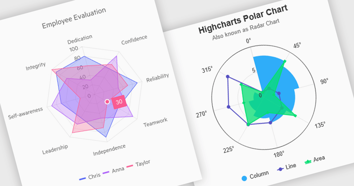
Polar and radar charts provide an intuitive way to visualize multidimensional and circular data. These chart types plot data points relative to a central axis, with polar charts ideal for showcasing proportional relationships, such as seasonal trends or directional metrics, and radar charts excelling at comparing multiple variables, such as performance metrics or skill assessments. Angular’s interactivity enhances engagement with features like tooltips, zooming and real-time updates, making these charts ideal for dashboards and reports. Use cases include analyzing skill assessments, market segmentation, and cyclic trends, delivering clear, actionable insights in a visually compelling format.
Several Angular chart controls offer visual polar and radar chart support including:
For an in-depth analysis of features and price, visit our Angular chart controls comparison:
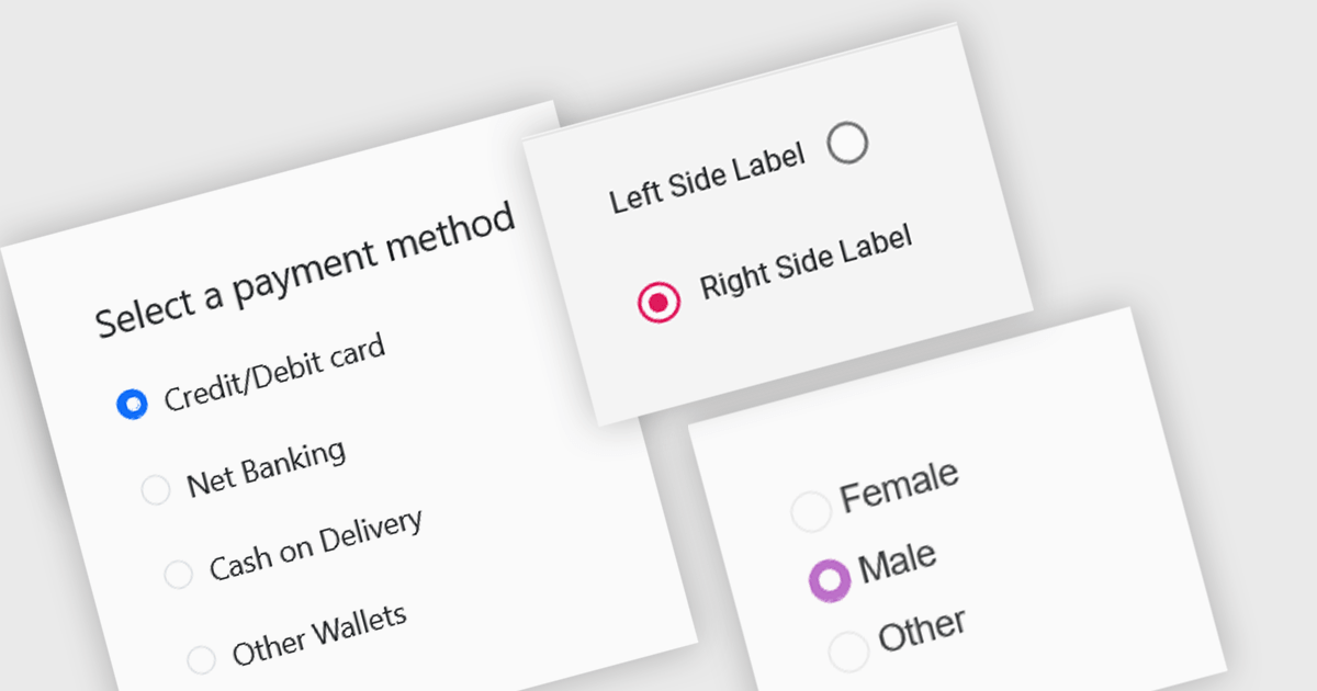
A radio group is a user interface element that presents a set of mutually exclusive options. Users can select only one option from the group at a time, visually represented by a circular button that fills with color when selected. This design pattern is commonly used to represent options like gender, payment method, or difficulty level, where a single choice is required and alternatives are clearly defined. Radio groups enhance user experience by simplifying decision-making, reducing cognitive load, and preventing errors associated with ambiguous selections.
Several React data editor collections feature a radio group, including:
For an in-depth analysis of features and price, visit our React data editors comparison.
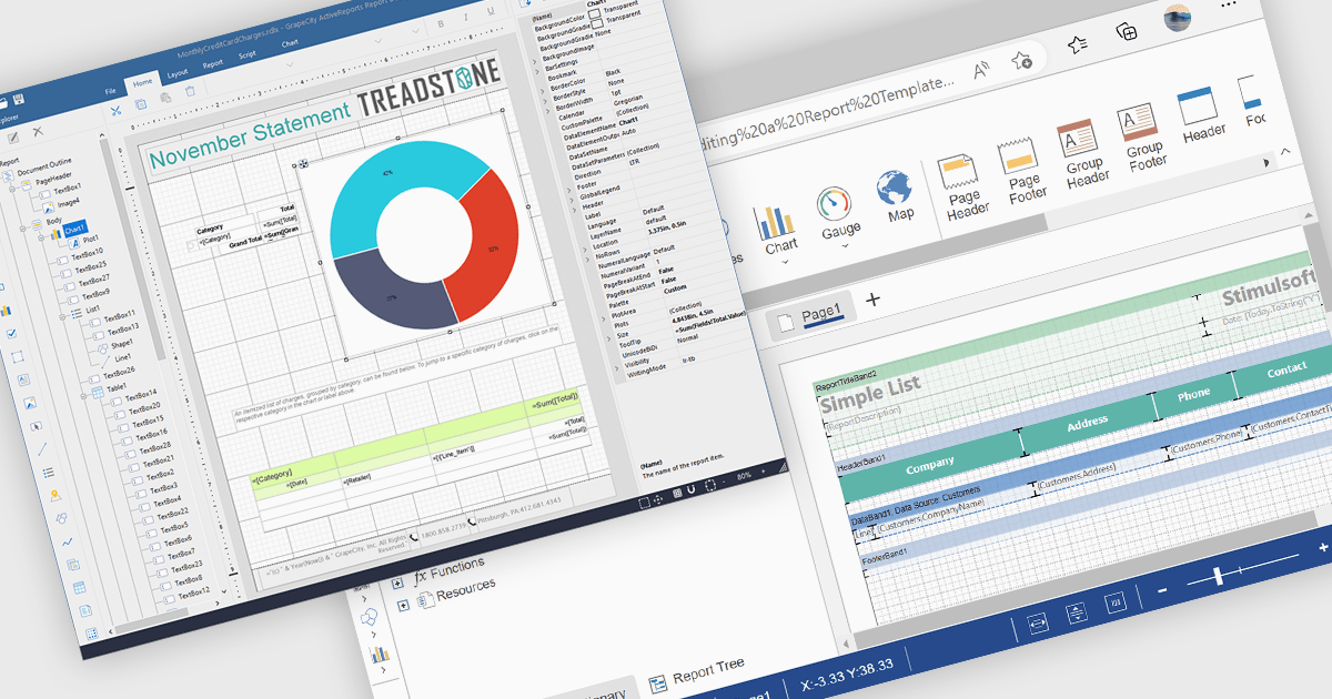
A Visual Report Designer in a reporting control enables users to create and customize data-rich reports through an intuitive, drag-and-drop interface. With ready-to-use templates, interactive elements, and direct data binding, it simplifies report creation while maintaining professional quality. Key benefits include real-time data updates, brand customization, and interactive filters, making it ideal for business intelligence tasks like financial dashboards, performance reports, and analytics summaries. This feature empowers teams to generate insights quickly and make data-driven decisions with ease.
Several Angular reporting controls offer visual report designer support including:
For an in-depth analysis of features and price, visit our Angular Reporting Controls comparison.

Gantt controls are invaluable tools for project management, particularly in visualizing and tracking the timeline of tasks, dependencies, and progress. These controls are ideal for illustrating project schedules, resource allocation, and critical paths. By providing a clear and concise overview of project milestones, Gantt controls facilitate effective planning, communication, and monitoring, ultimately helping organizations achieve project goals efficiently and on time.
Several React UI suites offer Gantt controls including:
For an in-depth analysis of features and price, visit our React UI suites comparison.
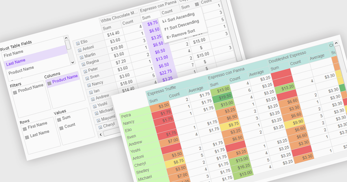
Pivot grids or tables are dynamic tools that allow users to organize and analyze large datasets interactively by allowing them to group, filter, and summarize data across multiple dimensions. This functionality makes it easier to spot patterns and insights, supporting faster decision-making and data processing. Common use cases include help to identify trends in product performance or customer demographics, or financial applications, where users can analyze and forecast expense patterns. Pivot grids empower users with an adaptable and user-friendly interface, offering both high-level overviews and detailed insights with minimal effort.
Several Vue.js UI suites offer pivot grid components including:
For an in-depth analysis of features and price, visit our comparison of Vue.js UI suites.
联系电话: (888) 850 9911
传真: +1 770 250 6199


