


官方供应商
我们作为官方授权经销商,直接提供超过200家开发厂家所发行超过1000个的产品授权给您。
查看我们的所有品牌。
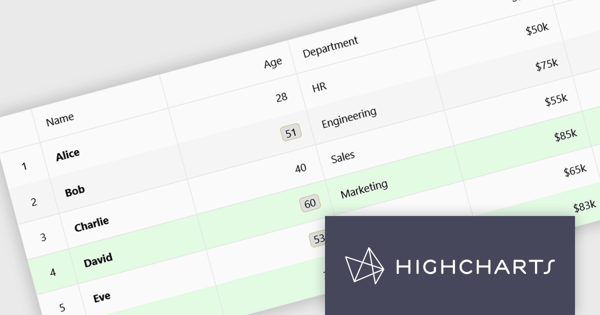
Highcharts Grid Pro is a versatile data grid component developed by the creators of Highcharts, offering both standalone functionality and tight integration within the Highcharts and Highcharts Dashboards ecosystems. It features advanced capabilities such as real-time data binding, column sorting, filtering, inline editing, pagination, and data export, enabling users to work with structured data efficiently. Features include:
Highcharts Grid Pro is licensed per developer as an Annual or Perpetual License with Internal, Saas, SaaS+ and OEM distribution options. The annual license includes support and all product updates for 1 year and must be renewed to continue to use the software. The perpetual license includes an "Advantage Subscription" which provides support and updates for a set period of time. If you do not renew Advantage then you may continue to use the software at the last release available during the active Advantage period. See our Highcharts Grid Pro licensing page for full details.
Learn more on our Highcharts Grid Pro product page.
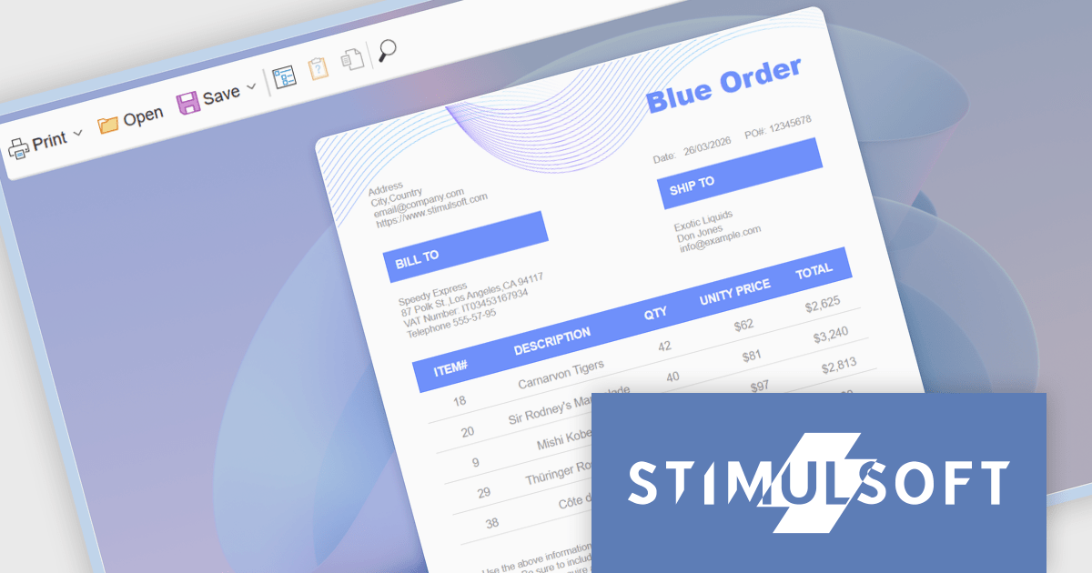
Stimulsoft Reports.WEB is a cross-platform reporting solution designed for integration within web applications. It leverages a client-server architecture for report generation, viewing, printing, and exporting directly in web browsers. Its powerful .NET report engine offers efficient report processing, a user-friendly HTML5 report designer for building reports with various data sources and visualizations, and an interactive HTML5 viewer for seamless report display within web applications. This integration allows developers to implement robust reporting functionalities without browser plugins or additional client-side dependencies.
The Stimulsoft Reports.WEB 2026.2 update introduces a native React Viewer component that allows developers to embed report viewing and interaction directly within React applications using standard npm and NuGet packages. This approach simplifies integration and deployment by aligning with familiar tooling and workflows, while the clear separation between client-side and server-side components supports scalable architecture and easier maintenance. It also enhances performance through efficient client-side rendering and provides a consistent way to deliver interactive reporting functionality within modern web development environments.
To see a full list of what's new in 2026.2, see our release notes.
Stimulsoft Reports.WEB is licensed per developer and is available as a perpetual license with 1 year support and maintenance. See our Stimulsoft Reports.WEB licensing page for full details.
Stimulsoft Reports.WEB is available individually or as part of Stimulsoft Ultimate.
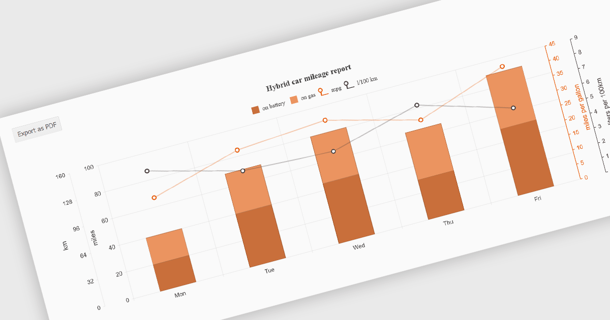
Exporting charts to PDF involves generating a static, portable document version of a chart that preserves its visual structure and data representation. This capability is valuable for reporting, compliance, and sharing insights in a consistent format that does not depend on a live application or browser environment. It allows teams to distribute visual data in a widely accepted file format, ensures layout stability across devices, and supports archival or print-ready use cases without requiring additional tooling.
Several jQuery chart components allow you to export to PDF, including:
For an in-depth analysis of features and price, visit our comparison of jQuery chart components.

OrgChart JS by BALKAN App is a JavaScript library designed for creating flexible, interactive and customizable organizational charts for presenting structural data. This visual tool helps managers illustrate the roles and hierarchy of an organization, supporting a variety of features, including grouping, assistant nodes, expand/collapse, a built-in search field, and multi-format exports for example to PDF, PNG, SVG or CSV. Compatible with all modern browsers, it supports thousands of nodes without any impact on performance, and offers extensive customization, giving users a versatile and efficient tool for visualizing hierarchical data structures in web applications.
OrgChart JS includes the Tree List Layout, offering a space-efficient and readable way to represent hierarchical data by combining a tree structure with a linear list, enabling developers to display deeply nested hierarchies without the horizontal sprawl of traditional node-link diagrams. It allows nodes to be expanded and collapsed within a vertically aligned list, improving navigation and scalability while maintaining parent-child relationships, and supporting extensive nesting without compromising usability. This makes it particularly useful in scenarios with limited screen space or large datasets, where reducing visual complexity while preserving the full hierarchy is essential, such as administrative dashboards and data management interfaces.
OrgChart JS is licensed based on usage, offering single website, unlimited websites or SaaS, and OEM licenses. It is available as a perpetual license with 1 year maintenance and technical support. See our OrgChart JS licensing page for full details.
For more information, see our OrgChart JS product page.
ActiveReportsJS is a powerful, lightweight reporting tool designed to integrate advanced reporting capabilities into any JavaScript application. ActiveReportsJS enables developers to create, view, export, and print richly formatted reports entirely on the client side - with zero server dependencies.
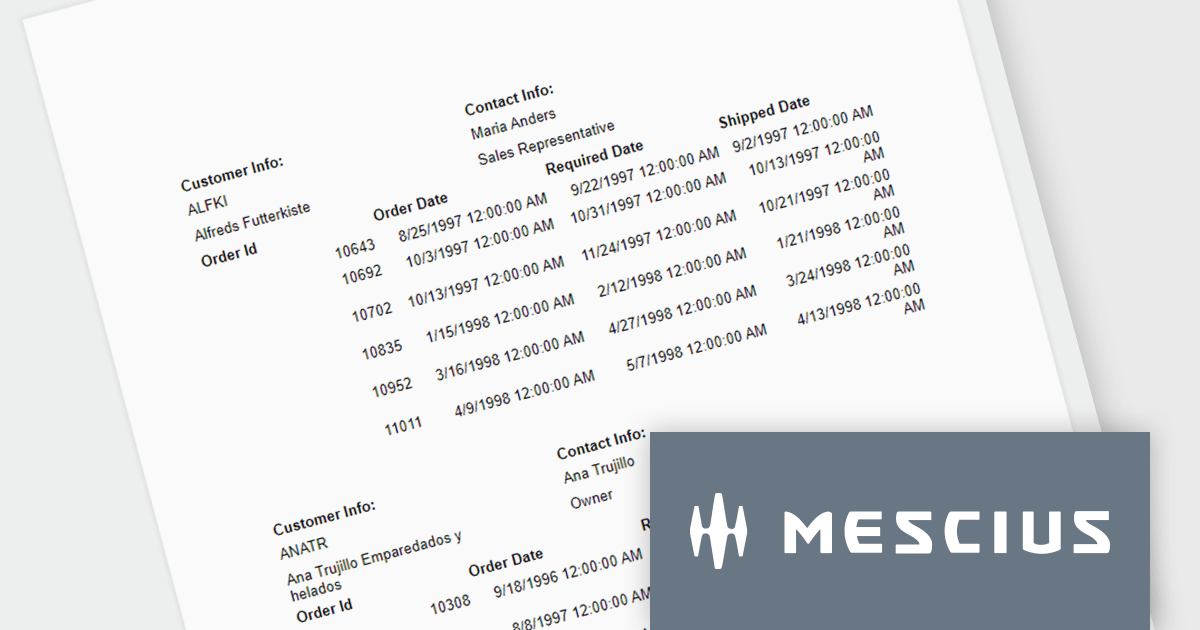
In this blog post, MESCIUS Product Consultant Victor Stahlman demonstrates how to build nested data regions in ActiveReportsJS to create master-detail reports that display related data, such as customers and their orders, within a structured layout. He walks your through configuring datasets, nesting controls like Lists and Tables, and applying filters to correctly link and present hierarchical data relationships in your reports. Key topics include:
By implementing nested data regions in ActiveReportsJS, you can transform flat datasets into structured, master-detail reports that are easier to read and analyze.
Read the complete blog to get started building scalable, dynamic JavaScript reports that deliver more meaningful insights to your users.
ActiveReportsJS is licensed on an annual subscription or perpetual basis and is available as a Single Deployment License for non-commercial use, and as a Single Domain License or Unlimited Domain License for commercial and/or SaaS use. See our ActiveReportsJS licensing page for full details.
For more information, visit our ActiveReportsJS product page.
联系电话: (888) 850 9911
传真: +1 770 250 6199


