


官方供应商
我们作为官方授权经销商,直接提供超过200家开发厂家所发行超过1000个的产品授权给您。
查看我们的所有品牌。
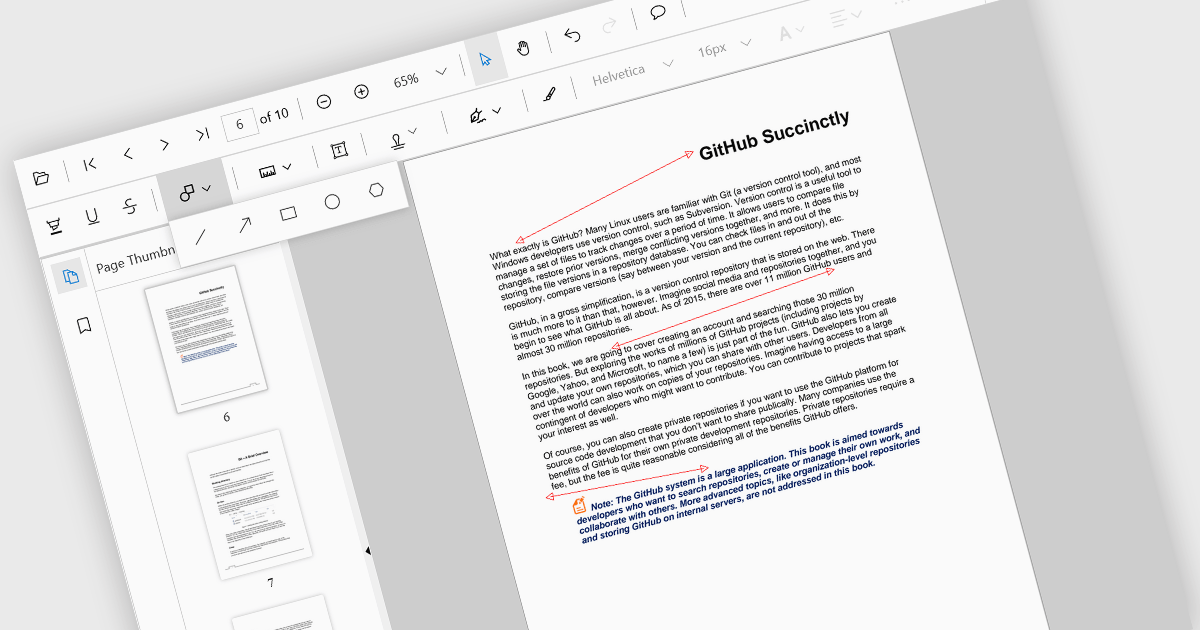
Arrow annotations are digital markings that allow users to visually indicate connections, relationships, or directions within a PDF document. They can be used to highlight specific sections, point out important details, or illustrate sequences of events. This feature is particularly valuable for collaborative work, as it enables multiple individuals to annotate the same document and share their insights effectively.
Several React PDF viewer controls offer support for arrow annotations including:
For an in-depth analysis of features and price, visit our React PDF viewer controls comparison.

Froala Editor is a JavaScript-based WYSIWYG HTML editor that empowers developers to seamlessly integrate rich text editing functionalities into their applications.
The Froala Editor 4.3 release offers a new "Transform" button in the image editing popup, allowing users to enhance images directly within the editor. This feature allows users to apply filters, resize images, and make various other adjustments with ease. Once changes are made, the image is instantly replaced with the transformed version. This integration streamlines the editing process, offering users greater control and flexibility over their visual content without needing to leave the editor.
To see a full list of what's new in 4.3, see our release notes.
Froala Editor is licensed per product and domain. It is available as an annual or perpetual license with version upgrades and support. See our Froala Editor licensing page for full details.
For more information, visit our Froala Editor product page.
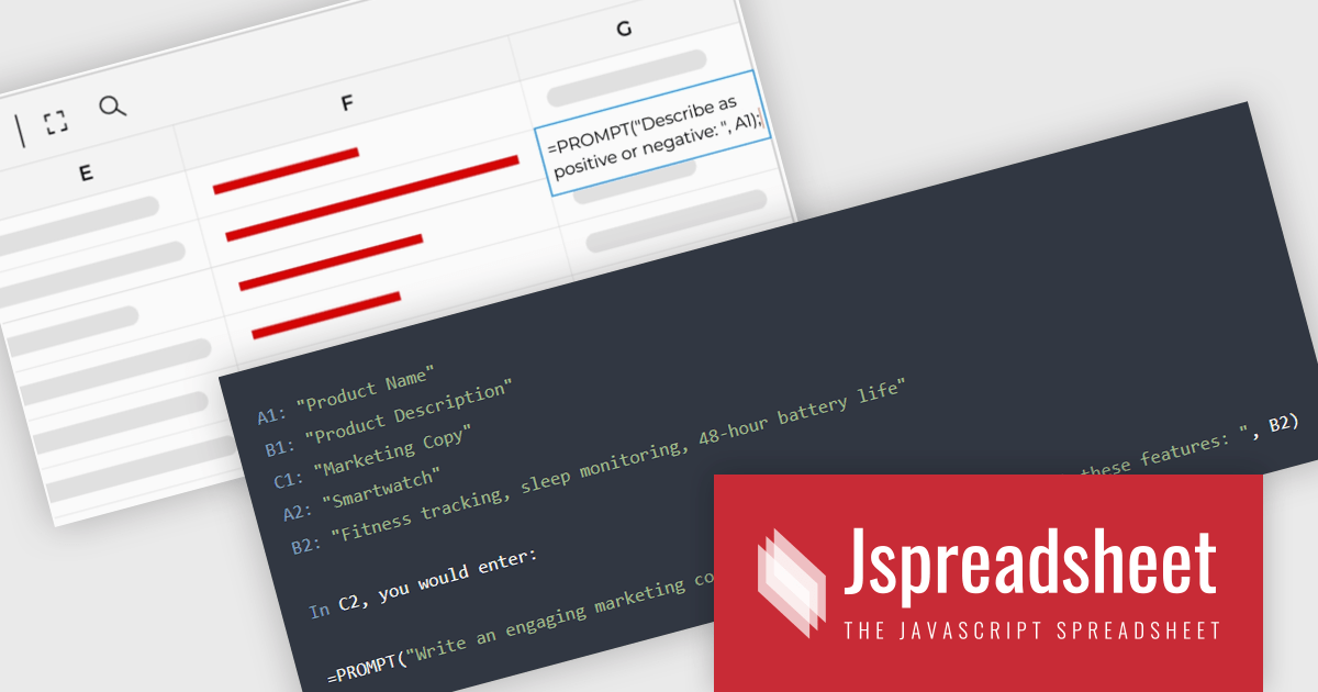
Jspreadsheet Pro is a flexible JavaScript-based spreadsheet solution that enables developers to create customizable, feature-rich data grids for web applications. It offers advanced formulas, data validation, and API integrations. Ideal for tasks like financial modeling, inventory management, and project tracking, it helps businesses efficiently manage and analyze data. Its backend server integration supports real-time data processing, enhancing workflows and boosting productivity across various industries.
Jspreadsheet Pro seamlessly incorporates ChatGPT API into data grids. This integration facilitates automated content generation, efficient response management, and comprehensive data analysis. For full functionality it requires the Jspreadsheet Server extension which enables front-end queries to communicate with the API via your back-end, delivering real-time data and insights to users.
Jspreadsheet Pro is licensed as an Annual or a Perpetual License with support and maintenance. We can supply any Jspreadsheet Pro license including new licenses, maintenance renewals, and upgrade licenses. See our Jspreadsheet Pro for full details.
For more information, visit our Jspreadsheet Pro product page.

jQWidgets is a comprehensive JavaScript UI framework offering a robust collection of over 60 widgets, themes, and utilities for building professional-grade, cross-platform web applications. Built on jQuery, HTML5, and CSS, it provides extensive functionality including data grids, charts, navigation, input validation, and more. jQWidgets simplifies web development, ensuring your applications work seamlessly across desktop browsers, tablets, and smartphones.
The jQWidgets v20.0.0 release introduces AI-powered sentence completion in its input component, enhancing user efficiency by suggesting autocompletions for full sentences based on context and how it has been configured.
To see a full list of what's new in v20.0.0, see our release notes.
jQWidgets is licensed per developer and is available as a Perpetual license 1 year support and maintenance. See our jQWidgets licensing page for full details.
Learn more on our jQWidgets product page.
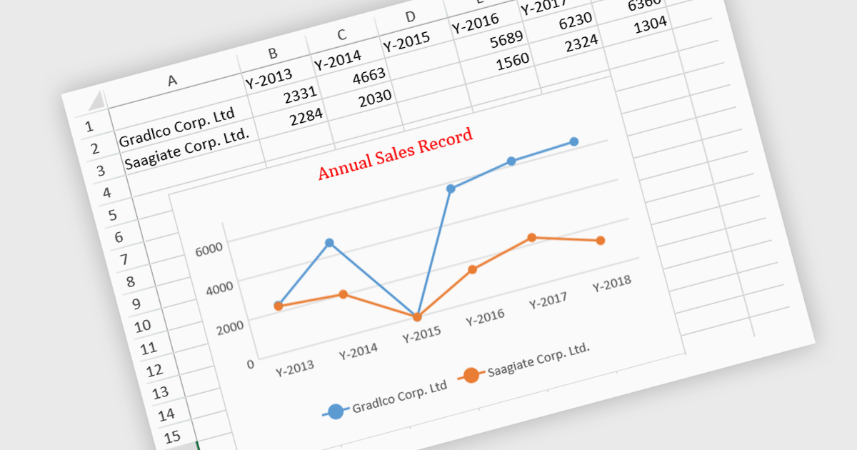
JavaScript spreadsheet controls with built-in chart features enable developers to visualize data directly within web-based spreadsheet applications. These charts are generated dynamically from the data within the spreadsheet, providing users with a more intuitive way to analyze and interpret complex datasets. By integrating charting capabilities, developers can offer real-time data visualization without relying on external libraries, resulting in more efficient user experiences. This functionality improves data-driven decision-making, enhances user engagement, and reduces the complexity of handling complex datasets in web applications.
Several JavaScript spreadsheet controls offer charts including:
For an in-depth analysis of features and price, visit our comparison of JavaScript Spreadsheet controls.
联系电话: (888) 850 9911
传真: +1 770 250 6199


