





官方供应商
我们作为官方授权经销商,直接提供超过200家开发厂家所发行超过1000个的产品授权给您。
查看我们的所有品牌。
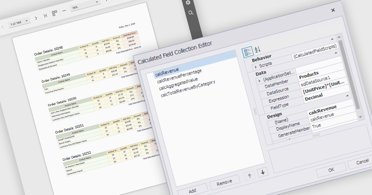
Calculated fields are dynamic values derived from existing data within reporting components. They enable complex data manipulations, calculations, and transformations, providing enhanced data analysis capabilities. By creating new fields based on existing data, calculated fields offer flexibility and efficiency, allowing users to perform calculations, aggregations, and logical comparisons directly within the report. This empowers users to generate insights, visualize trends, and make data-driven decisions without requiring modifications to the underlying data source, ultimately improving report accuracy and usability.
Several React reporting controls offer support for calculated fields:
For an in-depth analysis of features and price, visit our React reporting controls comparison.
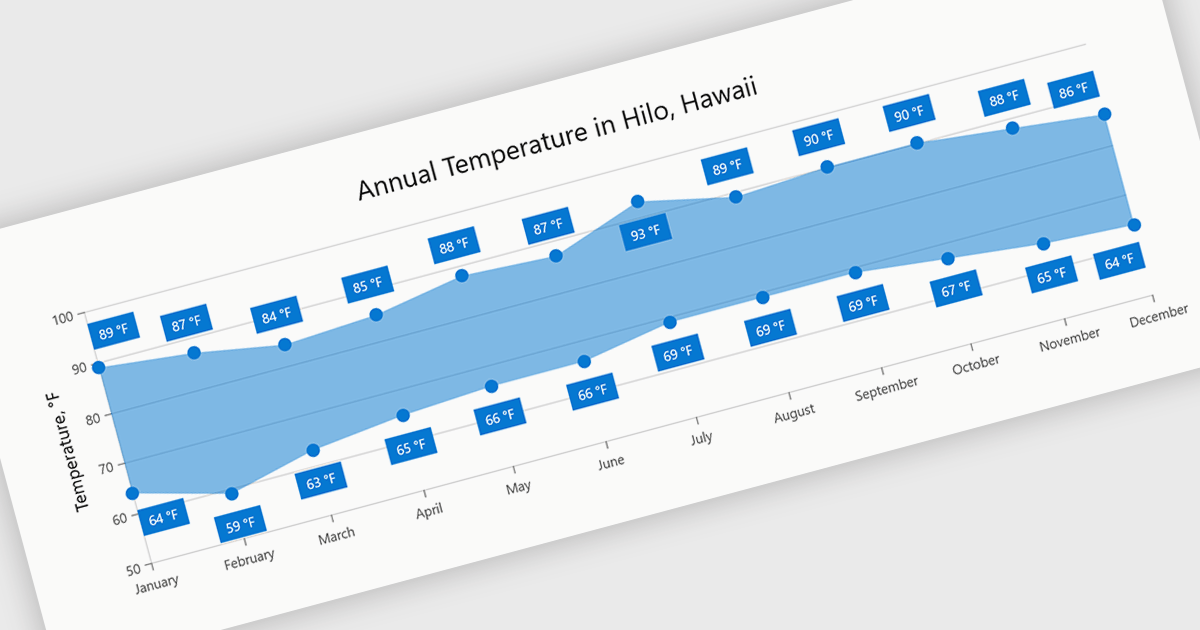
Range charts visualize the difference between minimum and maximum values for each data point using a filled area to represent variation. This makes it easier to understand fluctuations, compare ranges and identify patterns without the clutter of multiple lines. By focusing on value distribution rather than individual points, they improve readability and highlight trends and inconsistencies at a glance. They are useful for scenarios such as tracking temperature ranges, monitoring performance thresholds or comparing variations across datasets.
Several .NET Blazor charting components provide you with range charts, including:
For an in-depth analysis of features and price, visit our .NET Blazor chart controls comparison.
FastReport VCL Reporting Lazarus is a powerful reporting solution for the Lazarus IDE built on Free Pascal, enabling developers to design and generate rich, band oriented reports for Windows and Linux applications. It provides a visual report designer with support for text, images, tables, and scripting in multiple languages, allowing the creation of diverse report types such as invoices, catalogs, and business forms. With integrated data handling, export to widely used formats, and full source code access, it offers extensive customization and flexibility. Its cross platform compatibility, multi language support, and seamless alignment with FastReport VCL make it an efficient choice for developers building scalable, data driven applications.
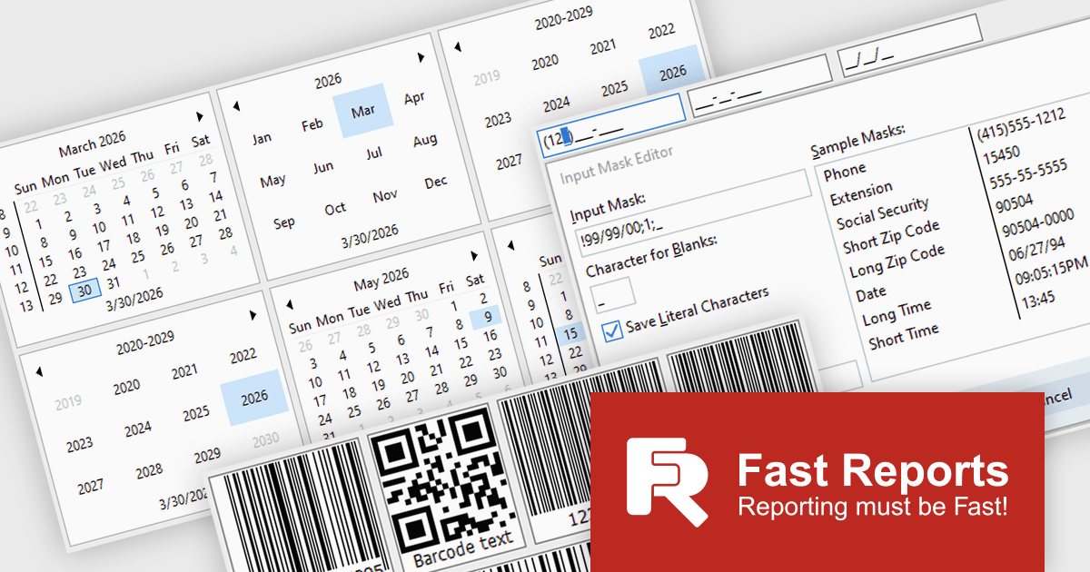
The latest FastReport VCL Reporting Lazarus release introduces new UI editor components that enhance application development by providing more advanced input controls and extended customization beyond standard components. This enables developers to implement richer user interfaces with built in support for features such as barcode generation, masked input, and currency handling, reducing the need for custom development and third party libraries.
FastReport VCL Reporting Lazarus is licensed per named user and is available as a Perpetual license with 1 year of technical support and product updates. See our FastReport VCL Reporting Lazarus licensing page for full details.
Learn more on our FastReport VCL Reporting Lazarus product page.
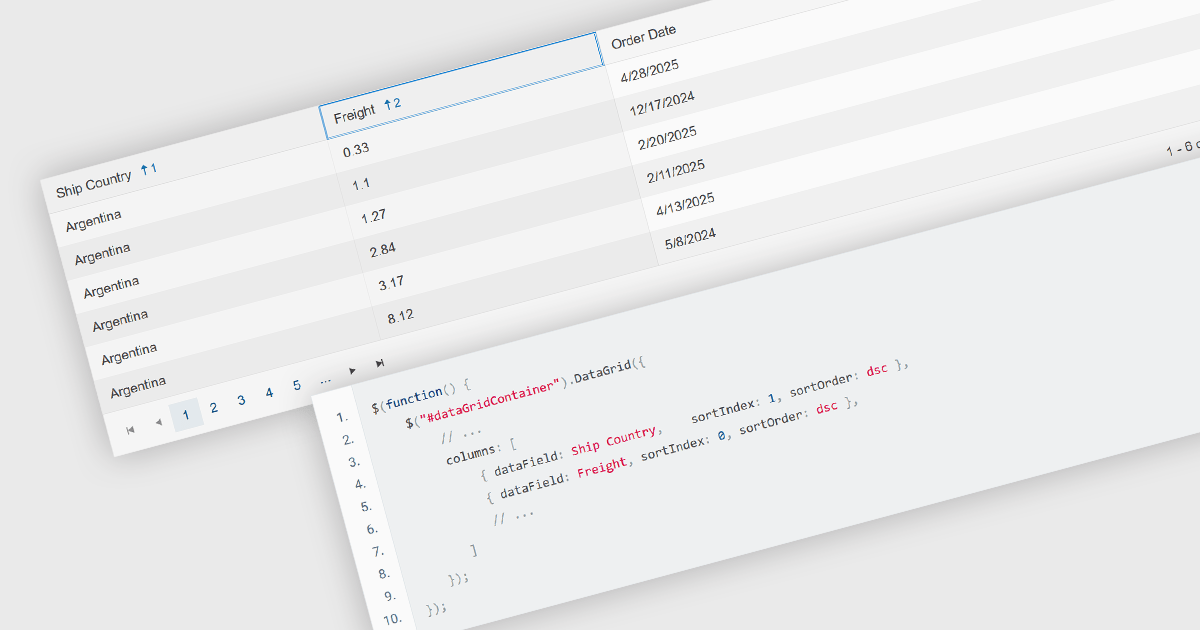
Multi-column sorting in a grid allows users to order data based on more than one column at the same time, applying a hierarchy of sort conditions. This means that when values in a primary column are identical, secondary or tertiary columns are used to further refine the order. The approach improves data exploration by enabling more precise organization, reducing the need for manual filtering, and supporting clearer comparisons across related fields. It is particularly useful in datasets where single-column sorting does not provide enough context to surface meaningful patterns.
Several jQuery grid components allow you to sort multiple columns, including:
For an in-depth analysis of features and price, visit our comparison of jQuery grid components.
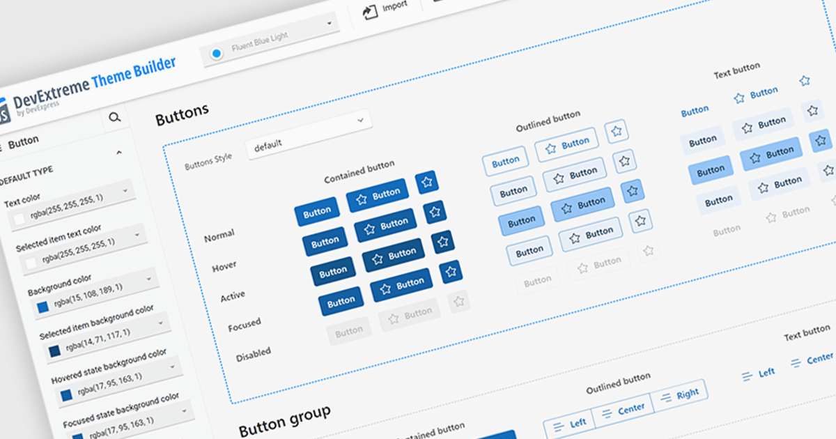
Theming support in UI component suites refers to the capability to define and apply consistent visual styles, such as colors, typography, spacing, and component appearances across an entire application. It typically allows developers to customize or switch themes dynamically, enabling alignment with branding requirements or user preferences without modifying core component logic. This separation of styling from functionality improves maintainability, reduces duplication, and accelerates development by promoting reuse, while also supporting scalability as design systems evolve and new themes are introduced.
Several Angular UI suites offer theming including:
For an in-depth analysis of features and price, visit our Angular UI suites comparison.
联系电话: (888) 850 9911
传真: +1 770 250 6199


