


官方供应商
我们作为官方授权经销商,直接提供超过200家开发厂家所发行超过1000个的产品授权给您。
查看我们的所有品牌。
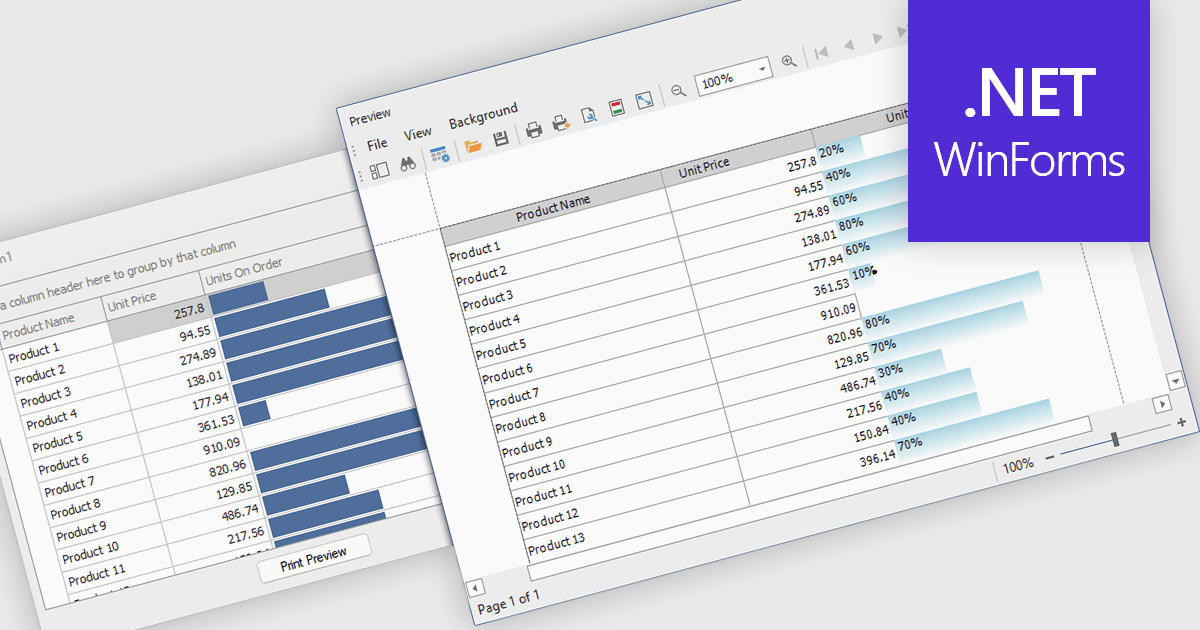
ProgressBar cell types in a .NET WinForms grid control are specialized cells that visually represent progress or completion levels within a grid layout, using horizontal progress bars. These cells are particularly useful for tracking status indicators, such as task completion or data processing percentages, directly within tabular views. They provide a clear, immediate representation of numeric progress values, enhancing readability without requiring users to interpret raw numbers. For developers, integrating ProgressBar cells simplifies the task of conveying progress-related information in data-driven interfaces, offering a familiar and consistent user experience aligned with standard Windows Forms controls.
Several .NET WinForms grid controls offer ProgressBar cell type controls, including:
For an in-depth analysis of features and price, visit our .NET WinForms grid controls comparison.
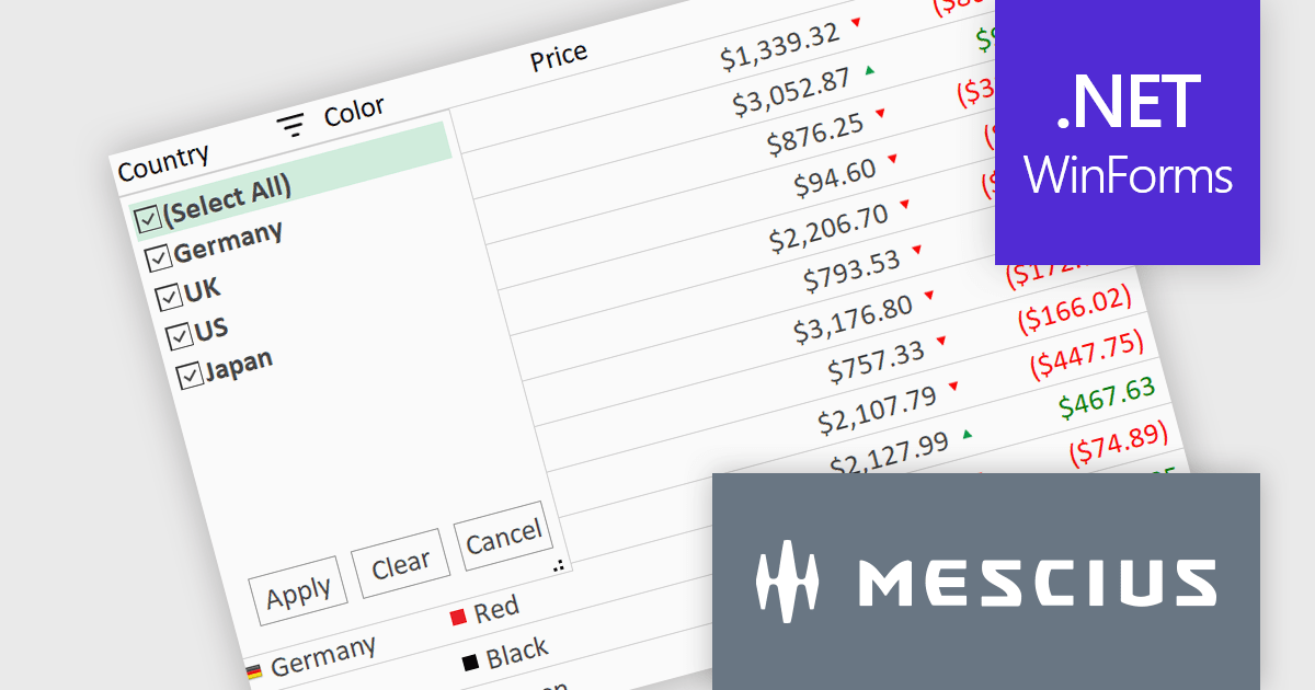
ComponentOne Studio WinForms by MESCIUS is a comprehensive toolkit offering over 120 advanced UI components to streamline Windows Forms application development. It empowers you to build visually appealing and feature-rich applications with functionalities like data visualization through charts and reports, intuitive data editing with performant grids, and modern UI elements including ribbons and docking for a user-friendly experience.
The ComponentOne Studio WinForms 2025 v1 maintenance update refines the FlexGrid Filter UI by making the dropdown more compact, allowing it to fit more efficiently within tight interface layouts. This adjustment improves the overall usability of the grid, particularly in data-heavy applications where screen space is limited. By streamlining the visual footprint of the filter interface, developers can deliver cleaner, more focused user experiences without compromising functionality, making it easier for end users to interact with and analyze data effectively.
To see a full list of what's new in 2025 v1 maintenance release, see our release notes.
ComponentOne Studio WinForms is licensed per developer on a perpetual basis and includes a 12 month subscription. Priority Support is also available. See our ComponentOne Studio WinForms licensing page for full details.
Learn more on our ComponentOne Studio WinForms product page.
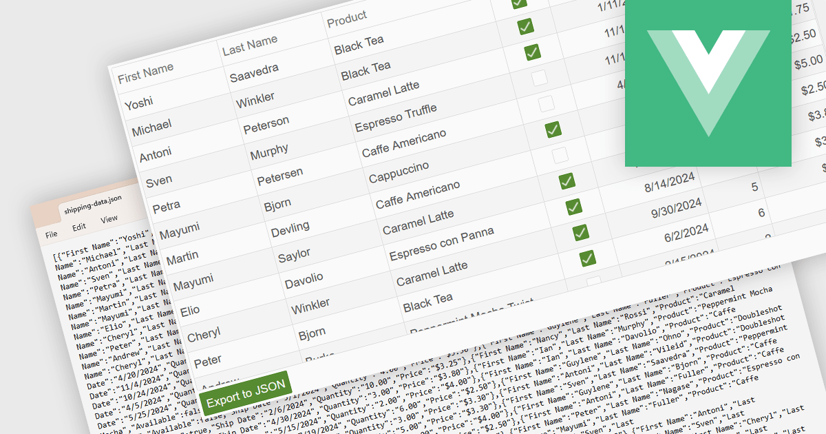
Exporting a data grid to JSON format is a common feature in modern web-based data tools that involves converting the structured data displayed in a grid, such as rows and columns representing records and fields, into JavaScript Object Notation (JSON), a lightweight, text-based format commonly used for data interchange. This process enables the grid's contents to be saved in a machine-readable structure that preserves the hierarchy and attributes of the data, making it easily consumable by web services, APIs, or other applications. The benefits of exporting to JSON include its compatibility with a wide range of programming environments, ease of integration with frontend and backend systems, and suitability for transmitting data across networked systems or persisting it for later use in client-side operations or remote storage.
Several Vue.js grid controls allow you to export to JSON, including:
For an in-depth analysis of features and price, visit our comparison of Vue.js grid controls.
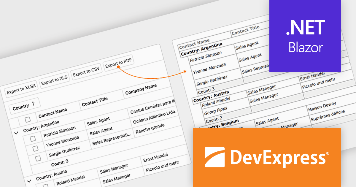
DevExpress Blazor (part of DevExpress ASP.NET and Blazor) helps you create high-impact user experiences for both Blazor Server and Blazor WebAssembly using C#. The Blazor UI Component Library ships with a comprehensive set of native components (including a DataGrid, Pivot Grid, Scheduler, Chart, Data Editors and Reporting).
The DevExpress Blazor v25.1 update enhances the Blazor Grid component with support for PDF export, allowing developers to generate documents that mirror the current data view. This includes all applied filters, sort orders, and group configurations, ensuring that the exported content matches the user's on-screen context. The PDF output retains data columns, group rows with summaries, and overall total summaries, making it a practical tool for sharing, archiving, or printing user-customized reports. This update helps developers deliver consistent, visually structured documents from within Blazor applications.
To see a full list of what's new in version 25.1, see our release notes.
DevExpress ASP.NET and Blazor is licensed per developer and is available as a Perpetual License with a 12 month support and maintenance subscription. See our DevExpress ASP.NET and Blazor licensing page for full details.
DevExpress Blazor is available in the following products:
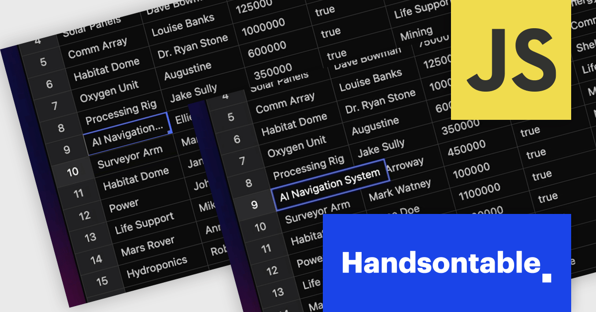
Handsontable is a JavaScript library designed to help developers build interactive data grids into their web applications. Offering a familiar spreadsheet-like interface, it allows users to edit, sort, and filter data with ease. Highly customizable and compatible with popular frameworks like React and Angular, Handsontable empowers developers to build robust data manipulation features into their web applications.
The Handsontable 16.0.0 update adds a new feature called 'textEllipsis' which improves the readability and layout of tables. When activated, this feature automatically replaces any overflowing text in a cell with an ellipsis (…), ensuring that excessive content does not spill over and disrupt the alignment of the table. This approach keeps tables visually clean while clearly signaling that additional content exists, making it easier for users to scan data-heavy views without distraction.
To see a full list of what's new in version 16.0.0, see our release notes.
Handsontable is licensed per developer and is available as an Annual or Perpetual license with 1 year support and maintenance. See our Handsontable licensing page for full details.
For more information, visit our Handsontable product page.
联系电话: (888) 850 9911
传真: +1 770 250 6199


