


Offizieller Lieferant
Als offizieller und autorisierter Distributor beliefern wir Sie mit legitimen Lizenzen direkt von mehr als 200 Softwareherstellern.
Sehen Sie alle unsere Marken.
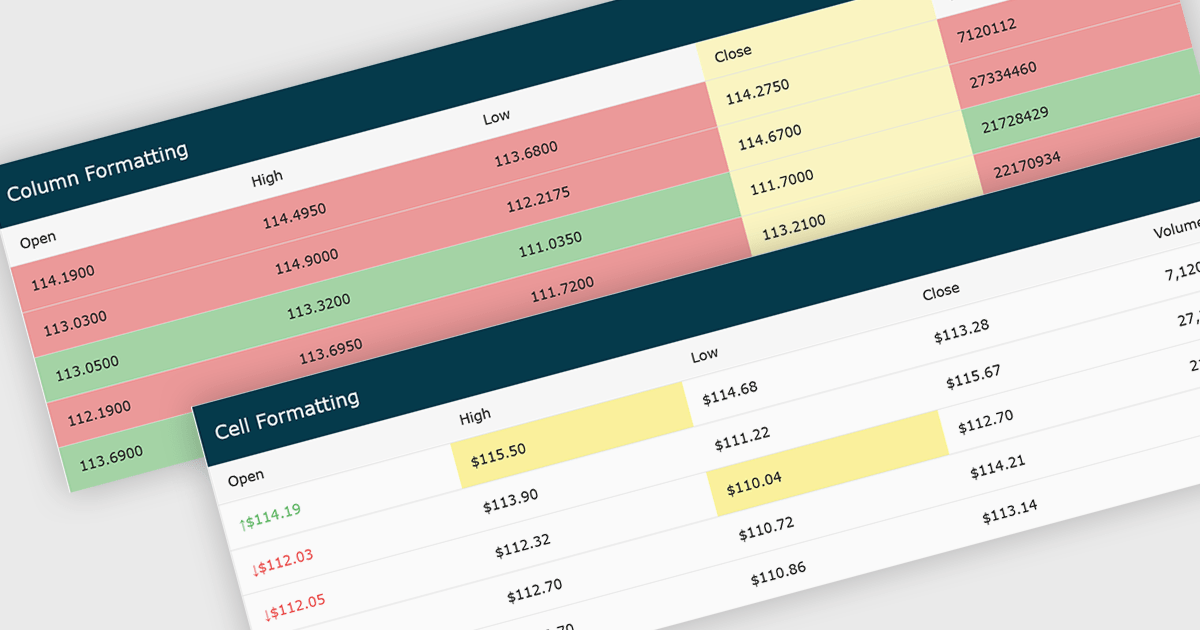
Conditional formatting in grids automatically applies visual styles such as colors or icons based on defined rules, making it easier to interpret large datasets at a glance. It improves readability, highlights patterns and outliers, and supports faster, more informed decision making by surfacing key insights in real time. Common use cases include flagging budget issues in financial reports, emphasizing top performing sales data, monitoring KPIs, and drawing attention to errors or critical statuses in operational tools.
Several JavaScript grid controls offer conditional formatting, including:
For an in-depth analysis of features and price, visit our comparison of JavaScript Grid controls.
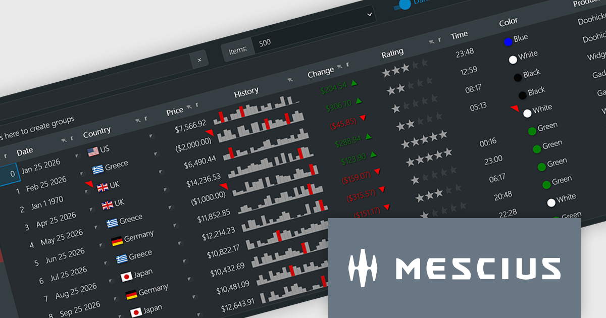
Wijmo by MESCIUS is a comprehensive JavaScript library offering a suite of high-performance UI components and data grids specifically designed to streamline the development of modern enterprise applications. It emphasizes reduced development time and improved maintainability, along with a focus on performance through its efficient design and small module size. Wijmo integrates seamlessly with popular JavaScript frameworks like Angular, React, and Vue.js, and supports cutting-edge technologies like TypeScript, making it a versatile solution for building complex web applications.
The Wijmo 2026 v1 update introduces support for Angular 21, enabling developers to adopt the latest framework capabilities while maintaining full compatibility with Wijmo’s comprehensive component library. This support ensures smoother integration, improved application performance, and alignment with current Angular development standards. Developers can build more responsive and maintainable applications while benefiting from advanced features such as FlexGrid cell templates and a high performance Angular DataGrid, helping deliver modern user experiences more efficiently.
To see a full list of what's new in 2026 v1, see our release notes.
Wijmo is licensed per developer. Developer Licenses are perpetual and include 1 year Subscription which provides upgrades, including bug fixes and new features. See our Wijmo licensing page for full details.
Learn more on our Wijmo product page.
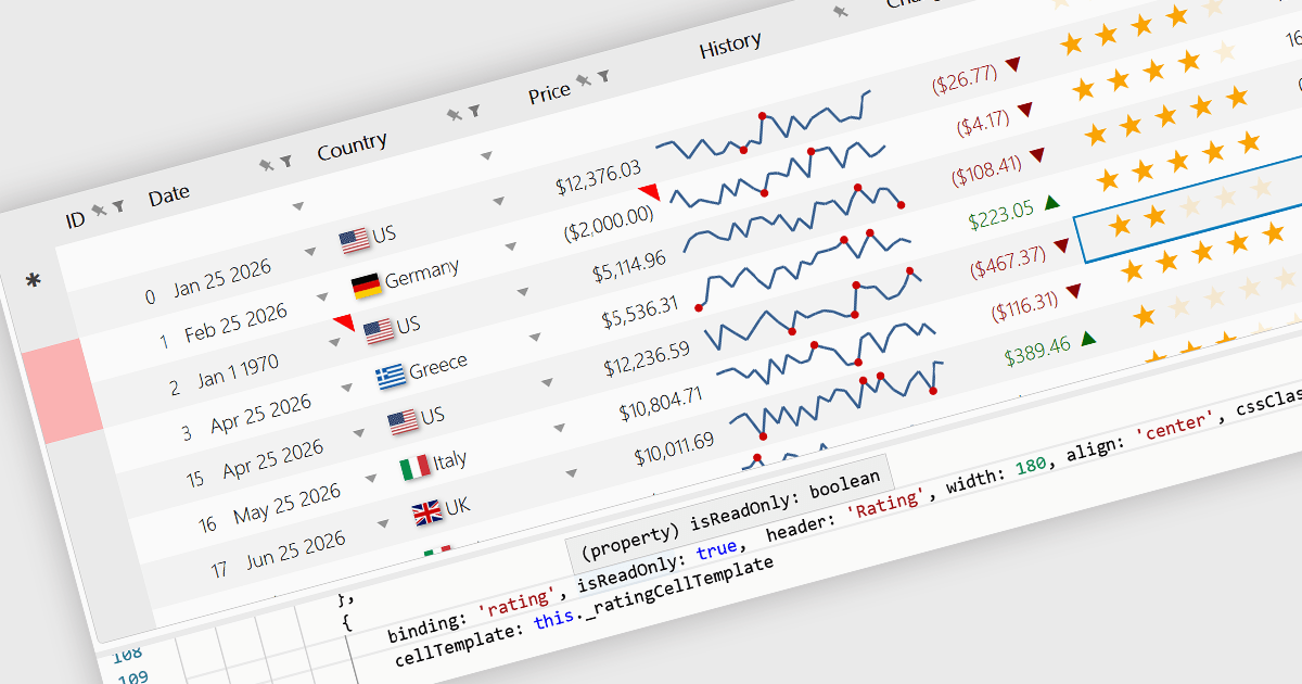
Read-only Columns are grid columns configured to display data without allowing users to edit the values directly in the interface. In a JavaScript grid control, this is typically used for fields that should remain fixed, such as calculated values, identifiers, audit data, or information controlled by business rules or backend processes. The main benefit is that it helps preserve data integrity while still making important information visible, reduces the risk of accidental changes, supports clearer editing workflows by distinguishing editable and non-editable fields, and makes it easier for developers to enforce validation and permission requirements consistently across the application.
Several JavaScript grid controls offer support for Read-only Columns including:
For an in-depth analysis of features and price, visit our comparison of JavaScript grid controls.

Sencha Ext JS is an enterprise-focused JavaScript framework for building complex, data-intensive web applications, particularly business software such as dashboards, admin systems, reporting tools, and other large-scale user interfaces. It provides a broad library of prebuilt components, including grids, charts, forms, layouts, and data handling features, along with supporting tools for theming, testing, and application development, which helps teams create consistent, cross-platform applications more efficiently. In practice, Ext JS is best known for its strong support for rich user interfaces and large datasets, making it a good fit for organisations that need robust, maintainable front-end applications rather than lightweight websites.
The Sencha Ext JS v8.0 update adds QR Code Reader/Generator functionality that lets developers generate and read QR codes directly within applications across both the Modern and Classic toolkits. It supports use cases such as payments, data sharing, contact exchange, calendar events, geolocation, phone and SMS, email, and Wi-Fi configurations, while also providing rendering options including SVG, Canvas, and PNG, plus image download, clipboard copy, preview, responsive sizing, customization, and input sanitization. The result is a built-in way to add QR code barcode capabilities to enterprise applications with broad format support and flexible configuration.
To see a full list of what's new in v8.0, see our release notes.
Sencha Ext JS is available in Pro, Enterprise and Ultimate editions, as Annual Subscription Licenses. See our Sencha Ext JS licensing page for full details.
For more information, see our Sencha Ext JS product page.

Map components allow developers to embed interactive, location-based data visualizations into applications and dashboards. By presenting data in a geographic context, they make it easier to identify patterns, monitor activity, and support faster decision-making. With features like real-time updates, data layering, and interactive navigation, maps are commonly used for tracking regional performance, visualizing logistics and routes, and monitoring live or spatial data within modern dashboards.
Several React UI suites provide map controls including:
For an in-depth analysis of features and price, visit our React chart controls comparison.


Tel.: (888) 850 9911
Fax: +1 770 250 6199


