













공식 공급 업체
200 이상의 소프트웨어 개발처와 판매 계약을 맺은 공인 디스트리뷰터로서 합법적인 라이선스를 제공합니다.
모든 브랜드 보기.
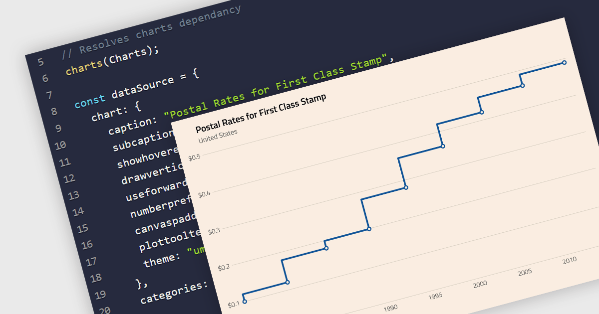
A step line chart is a type of data visualization that displays data points connected by horizontal and vertical line segments, forming a step-like appearance. Unlike traditional line charts that emphasize continuous trends, step line charts highlight changes that occur at irregular intervals and are for depicting data that changes at specific points in time. This makes them particularly effective for representing data that undergoes discrete shifts, such as inventory levels, interest rates, or monitoring server performance, where the exact timing and magnitude of changes are crucial to understand. By clearly showing these transitions, these charts provide precise insights into the timing and impact of changes, aiding in more accurate decision-making and analysis.
Several React chart components support the step line chart type, including:
For an in-depth analysis of features and price, visit our comparison of React chart components.
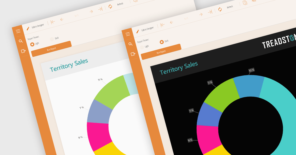
Reporting component themes provide a consistent visual style and branding across complex data visualizations. By offering pre-defined color palettes, typography, and layout options, themes streamline the design process and ensure reports align with overall application aesthetics. They enable rapid customization, allowing developers to create multiple themes for different report types or user preferences. Additionally, themes enhance user experience by improving readability and data perception, making complex information easier to understand. Use cases include creating branded reports, adapting to different screen sizes, and matching the look and feel of existing applications.
Several React reporting controls offer support for themes including:
For an in-depth analysis of features and price, visit our React reporting controls comparison.

Gauge controls are visual components employed in software development to represent numerical data in a graphical format. They effectively communicate quantitative information at a glance, aiding rapid decision-making. Common types include radial, linear, and circular gauges. Primarily utilized in dashboards and monitoring interfaces, gauges excel at displaying performance metrics, system health indicators, and real-time data trends. Their intuitive design enhances user experience by providing immediate insights into key performance indicators (KPIs) and facilitating efficient analysis.
Several Vue.js UI suites offer gauge controls including:
For an in-depth analysis of features and price, visit our Vue.js UI suites comparison.

In datagrids, tooltips are on-demand informational popups that appear when hovering over a cell. They provide critical context for truncated content, enhancing usability by allowing users to view the full data point without sacrificing grid layout or requiring them to navigate elsewhere. This improves data comprehension and reduces the need for scrolling or resizing columns, leading to a more efficient user experience.
Several jQuery grid controls offer support for tooltips including:
For an in-depth analysis of features and price, visit our jQuery grid controls comparison.

Wijmo by MESCIUS is a comprehensive JavaScript library offering a suite of high-performance UI components and data grids specifically designed to streamline the development of modern enterprise applications. It emphasizes reduced development time and improved maintainability, along with a focus on performance through its efficient design and small module size. Wijmo integrates seamlessly with popular JavaScript frameworks like Angular, React, and Vue.js, and supports cutting-edge technologies like TypeScript, making it a versatile solution for building complex web applications.
The Wijmo 2024 v1 (Build 5.20241.19) update introduces full support for Angular 18. The latest Angular release prioritizes application performance with several key advancements. Build times are reduced through an enhanced optimizer and differential loading. Streamlined code splitting and lazy loading techniques ensure modules are loaded only when needed. Zoneless change detection, powered by signals, replaces the Zone.js dependency, offering a lighter-weight and more efficient approach to managing state updates. These optimizations combine to deliver faster load times and a smoother user experience. Wijmo’s support for Angular 18 means that it can take advantage of these enhancements, resulting in more performant web apps.
Wijmo is licensed per developer. Developer Licenses are perpetual and include 1 year Subscription which provides upgrades, including bug fixes and new features. See our Wijmo licensing page for full details.
Learn more on our Wijmo product page.
전화 : 00798 14 800 6332
팩스 : +1 770 250 6199


