













공식 공급 업체
200 이상의 소프트웨어 개발처와 판매 계약을 맺은 공인 디스트리뷰터로서 합법적인 라이선스를 제공합니다.
모든 브랜드 보기.
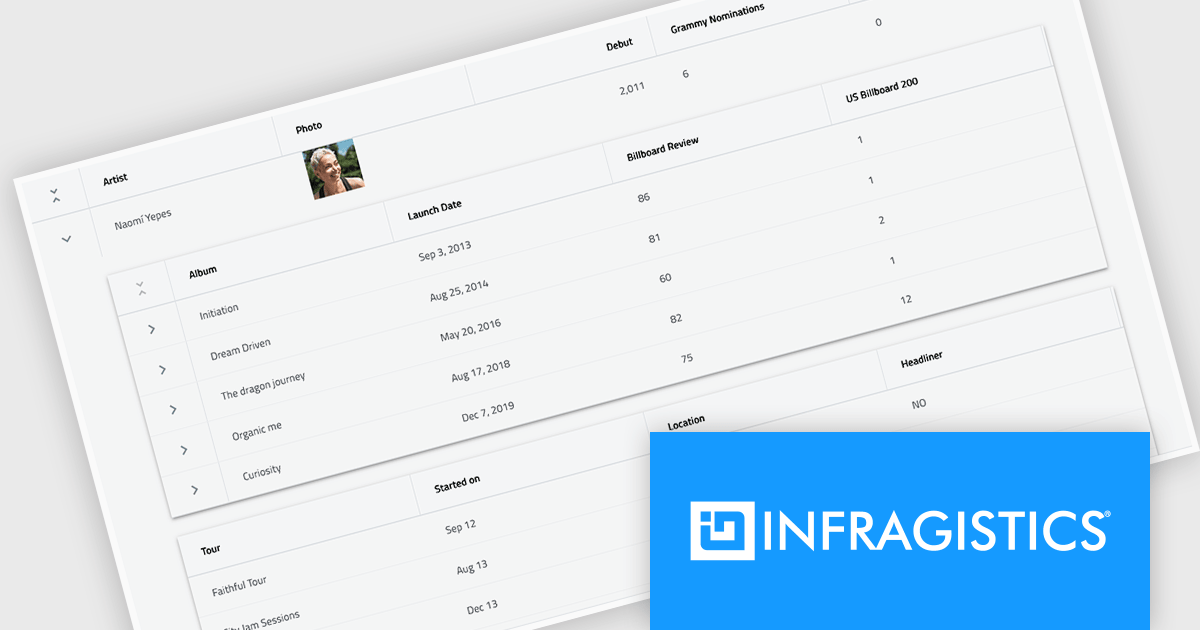
Infragistics Ignite UI for React is a comprehensive suite of enterprise-grade React UI components designed to accelerate the development of modern, high-performance web applications. Packed with features such as data grids, charts, gauges, and spreadsheets, it empowers developers to visualize and interact with complex data effortlessly. Ignite UI for React offers exceptional performance, customization options, and responsive design, facilitating the creation of engaging user experiences across various devices.
Infragistics Ignite UI Version 24.1 (Infragistics Ignite UI for React 18.6.0) adds a new Hierarchical Data Grid component, which provides a robust solution for visualizing and interacting with complex, hierarchical datasets. It empowers users to effortlessly expand or collapse parent rows to reveal detailed child grids, offering an intuitive, dynamic way to explore data at various levels of granularity. With rapid data binding, extensive customization options, and a comprehensive suite of functionality the Hierarchical Data Grid is a versatile tool for creating engaging and informative data-driven applications.
To see a full list of what's new in version 24.1 (18.6.0), see our release notes.
Infragistics Ignite UI for React is part of Infragistics Ignite UI which is licensed per developer and is available as a Perpetual License with a 1, 2 or 3 year support and maintenance subscription. See our Infragistics Ignite UI licensing page for full details.
Infragistics Ignite UI for React is available to buy in the following products:
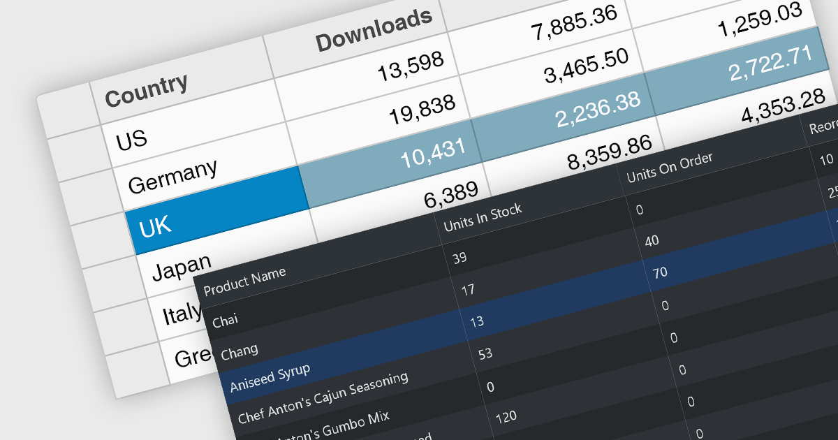
Row selection functionality empowers users to interact with data grids by selecting individual or multiple rows, enabling efficient data manipulation and analysis. Users can perform actions on selected rows such as editing, deleting, exporting, or filtering data. This feature significantly enhances user experience and productivity by providing a direct and intuitive way to manage and process large datasets, facilitating tasks like batch updates, generating reports, or performing complex data operations based on user-defined criteria.
Several React grid controls offer row selection including:
For an in-depth analysis of features and price, visit our comparison of React grid controls.
Infragistics Ignite UI for Angular is a comprehensive suite of Angular components and UI controls designed to accelerate development of high-performance, enterprise-grade web applications. It offers a rich collection of data grids, charts, and other UI elements, along with advanced features like pivoting, docking, and hierarchical data management. Built on Angular, the toolkit integrates seamlessly into existing projects and provides a foundation for building modern, responsive, and interactive user interfaces.
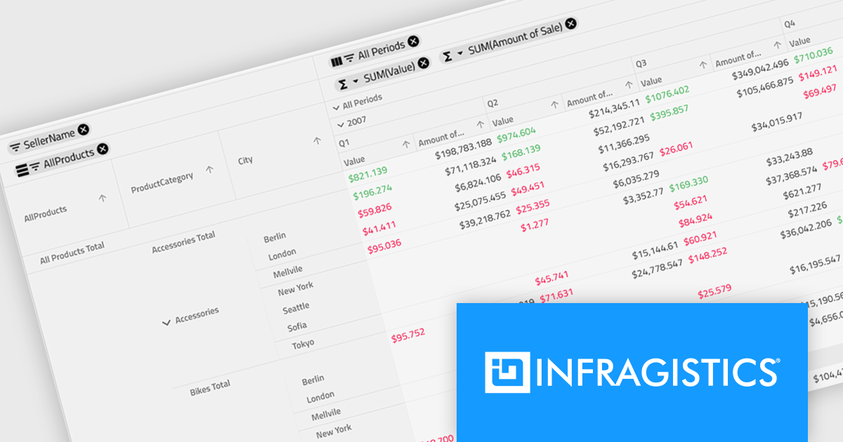
Ignite UI for Angular's Pivot Grid now offers horizontal row dimension expansion, providing developers with greater flexibility in data visualization. In this mode, child elements of a row dimension are displayed horizontally within the same multi-row layout instead of vertically. This approach allows for a more compact and potentially informative representation of hierarchical data, enabling users to easily compare related data points within a single row context. Developers can dynamically toggle between horizontal and vertical expansion modes to suit their specific data analysis requirements.
To see a full list of what's new in version 24.1 (18.1.0), see our release notes.
Infragistics Ignite UI for Angular is part of Infragistics Ignite UI which is licensed per developer and is available as a Perpetual License with a 1, 2 or 3 year support and maintenance subscription. See our Infragistics Ignite UI licensing page for full details.
Infragistics Ignite UI for Angular is available in the following products:

Spline charts are a type of line chart that uses smooth curves to connect data points, offering a visually appealing and intuitive representation of trends over time. Unlike traditional line charts with straight segments, spline charts emphasize the continuous nature of data, making them particularly effective for visualizing patterns, cycles, and gradual changes, commonly used in fields like finance, economics, and engineering to highlight the evolution of metrics and predict future trajectories
Several React chart controls offer spline charts including:
For an in-depth analysis of features and price, visit our React chart controls comparison.

KendoReact by Telerik is a professional UI kit of more than 120 responsive and customizable native UI and data visualization components for React developers. Designed to save time building powerful high performance React applications, it helps ensure a modern, consistent look-and-feel across your application's user interface.
KendoReact v8.2.0, part of the 2024 Q3 release, adds a new chart wizard component, enhancing the developer experience by streamlining the chart creation process. This component provides a simple and intuitive interface that enables React developers to quickly create charts from a data-bound component or an external source. It guides you through a chart's configuration, allowing you to set up the chart type, title, series, legend, area, value axis, category axis and data source. This reduces the potential for errors in the chart setup whilst saving development time by reducing the complexity of building interactive data visualizations within React apps.
To see a full list of what’s new in 2024 Q3 (v8.2.0), see our release notes.
KendoReact is licensed per developer and is available as a perpetual license with a 1 year support subscription, which is available in 3 tiers: Lite, Priority or Ultimate. See our KendoReact licensing page for full details.
KendoReact is available to buy in the following products:
전화 : 00798 14 800 6332
팩스 : +1 770 250 6199


