


공식 공급 업체
200 이상의 소프트웨어 개발처와 판매 계약을 맺은 공인 디스트리뷰터로서 합법적인 라이선스를 제공합니다.
모든 브랜드 보기.
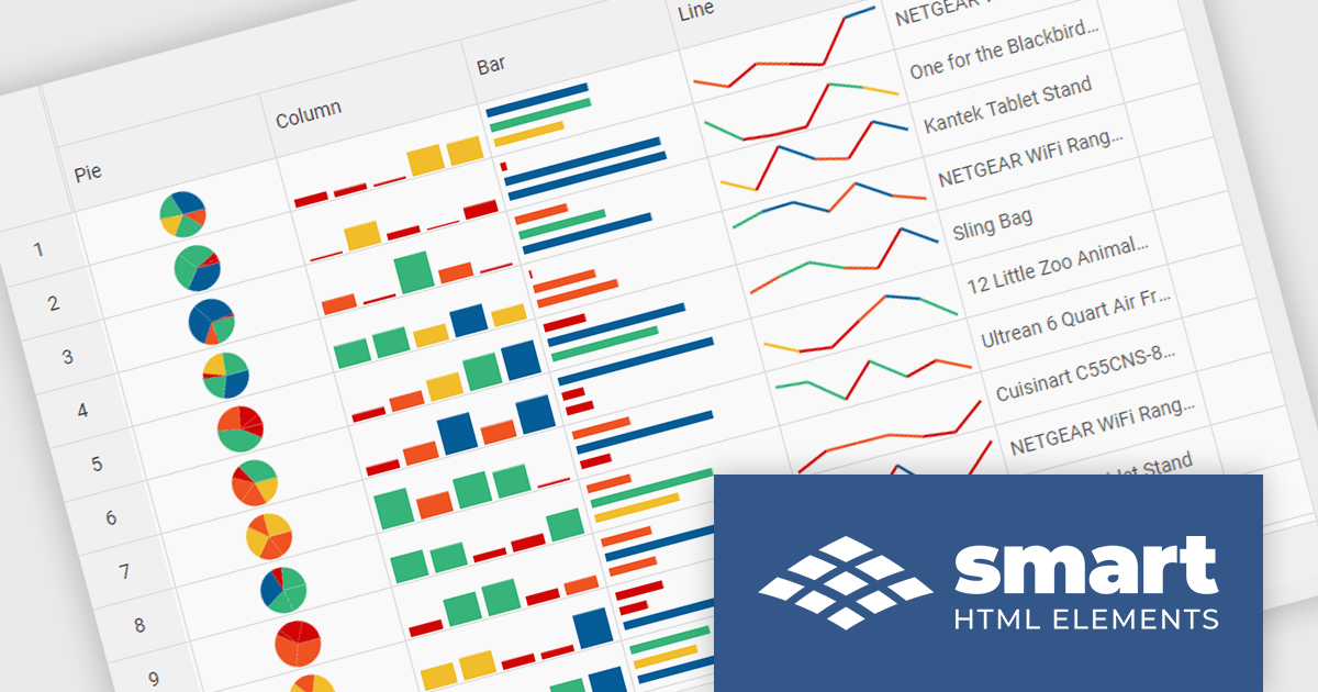
Smart HTML Elements is an enterprise-grade UI library offering pre-built web components for developers in Angular, React, Vue, Blazor, and JavaScript. It boasts over 60 ready-to-use components like grids, charts, schedulers, and editors, all featuring two-way data binding, responsiveness, accessibility, and theming capabilities. This library helps developers rapidly build dynamic and modern web applications with consistent look-and-feel and rich functionalities, accelerating development time and ensuring professional quality.
The Smart HTML Elements v19.0.0 release adds support for Grid Sparklines. These are small, data-intense, design simple charts that fit into a single cell of a grid and provide a visual representation of data trends. They are typically used to show trends in a series of values, such as seasonal increases or decreases, economic cycles, or to highlight maximum and minimum values. Grid Sparklines help users to quickly understand patterns and trends in their data without having to create separate charts or graphs.
To see a full list of what's new in v19.0.0, see our release notes.
Smart HTML Elements is licensed per developer and is available as a Perpetual license with 1 year support and maintenance. It includes distribution to Unlimited Web applications, SaaS projects, Intranets and Websites. See our Smart HTML Elements licensing page for full details.
Learn more on our Smart HTML Elements product page.
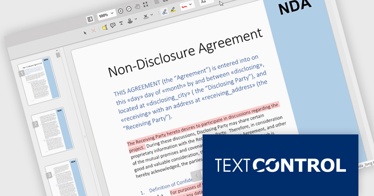
TX Text Control .NET Server for ASP.NET is a server-side component that equips your web applications with a powerful, MS Word-compatible document editor. This allows you to develop applications that generate and edit various document formats (RTF, DOCX, PDF, etc.) on the fly, using data from databases or files. It also boasts features like PDF generation and a browser-based editor with a familiar MS Word-inspired interface, ultimately enhancing the document processing capabilities of your ASP.NET web applications.
TX Text Control .NET Server's Document Viewer now utilizes long polling for asynchronous document loading. Instead of waiting for the entire document to be processed, the server starts sending generated pages as a stream. Using JavaScript, the client continuously consumes this stream, displaying each page as it arrives. Long polling eliminates the wait time typically associated with loading large documents, enhancing overall user satisfaction.
To see a full list of what's new in TX Text Control .NET Server for ASP.NET 32.0 SP3, see our release notes.
TX Text Control .NET Server for ASP.NET is licensed per developer and is available as a Perpetual License with a 12 month support and maintenance subscription. Run time licenses are required for the deployment to production servers. See our TX Text Control .NET Server for ASP.NET licensing page for full details.
For more information, visit our TX Text Control .NET Server for ASP.NET product page.
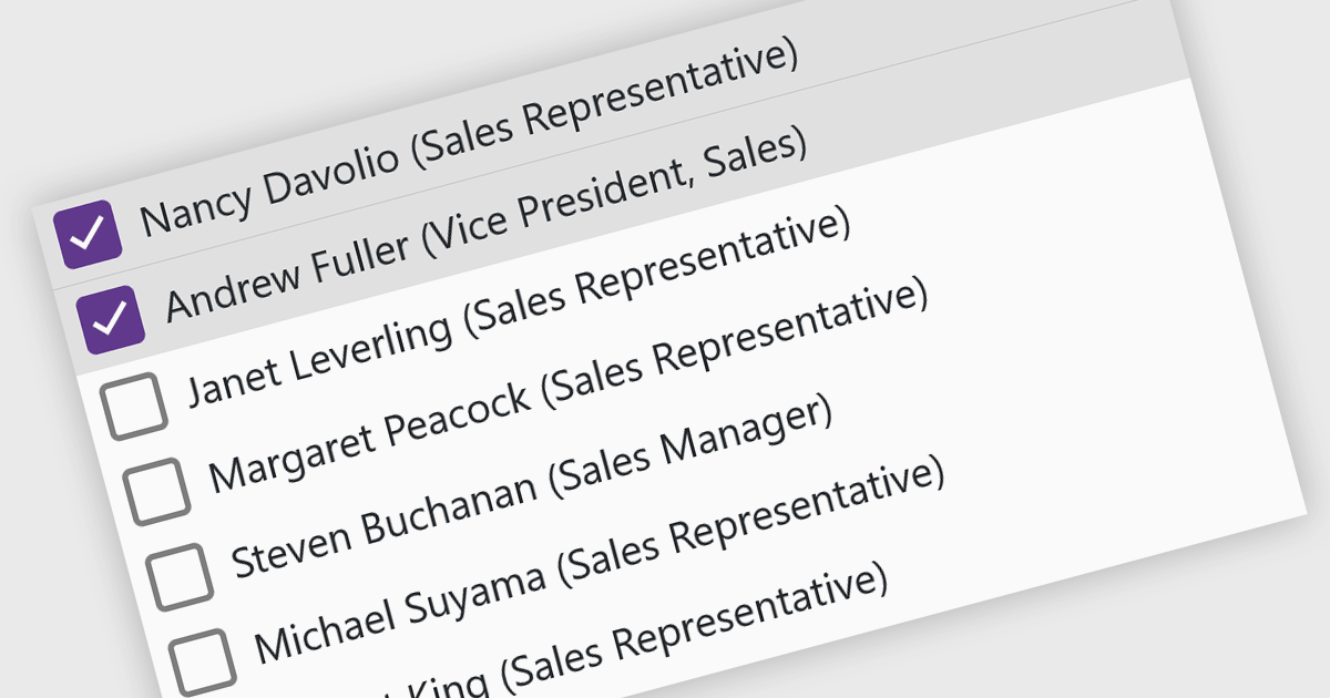
A checked listbox is a graphical user interface element that combines a listbox with checkboxes. It presents a list of options, similar to a standard listbox, but allows users to select multiple items by clicking on an adjacent checkbox for each option. This is useful for scenarios where users need to choose from various choices, but not be limited to a single selection.
Several Blazor data editor collections offer checked listboxes including:
For an in-depth analysis of features and price, visit our Blazor Data Editors comparison.

A radio group control is a user interface element that presents a collection of mutually exclusive possibilities within a data field. This control typically appears as a group of circular buttons, each representing a distinct option. Selecting one option automatically deselects any previously selected option within the same group. The primary benefit of a radio group is its ability to simplify the user interface by clearly displaying all available choices without ambiguity, which enhances user experience by making the selection processes straightforward and error-free. This is especially useful in forms or settings where a clear, singular choice must be made from a predefined set of options, ensuring that the user's input is constrained to valid selections and thereby reducing the likelihood of errors and simplifying data validation on the backend.
Several .NET 8 Blazor components offer radio group data editors, including:
For an in-depth analysis of features and price, visit our comparison of .NET 8 Blazor data editors.
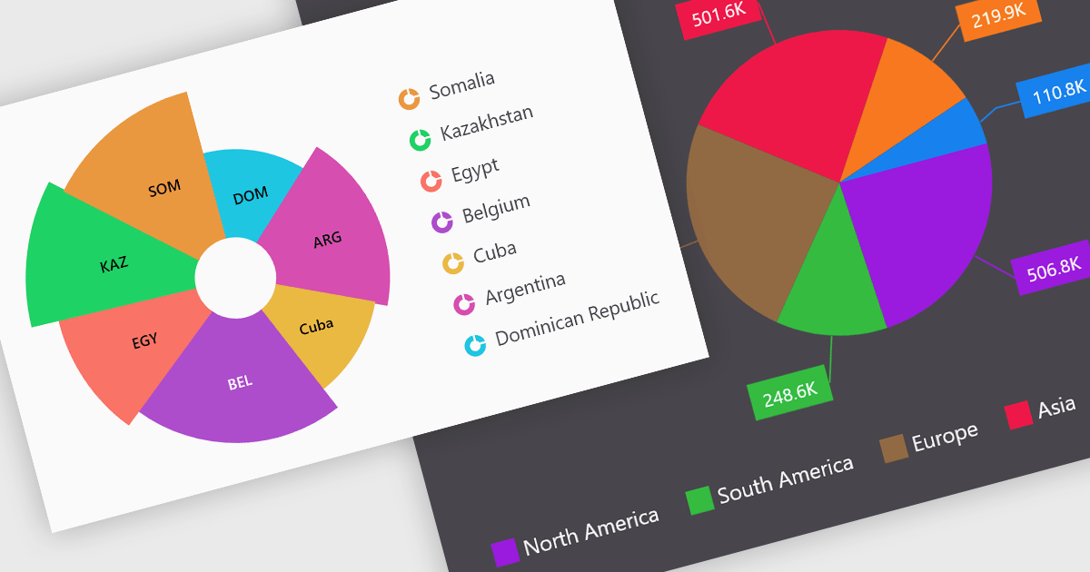
Pie charts are a useful and easily understood tool for visualizing data breakdowns at a glance, particularly when representing percentages of a whole. Their strength lies in highlighting the relative proportions between a small number of categories within a dataset. While less effective for complex comparisons or trends over time, pie charts can be an effective choice to communicate compositions and dominance within a dataset.
Several Blazor Chart controls offer Pie charts including:
For an in-depth analysis of features and price, visit our Blazor Chart controls comparison.
전화 : 00798 14 800 6332
팩스 : +1 770 250 6199


