













官方供应商
我们作为官方授权经销商,直接提供超过200家开发厂家所发行超过1000个的产品授权给您。
查看我们的所有品牌。
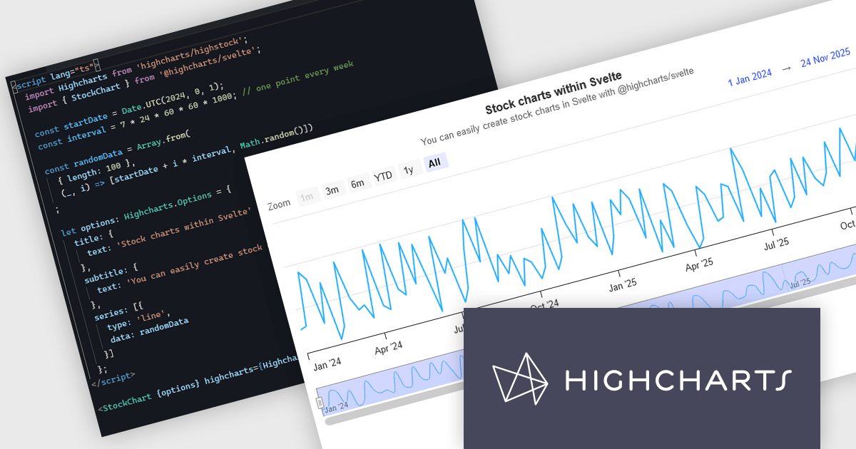
Highcharts is a JavaScript charting framework that allows web developers and data analysts to generate dynamic, visually appealing charts and graphs for websites and web applications. It can display a variety of chart types, including line, spline, area, column, bar, pie, scatter, and many more. Highcharts is well-known for its ease of use, rich documentation, and ability to handle huge datasets efficiently. Features include responsive design, accessibility support, and cross-browser compatibility. Its customization capabilities allow users to create bespoke data visualizations that increase engagement and provide insightful data presentations.
The new Highcharts for Svelte integration is a lightweight package that seamlessly integrates Highcharts' robust visualization capabilities into Svelte applications, providing a streamlined approach to creating interactive and dynamic charts while retaining the performance benefits of the Svelte framework. Svelte is a component-based front-end framework that, unlike standard techniques, compiles code during the build process rather than relying on the browser for runtime performance optimization. This revolutionary approach results in smaller, faster apps with a developer experience that promotes simplicity and efficiency, making it ideal for creating high-performance web interfaces. By combining the powerful capabilities of the Highcharts API with the sleek, minimalistic nature of Svelte, Highcharts for Svelte makes incorporating robust, custom data visualizations into your Svelte projects painless.
For more information see the Introducing Highcharts for Svelte blog post.
Highcharts Core is licensed on an annual or perpetual basis, OEM licenses, and Advantage Renewals. It is licensed per Developer and has several license options including Internal, SaaS, SaaS+, and Self Hosted. See our Highcharts Core licensing page for full details.
Learn more on our Highcharts Core product page.
Kendo UI by Telerik is a comprehensive suite of JavaScript UI components designed to accelerate web application development. Offering pre-built, customizable elements for grids, charts, schedulers, and more, it streamlines UI creation across popular frameworks like jQuery, Angular, React, and Vue. Key features include responsive design, accessibility, and high performance, enhancing user experience. Developers benefit from reduced development time, consistent UI patterns, and the ability to build feature-rich applications faster.
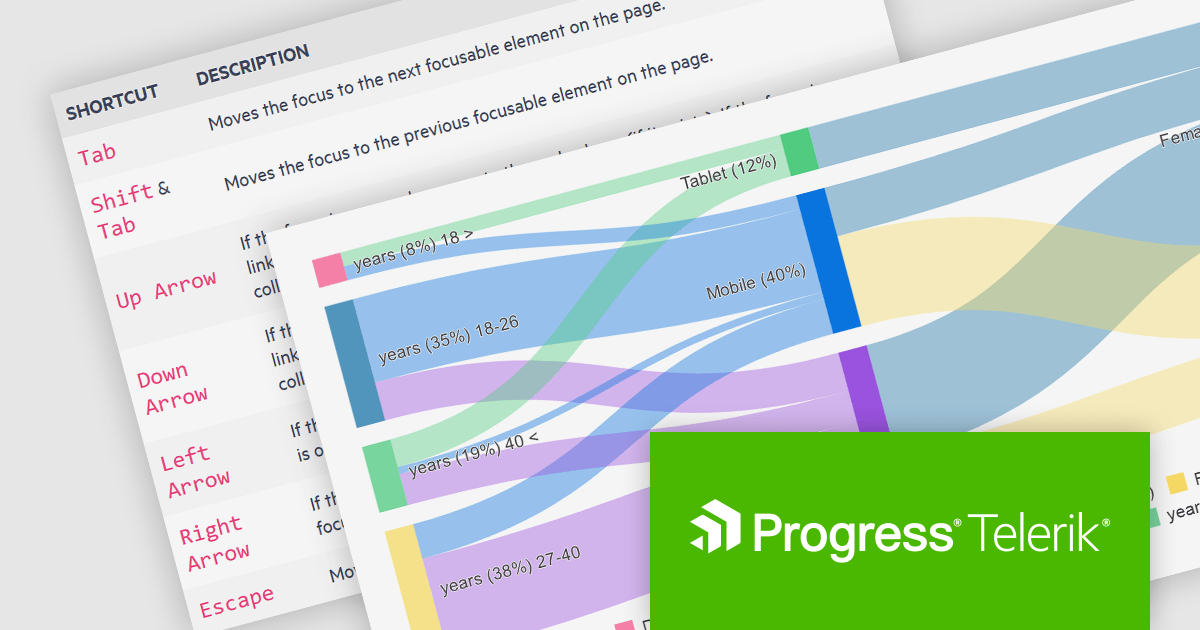
The Kendo UI for Angular v16.5.0 update (part of Kendo UI 2024 Q2) enhances the Sankey Diagram component with support for keyboard navigation and Right-to-Left (RTL) accessibility features. Keyboard navigation allows users to interact with the diagram using only their keyboard, making it more accessible to users with disabilities. RTL support ensures that the component is usable in languages written from right to left, such as Arabic and Hebrew, broadening its applicability and usability in international contexts. These additions collectively enhance the user experience, making the component more versatile and inclusive for a diverse range of users and applications.
To see a full list of what's new in 2024 Q2 (v16.5.0), see our release notes.
Kendo UI is licensed per developer and is available as a perpetual license with a one year support subscription, which is available in three tiers: Lite, Priority or Ultimate. See our Kendo UI licensing page for full details.
Kendo UI is available to buy in the following products:
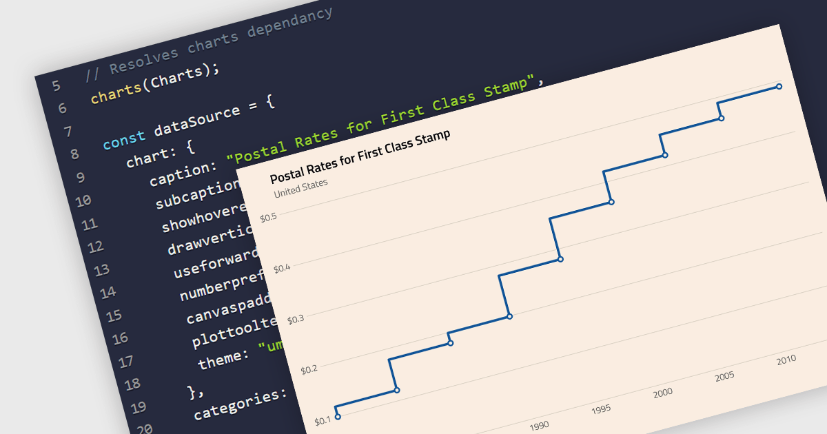
A step line chart is a type of data visualization that displays data points connected by horizontal and vertical line segments, forming a step-like appearance. Unlike traditional line charts that emphasize continuous trends, step line charts highlight changes that occur at irregular intervals and are for depicting data that changes at specific points in time. This makes them particularly effective for representing data that undergoes discrete shifts, such as inventory levels, interest rates, or monitoring server performance, where the exact timing and magnitude of changes are crucial to understand. By clearly showing these transitions, these charts provide precise insights into the timing and impact of changes, aiding in more accurate decision-making and analysis.
Several React chart components support the step line chart type, including:
For an in-depth analysis of features and price, visit our comparison of React chart components.
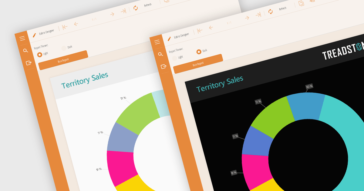
Reporting component themes provide a consistent visual style and branding across complex data visualizations. By offering pre-defined color palettes, typography, and layout options, themes streamline the design process and ensure reports align with overall application aesthetics. They enable rapid customization, allowing developers to create multiple themes for different report types or user preferences. Additionally, themes enhance user experience by improving readability and data perception, making complex information easier to understand. Use cases include creating branded reports, adapting to different screen sizes, and matching the look and feel of existing applications.
Several React reporting controls offer support for themes including:
For an in-depth analysis of features and price, visit our React reporting controls comparison.

Gauge controls are visual components employed in software development to represent numerical data in a graphical format. They effectively communicate quantitative information at a glance, aiding rapid decision-making. Common types include radial, linear, and circular gauges. Primarily utilized in dashboards and monitoring interfaces, gauges excel at displaying performance metrics, system health indicators, and real-time data trends. Their intuitive design enhances user experience by providing immediate insights into key performance indicators (KPIs) and facilitating efficient analysis.
Several Vue.js UI suites offer gauge controls including:
For an in-depth analysis of features and price, visit our Vue.js UI suites comparison.
联系电话: (888) 850 9911
传真: +1 770 250 6199


