













官方供应商
我们作为官方授权经销商,直接提供超过200家开发厂家所发行超过1000个的产品授权给您。
查看我们的所有品牌。
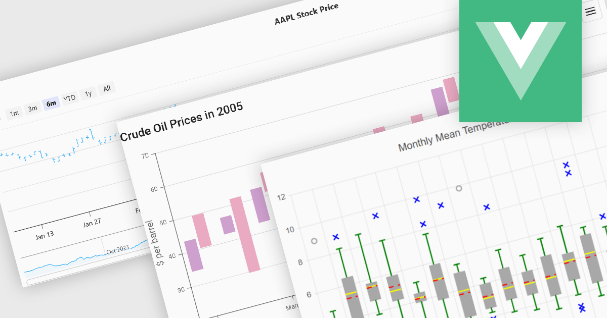
Financial chart components are used within software applications to visually represent complex financial data over time. They enable users, particularly those in trading, investment, and financial analysis, to interpret trends, compare performance, and make data-driven decisions more effectively. These components typically support a variety of chart types tailored to the unique requirements of financial datasets, allowing for granular analysis of price movements, market trends, and volatility.
Common features include:
For an in-depth analysis of features and price, visit our Vue.js Chart components comparison.
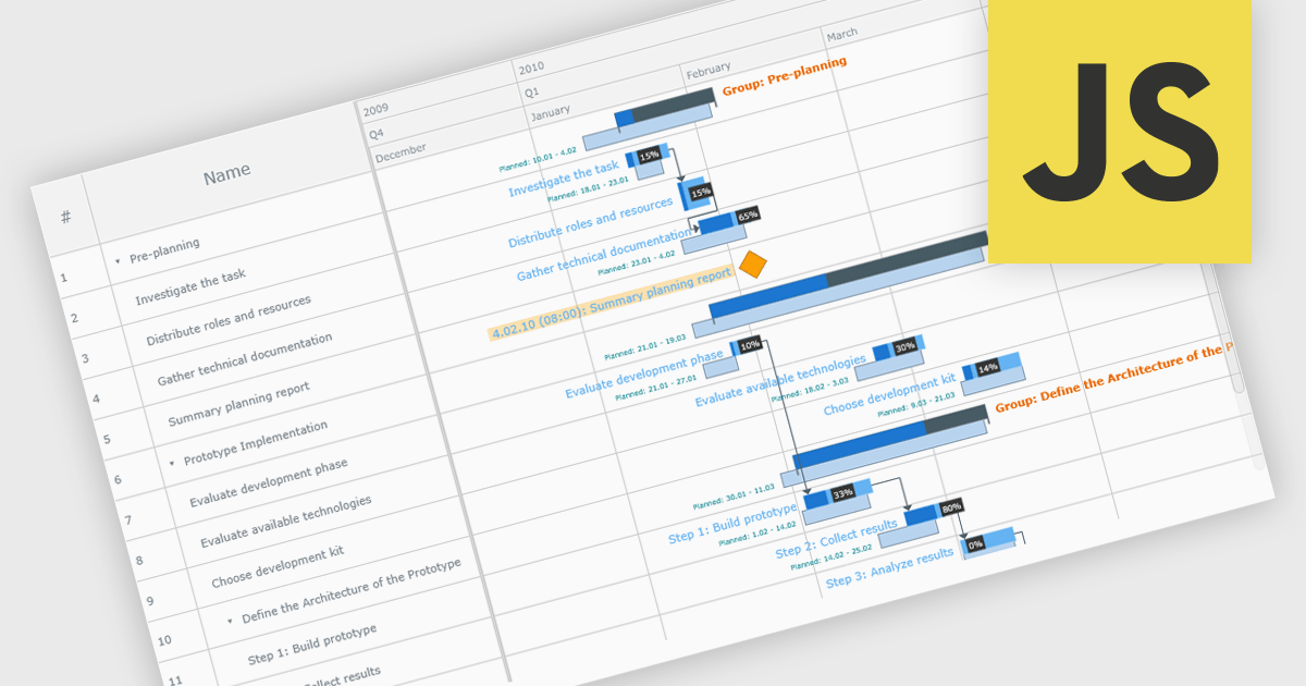
A Gantt chart is a visual project management tool that displays tasks or activities along a timeline, allowing teams to see the start and end dates, duration, and dependencies of each task within a project. Typically represented as horizontal bars across a calendar-based axis, Gantt charts provide a clear overview of project progress and help identify potential bottlenecks or scheduling conflicts. Gantt charts improve planning, scheduling, team coordination, and stakeholder transparency by clearly organizing tasks and timelines. They are especially valuable in complex projects, offering both macro and micro views to support informed decision-making and efficient execution.
Several JavaScript chart controls provide Gantt charts including:
For an in-depth analysis of features and price, visit our JavaScript chart controls comparison.
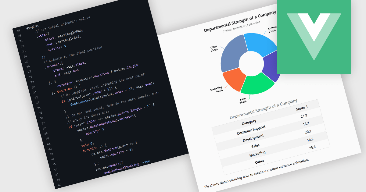
Animation in charts is a feature used in data visualization to visually transition between different data states or configurations. This technique helps communicate changes in data over time or between user interactions in a smooth, progressive manner. Rather than instantly switching from one state to another, animation introduces motion that can guide users’ attention, reinforce patterns, and reduce confusion. It is particularly useful in interactive dashboards and real-time analytics, where users benefit from a clearer understanding of what has changed and how.
Several Vue.js charting components support the use of animations, including:
For an in-depth analysis of features and price, visit our comparison of Vue.js chart components.
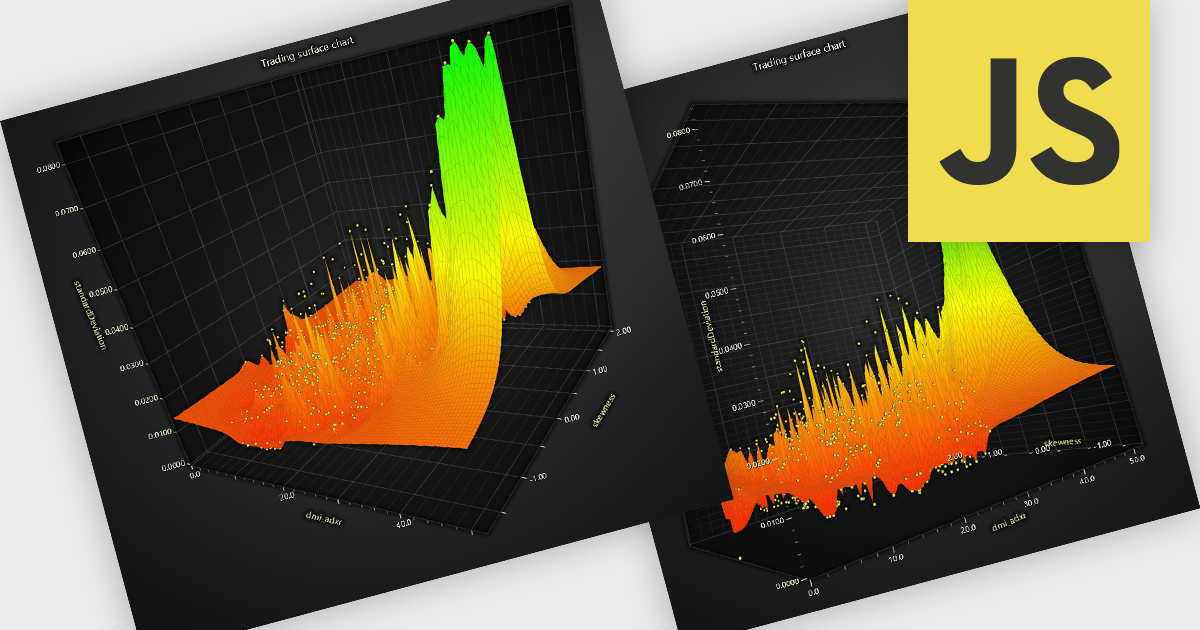
A surface chart is a powerful data visualization tool used to represent three-dimensional data, where the relationships between three numerical variables are plotted across a surface. By mapping values on the X, Y, and Z axes, and optionally applying dynamic color gradients to introduce a fourth variable, surface charts reveal patterns and correlations not easily detected in 2D charts. This makes them particularly valuable in fields such as engineering, scientific research, and finance. The ability to interpret multiple data dimensions simultaneously enables clearer insights and supports more informed, data-driven decisions.
Several JavaScript chart controls offer Surface Charts including:
For an in-depth analysis of features and price, visit our JavaScript chart controls comparison.
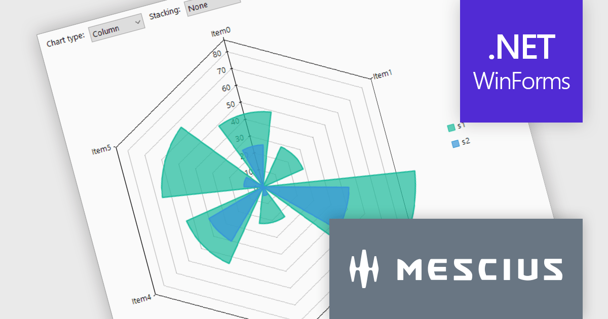
ComponentOne Studio WinForms by MESCIUS is a comprehensive toolkit offering over 120 advanced UI components to streamline Windows Forms application development. It empowers you to build visually appealing and feature-rich applications with functionalities like data visualization through charts and reports, intuitive data editing with performant grids, and modern UI elements including ribbons and docking for a user-friendly experience.
The ComponentOne Studio WinForms v2025 v1 update enhances its FlexChart control by introducing a new Column Radar chart type. FlexRadar now supports Column chart types with stacking options. This addition allows developers to visualize multivariate data in a more structured and intuitive format, particularly for applications requiring radial data representation such as wind rose charts. By aligning columns radially and enabling stacking, the chart makes it easier to compare the magnitude and distribution of values across categories, helping users identify patterns and trends more effectively. This new chart type expands the flexibility of radar-based visualizations, making it a valuable tool for scientific, engineering, and environmental data analysis.
To see a full list of what's new in 2025 v1, see our release notes.
ComponentOne Studio WinForms is licensed per developer on a perpetual basis and includes a 12 month subscription. Priority Support is also available. See our ComponentOne Studio WinForms licensing page for full details.
Learn more on our ComponentOne Studio WinForms product page.
联系电话: (888) 850 9911
传真: +1 770 250 6199


