













官方供应商
我们作为官方授权经销商,直接提供超过200家开发厂家所发行超过1000个的产品授权给您。
查看我们的所有品牌。
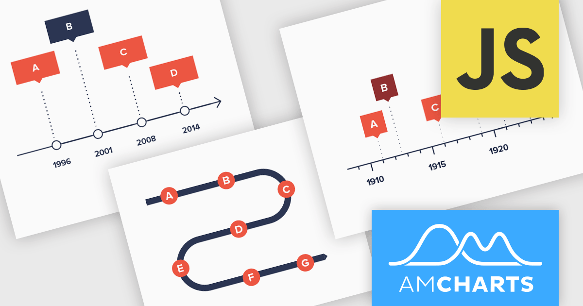
amCharts: Charts is a versatile and user-friendly JavaScript library designed for seamless data visualization across a wide range of applications. This ready-made solution helps users to integrate interactive charts without the need to learn complex new technologies. Featuring built-in support for TypeScript and ES6 modules, amCharts: Charts offers full compatibility with popular front-end frameworks such as Angular, React, and Vue.js. Its flexibility and ease of use make it an ideal choice for developers seeking a powerful yet simple drop-in solution to create engaging and informative data visualizations for dashboards and data analytics.
The amCharts 5.12.0 update introduces a new Timeline chart type, providing developers with a specialized component for visualizing linear datasets in a space-efficient manner. This chart facilitates the creation of two-dimensional plots that can be rendered along serpentine, spiral, or fully customized paths. By deviating from traditional linear axes, the Timeline chart offers a unique approach to presenting chronological or sequential data, potentially enhancing user engagement and providing alternative perspectives on data distribution without requiring complex configurations beyond standard XY chart principles. This new chart type inherits core functionalities from existing XY charts, ensuring a familiar development experience while offering a distinct visual representation option.
To see a full list of what's new in amCharts 5: Charts (version 5.12.0), see our release notes.
amCharts is licensed per developer on an annual or perpetual basis, with options for websites, SaaS and OEM distribution. See our amCharts 5: Charts licensing page for full details.
For more information, visit our amCharts 5: Charts product page.
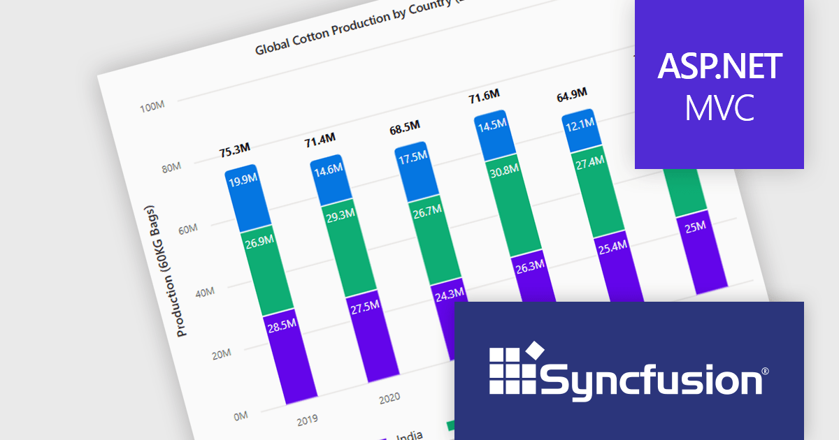
Syncfusion Essential Studio ASP.NET MVC (available as part of Syncfusion Essential Studio Enterprise) is a comprehensive suite of web UI controls that empowers developers to craft rich, interactive ASP.NET MVC applications. Backed by the lightweight and modular Essential JS 2 library, it offers over 80 components ranging from data grids and charts to schedulers and pivot grids, while ensuring a seamless integration with the MVC framework for an efficient development experience.
The Syncfusion Essential Studio ASP.NET MVC 2025 Volume 1 release introduces the ability to display cumulative totals directly within data labels on stacked charts. This enhancement provides immediate insight into the overall contributions of each category or series without requiring interaction or external calculations. By making the total visible at a glance, it improves data readability, supports faster decision making, and enhances dashboard usability, particularly in performance monitoring, financial reporting, and sales analysis applications.
To see a full list of what's new in 2025 Volume 1, see our release notes.
Syncfusion Essential Studio ASP.NET MVC is available as part of Syncfusion Essential Studio Enterprise which is licensed per developer starting with a Team License of up to five developers. It is available as a 12 Month Timed Subscription License which includes support and maintenance. See our Syncfusion Essential Studio Enterprise licensing page for full details.
Learn more on our Syncfusion Essential Studio ASP.NET MVC product page.
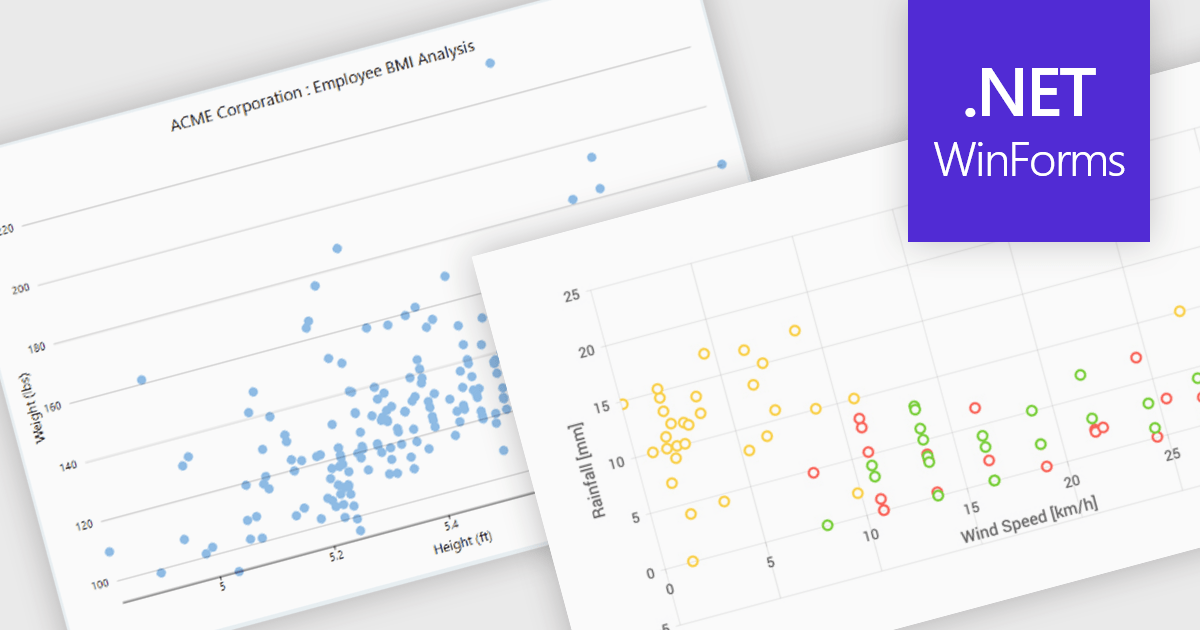
Scatter charts, also known as scatter plots or scatter diagrams, are fundamental visualization tools used to explore the relationship between two continuous variables by plotting data points, where each point's position is determined by its corresponding values for the two variables. This visual representation effectively reveals correlations and helps identify outliers, clusters, and the overall range and distribution of the data. The benefits of using scatter charts include their simplicity in conveying complex relationships, their ability to highlight anomalies that might be missed in tabular data, and their role as a precursor to more advanced statistical analyses like regression.
Several .NET WinForms chart controls offer scatter charts including:
For an in-depth analysis of features and price, visit our .NET WinForms chart controls comparison.
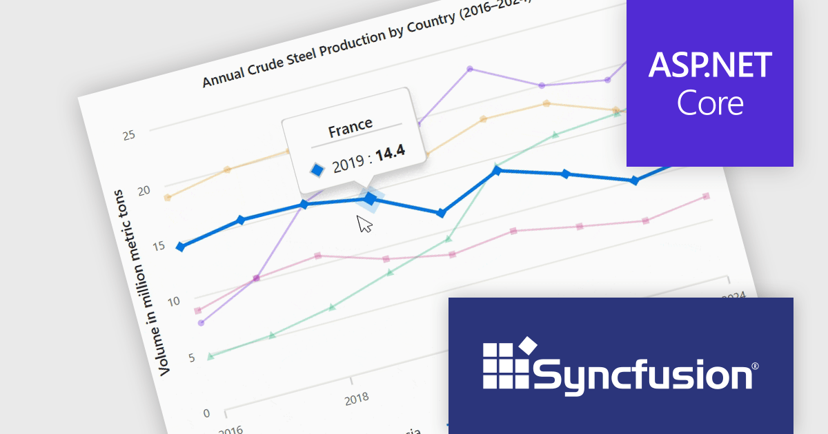
Syncfusion Essential Studio ASP.NET Core (available as part of Syncfusion Essential Studio Enterprise) empowers developers with a comprehensive suite of over 80 enterprise-grade UI components specifically designed for building modern and highly functional web applications. Leveraging the latest advancements in ASP.NET Core, it offers exceptional performance and scalability, streamlining development by eliminating the need for extensive custom coding. From data visualization tools like interactive charts and grids to sophisticated navigation elements and responsive layouts, Essential Studio equips developers with the building blocks to create rich user experiences, improve application efficiency, and accelerate time-to-market.
The Syncfusion Essential Studio ASP.NET Core 2025 Volume 1 release improves the chart component by adding tooltip functionality that displays information about the data point closest to the cursor. This feature allows users to quickly interpret complex datasets without needing to manually search for specific values, making interactions more intuitive and efficient. Especially in dense data plots or interactive dashboards, this real-time feedback enables deeper insight and more precise decision-making, which is critical in applications involving financial data, scientific analysis, or operational monitoring.
To see a full list of what's new in 2025 Volume 1, see our release notes.
Syncfusion Essential Studio ASP.NET Core is available as part of Syncfusion Essential Studio Enterprise which is licensed per developer starting with a Team License of up to five developers. It is available as a 12 Month Timed Subscription License which includes support and maintenance. See our Syncfusion Essential Studio Enterprise licensing page for full details.
Learn more on our Syncfusion Essential Studio ASP.NET Core product page.
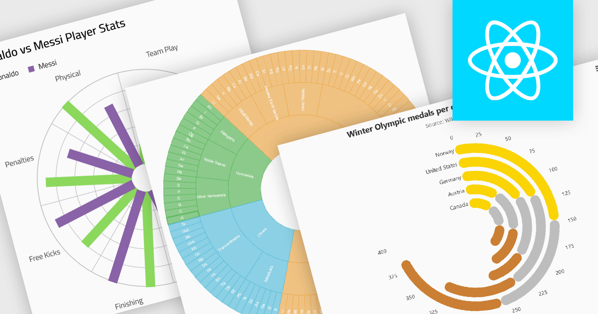
Radial charts provide an intuitive way to visualize hierarchical and categorical data. They display bars on a polar coordinate system instead of a cartesian system, which uses an x-y grid for positioning data. These charts represent values in a circular layout, making it ideal for comparing proportions and relationships between data points. Circular bar charts, a variation of the traditional bar chart, arrange data in a radial format for displaying comparisons between categories. They are particularly useful for visualizing periodic or cyclical data, such as time-based metrics. Sunburst charts break down hierarchical structures into concentric rings. The center of the chart typically represents the root category, while outer rings depict subcategories. These are used for visualizing part-to-whole relationships within a dataset.
Several React chart controls offer radial charts including:
For an in-depth analysis of features and price, visit our React chart controls comparison.
联系电话: (888) 850 9911
传真: +1 770 250 6199


