













官方供应商
我们作为官方授权经销商,直接提供超过200家开发厂家所发行超过1000个的产品授权给您。
查看我们的所有品牌。
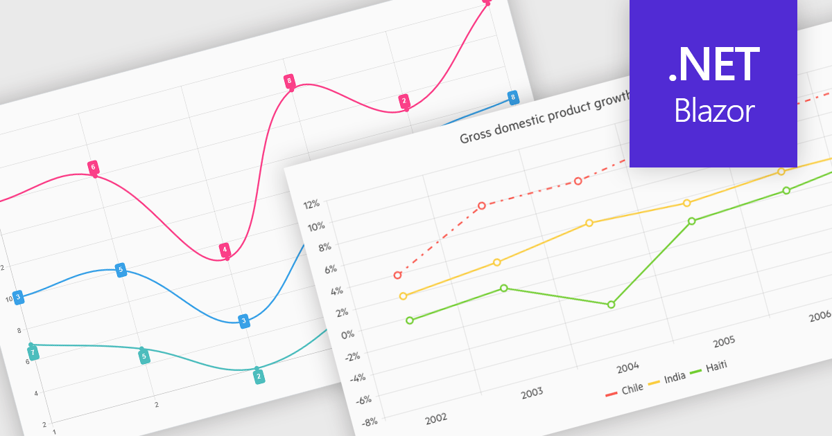
Line charts connect data points with lines to show how values change over a continuous scale, usually time. They make it easy to reveal long-term trends, seasonal patterns and sudden shifts while comparing multiple series on the same axes. Common applications include tracking stock prices, monitoring website traffic, analyzing climate data and comparing regional sales to guide business strategy. By highlighting progression and anomalies without clutter, line charts help turn raw numbers into clear, actionable insights.
Several .NET Blazor Chart Controls offer support for line charts including:
For an in-depth analysis of features and price, visit our comparison of .NET Blazor Chart Controls.
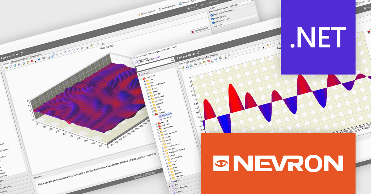
NOV Chart for .NET by Nevron is a comprehensive .NET charting component suite designed for cross-platform application development. It offers an array of 2D and 3D chart types, along with smart data labeling, an advanced chart axes model, numerous interactivity features and GPU-accelerated real-time rendering based on OpenGL. This library allows developers to seamlessly integrate rich, dynamic and interactive business, scientific, financial and presentation data visualizations into their .NET applications for more effective communication.
The NOV Chart for .NET 2025.1 update introduces Fast Bar, Fast Line, and Fast Point series that leverage GPU acceleration to deliver real-time visualization of extremely large datasets, enabling developers to render millions of data points with minimal latency in both 2D and 3D contexts and apply per-point color information for detailed analysis. By offloading heavy rendering tasks to the GPU, these new series reduce CPU overhead and free resources for other application logic, making them particularly valuable in scientific, engineering, and medical scenarios where high-throughput data streams must be displayed without delay.
To see a full list of what's new in 2025.1, see our release notes.
NOV Chart for .NET is licensed per developer and is available as a perpetual license with 1 year support and maintenance. See our NOV Chart for .NET licensing page for full details.
NOV Chart for .NET is available in the following products:
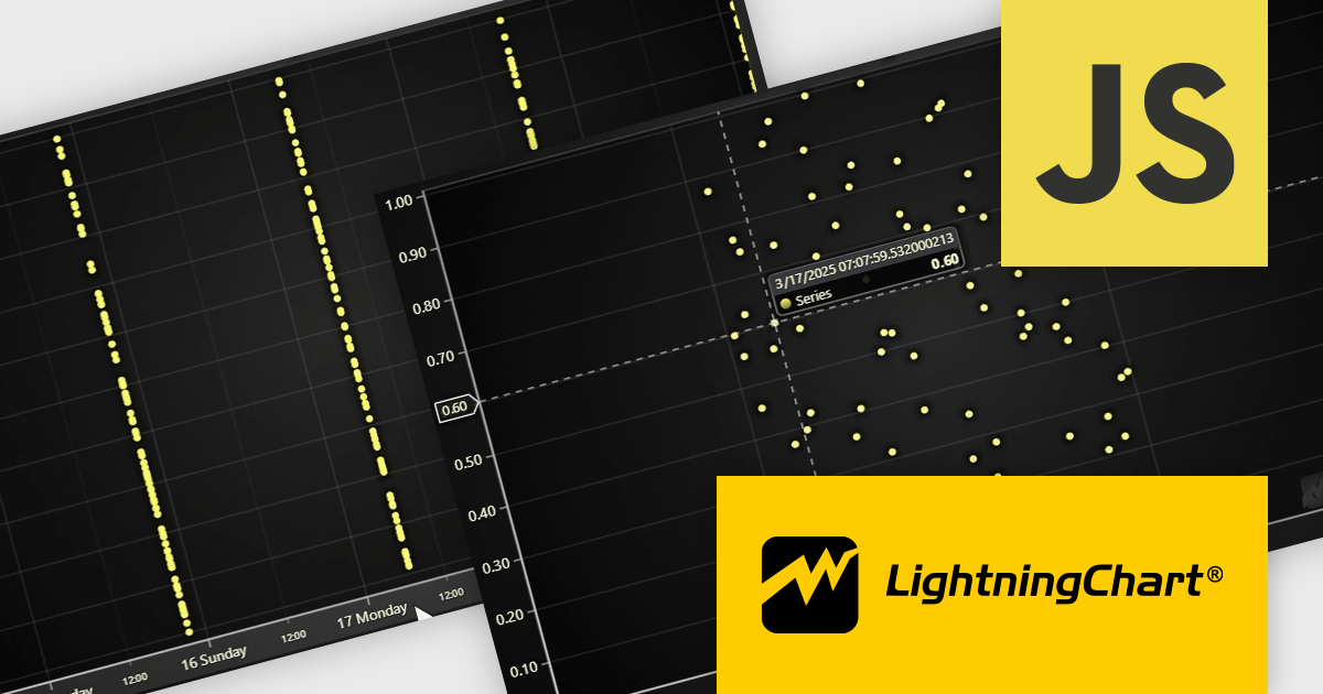
LightningChart JS is a JavaScript/TypeScript library developed by LightningChart that is particularly well-suited for data-intensive visualizations, offering exceptionally fast rendering capabilities thanks to its use of WebGL. This makes it a strong choice for applications that require real-time data updates, such as financial platforms, engineering tools, scientific research dashboards, and industrial monitoring systems. It provides high-performance, 2D, 3D, and real-time charting controls and a comprehensive suite of visualizations including candlestick, bar, line, and various technical indicators and drawing tools. This library enables software developers to craft interactive technical analysis tools without the need for server-side setup as it runs completely on the client device.
The LightningChart JS v7.1 update enhances its Date-Time axis capabilities by introducing support for nanosecond-resolution timestamps, allowing users to zoom into microsecond and nanosecond ranges for more granular time-based data analysis—well beyond the previous millisecond limitations. To utilize this feature, timestamps should generally be supplied as BigInt64. This update positions LightningChart JS among the few web charting libraries explicitly supporting nanosecond precision, making it a strong choice for applications requiring high-resolution temporal data visualization.
To see a full list of what's new in v7.1, see our release notes.
LightningChart JS is licensed per developer and is available as an annual license with 1 year support. See our LightningChart JS licensing page for full details.
For more information, see our LightningChart JS product page.
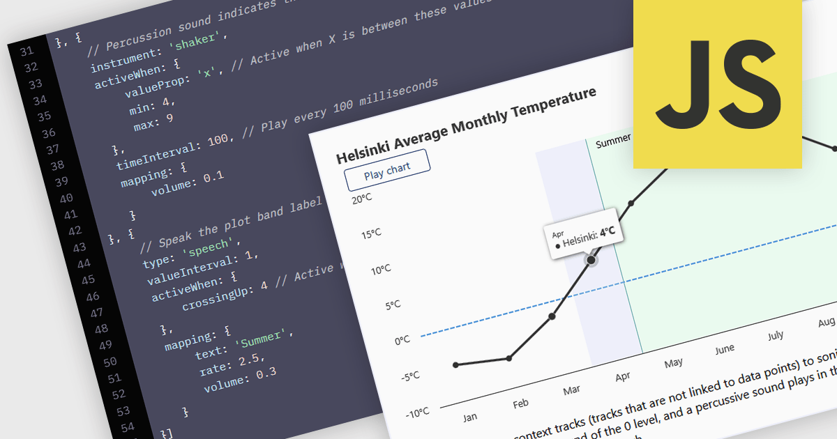
WCAG (Web Content Accessibility Guidelines) compliance in JavaScript charts ensures that visual data representations are accessible to all users, including those with disabilities. This involves implementing features such as semantic markup for assistive technologies, keyboard navigation support, high-contrast color schemes for users with visual impairments, and descriptive alternative text for charts and data points. Additionally, it may include providing data tables or summaries as textual alternatives and ensuring that interactive elements are operable without reliance on a mouse. Achieving WCAG 2.0 compliance enhances usability, meets legal accessibility standards, and promotes inclusive user experiences across web applications.
Several JavaScript chart controls offer WCAG compliance including:
For an in-depth analysis of features and price, visit our comparison of JavaScript Chart Controls.
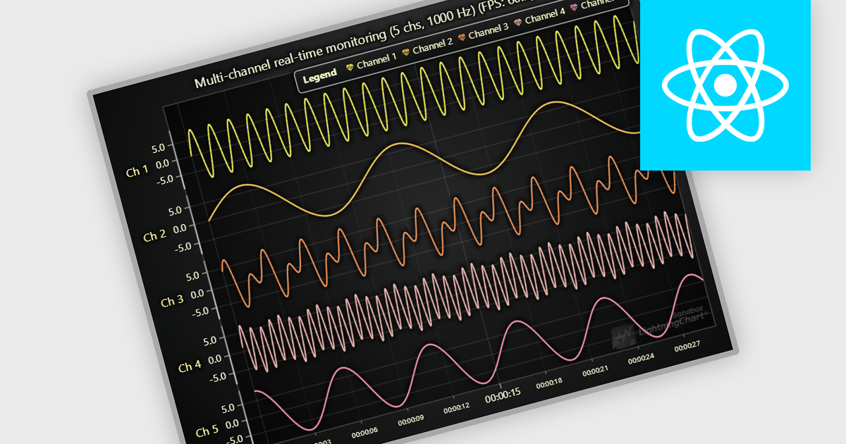
JavaScript API as a data source in React JavaScript Charts refers to the use of custom JavaScript functions or services that fetch and supply data dynamically to chart components at runtime, rather than relying on static datasets. This approach enables charts to reflect real-time data changes, support asynchronous operations, and integrate with external APIs or internal services. It is particularly useful for applications that require up-to-date information, such as dashboards, monitoring tools, or analytics platforms. The key advantage is enhanced flexibility and responsiveness, allowing developers to handle complex data flows, perform live updates, and tailor chart behavior based on interactive or conditional logic.
Several React Chart Controls offer support for using JavaScript API as a data source including:
For an in-depth analysis of features and price, visit our comparison of React Chart Controls.
联系电话: (888) 850 9911
传真: +1 770 250 6199


