













官方供应商
我们作为官方授权经销商,直接提供超过200家开发厂家所发行超过1000个的产品授权给您。
查看我们的所有品牌。
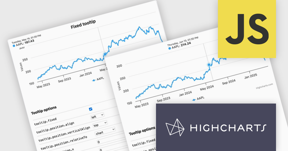
Highcharts is a JavaScript charting framework that allows web developers and data analysts to generate dynamic, visually appealing charts and graphs for websites and web applications. It can display a variety of chart types, including line, spline, area, column, bar, pie, scatter, and many more. Highcharts is well-known for its ease of use, rich documentation, and ability to handle huge datasets efficiently. Features include responsive design, accessibility support, and cross-browser compatibility. Its customization capabilities allow users to create bespoke data visualizations that increase engagement and provide insightful data presentations.
The Highcharts v12.2.0 release introduces a new Tooltip Positioning capability that lets you control tooltip placement directly through configuration, without writing any custom JavaScript. With the new tooltip.fixed and tooltip.position options, you can easily set fixed positions for tooltips and define exactly where they should appear on the chart. This enhancement simplifies layout management, reduces implementation time, and ensures a cleaner, more consistent user experience across your data visualizations.
To see a full list of what's new in v12.2.0, see our release notes.
Highcharts Core is licensed on an annual or perpetual basis, OEM licenses, and Advantage Renewals. It is licensed per Developer and has several license options including Internal, SaaS, SaaS+, and Self Hosted. See our Highcharts Core licensing page for full details.
Learn more on our Highcharts Core product page.
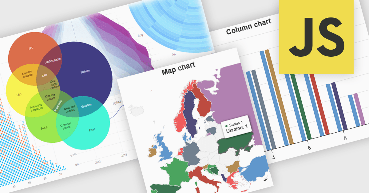
High contrast charts use distinct and contrasting color palettes within data visualizations to improve clarity, particularly for individuals with visual impairments. This involves choosing colors with noticeably different hues and brightness for elements such as lines, bars, labels, and backgrounds, so that differences in data are easy to spot. These charts improve data understanding, make information accessible to more people, reduce eye strain for some users, and support accessibility standards. They are useful in many areas, such as financial reports, scientific papers and public health dashboards that must be clear and designed for a everyone regardless of visual ability.
Several JavaScript charting components provide accessible high contrast features, including:
For an in-depth analysis of features and price, visit our JavaScript chart components comparison.
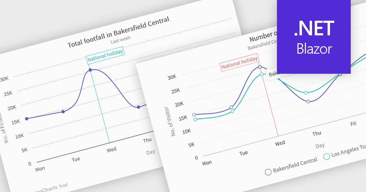
Spline charts are a type of line graph that displays continuous data points connected by smooth, curved lines, offering a visually fluid representation of trends and changes over time. This smoothing effect helps to highlight the overall trajectory of the data and can provide estimations of values between plotted points. Multi-Series Spline Charts extend this functionality by plotting multiple related datasets on the same graph, enabling direct visual comparison of their trends and the identification of correlations or divergences.
Several .NET Blazor chart controls offer spline charts including:
For an in-depth analysis of features and price, visit our .NET Blazor chart controls comparison.

ComponentSource's expertise and global reach have significantly expanded the worldwide accessibility of FusionCharts' data visualization solutions. By leveraging ComponentSource's established distribution network and multilingual support, FusionCharts has connected with a broader international audience of developers and organizations across diverse industries and geographical locations, enabling them to enhance their applications with compelling data insights.
This 5 year partnership between ComponentSource and FusionCharts reflects a shared dedication to empowering developers with best-in-class tools, acknowledging the role of effective data visualization in modern applications. Through this partnership, ComponentSource has played a key role in making FusionCharts flagship product FusionCharts Suite XT more accessible to a global audience.
Now marking 5 years of working together, ComponentSource and FusionCharts are continuing to build on their collaboration. As demand grows for tools that help developers deliver more data-driven and visually rich applications, the partnership remains focused on improving access and simplifying procurement for teams everywhere.
As we celebrate this milestone, we look forward to strengthening our partnership and continuing to provide developers with the tools they need to succeed.
For more information, visit our FusionCharts brand page.
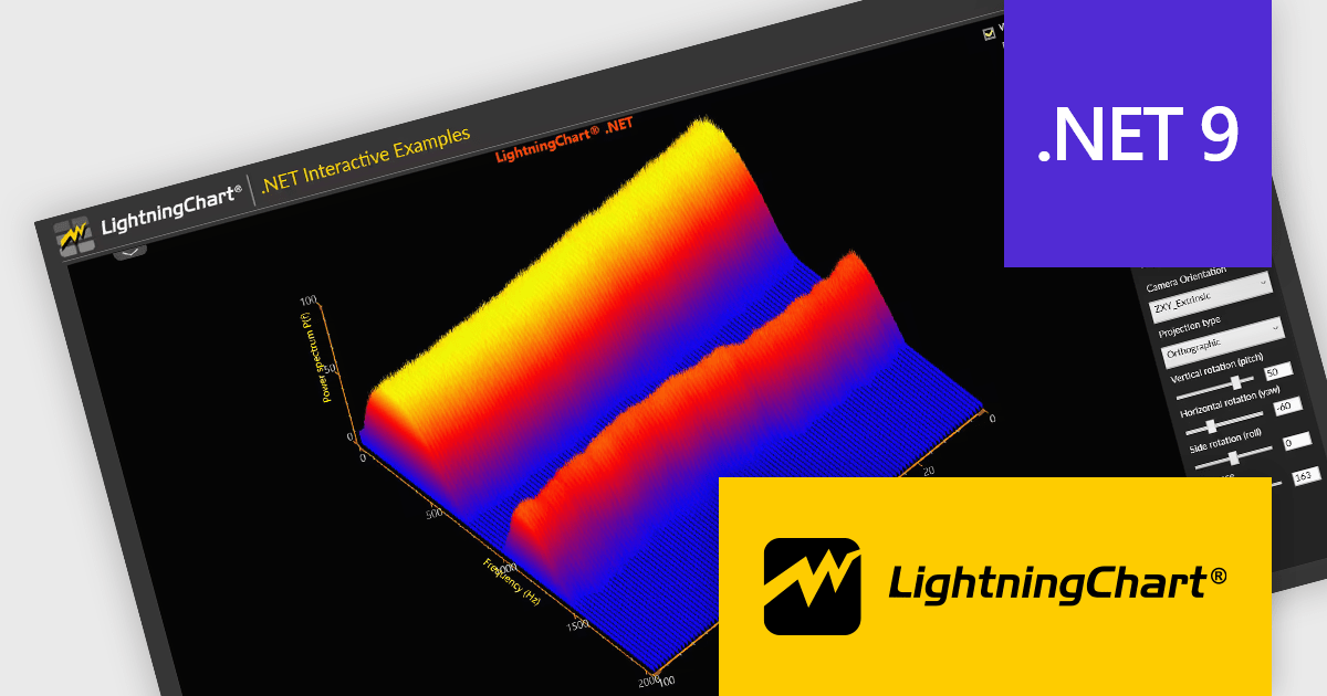
LightningChart .NET is a high-performance data visualization library designed for .NET developers working with WPF, WinForms, and UWP applications. It offers GPU-accelerated rendering for smooth real-time visualization of massive datasets, exceeding billions of data points. This library supports a wide variety of chart types, including 2D, 3D, polar, and geographic maps, along with extensive customization options for each. LightningChart .NET is a powerful tool for developers creating demanding data visualization applications requiring exceptional performance.
The LightningChart .NET v12.2.1 update adds support for .NET 9. This brings a significant performance and compatibility boost to developers building high-performance data visualization applications. By aligning with the latest version of the .NET platform, LightningChart ensures developers can take advantage of modern language features, improved memory management, and enhanced runtime performance. This results in faster chart rendering, lower latency in data updates, and better responsiveness in UI-heavy applications.
To see a full list of what's new in v12.2.1, see our release notes.
LightningChart .NET is available per developer in packages for either WPF, WinForms, UWP or all 3. Each package comes as a subscription license (with 1 or 2 years of limited support), or a perpetual license (with 1 or 2 years of Standard or Premium support). Floating licenses and site licenses are available upon request. See our LightningChart .NET licensing page for full details.
Learn more on our LightningChart .NET product page.
联系电话: (888) 850 9911
传真: +1 770 250 6199


