













官方供应商
我们作为官方授权经销商,直接提供超过200家开发厂家所发行超过1000个的产品授权给您。
查看我们的所有品牌。
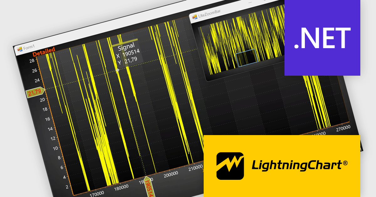
LightningChart .NET is a high-performance data visualization library designed for .NET developers working with WPF, WinForms, and UWP applications. It offers GPU-accelerated rendering for smooth real-time visualization of massive datasets, exceeding billions of data points. This library supports a wide variety of chart types, including 2D, 3D, polar, and geographic maps, along with extensive customization options for each. LightningChart .NET is a powerful tool for developers creating demanding data visualization applications requiring exceptional performance.
The LightningChart .NET v12.4.1 update enhances data visualization and navigation, allowing developers to display an overview of the entire dataset alongside a zoomed-in chart view - improving context awareness when analyzing large or complex data. The new LiteZoomBar offers a lightweight, memory-efficient alternative for applications requiring optimized performance. This tool provides greater control and efficiency in exploring and interpreting chart data.
To see a full list of what's new in v12.4.1, see our release notes.
LightningChart .NET is available per developer in packages for either WPF, WinForms, UWP or all 3. Each package comes as a subscription license (with 1 or 2 years of limited support), or a perpetual license (with 1 or 2 years of Standard or Premium support). Floating licenses and site licenses are available upon request. See our LightningChart .NET licensing page for full details.
Learn more on our LightningChart .NET product page.
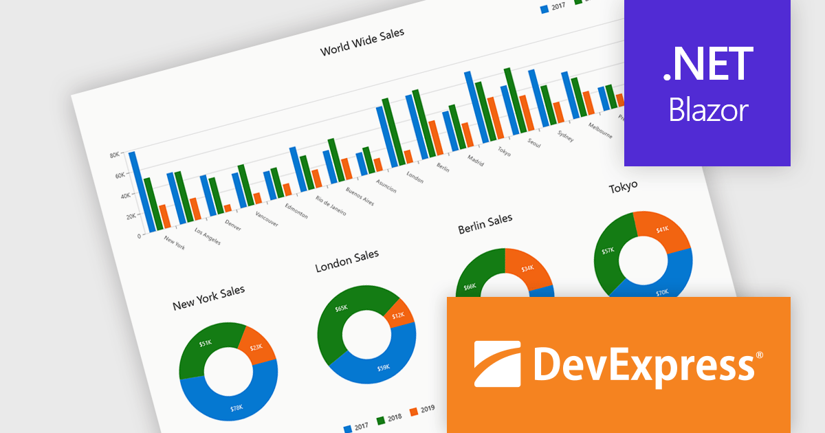
DevExpress Blazor (part of DevExpress ASP.NET and Blazor) helps you create high-impact user experiences for both Blazor Server and Blazor WebAssembly using C#. The Blazor UI Component Library ships with a comprehensive set of native components (including a DataGrid, Pivot Grid, Scheduler, Chart, Data Editors and Reporting).
DevExpress Blazor provide comprehensive chart types that allow developers to present data in the most effective and readable format for any scenario. With support for a wide range of 2D chart options, including standard, stacked, and financial views, developers can accurately visualize trends, comparisons, and relationships within their applications. These charts integrate seamlessly into interactive dashboards, enabling real-time data analysis and clear visual storytelling. The flexibility of the chart types ensures precise data representation, while built-in export capabilities simplify sharing insights across platforms and reports, supporting the creation of professional, data-driven interfaces with minimal effort.
DevExpress ASP.NET and Blazor is licensed per developer and is available as a Perpetual License with a 12 month support and maintenance subscription. See our DevExpress ASP.NET and Blazor licensing page for full details.
DevExpress Blazor is available in the following products:

LightningChart Python is a high-performance visualization library designed for real-time analytics and large-scale data rendering. Utilizing GPU acceleration and WebGL, it efficiently processes millions of data points in 2D and 3D with smooth, interactive visuals. Some example chart types include Line graphs, Scatter plots, Heatmaps, Area plots, Box plots, 3D Surface graphs and Mesh plots, and it supports UI elements such as CustomTicks, interval Bands and Constant Lines. It seamlessly integrates with Python’s data ecosystem, including numpy, pandas, and GUI frameworks like PyQt and PySide, making it a powerful tool for interactive dashboards, financial analytics, scientific simulations, and engineering applications.
The LightningChart Python v2.0 update introduces flexible legend positioning, giving developers precise control over where legends appear within their charts. This enhancement allows legends to be placed above, below, beside, or inside the chart area, enabling better use of available space and improved readability across different layouts. By adapting legend placement to suit varying screen sizes, data densities, and design requirements, developers can create cleaner, more efficient visualizations that align seamlessly with their application’s user interface and presentation goals.
To see a full list of what's new in v2.0, see our release notes.
LightningChart Python offers two licensing options: the subscription-based Data Scientist License for internal, non-public facing usage and the perpetual, per-seat Software Developer License for commercial use with professional support and deployment keys. Both licenses allow one active session per user, with developer licenses assigned individually. See our LightningChart Python licensing page for full details.
For more information, see our LightningChart Python product page.
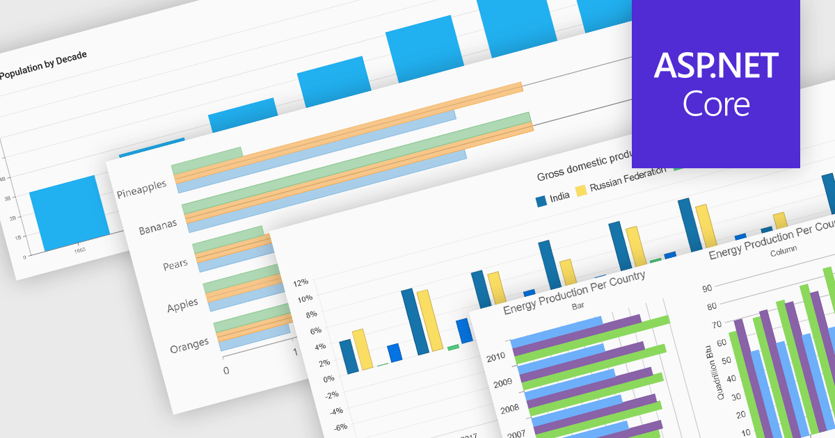
Column and bar charts form fundamental visualization tools in many charting suites. These chart types use vertical (column) or horizontal (bar) bars to represent quantitative data across categories, making them ideal for straightforward comparisons. Typically, you can display single or multiple series, stack values to show cumulative totals, or group categories to highlight differences. Their simplicity and clarity make column and bar charts a staple in dashboards, business reports, and analytics applications where rapid insight is required.
Several ASP.NET Core chart controls offer support for column & bar charts including:
For an in-depth analysis of features and price, visit our ASP.NET Core chart controls comparison.
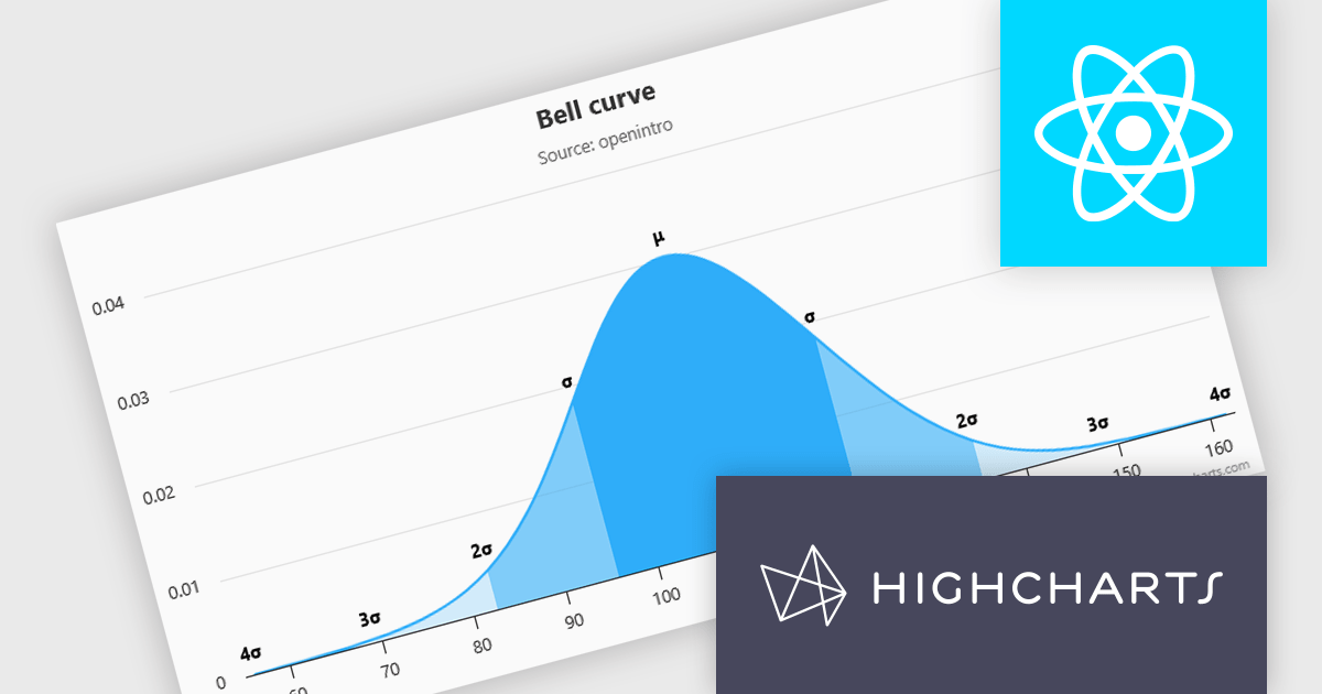
Highcharts is a JavaScript charting framework that allows web developers and data analysts to generate dynamic, visually appealing charts and graphs for websites and web applications. It can display a variety of chart types, including line, spline, area, column, bar, pie, scatter, and many more. Highcharts is well-known for its ease of use, rich documentation, and ability to handle huge datasets efficiently. Features include responsive design, accessibility support, and cross-browser compatibility. Its customization capabilities allow users to create bespoke data visualizations that increase engagement and provide insightful data presentations.
Highcharts has introduced a major update for React developers, focusing on a smoother and more natural experience when working with charts in React applications. The newly refined API now mirrors common React patterns, allowing developers to write less boilerplate and avoid workarounds. Integration is more seamless too - custom React components can be passed directly into chart configurations, enabling dynamic, reusable elements like tooltips and data-fetching containers without resorting to hacks. The update also brings full support for ECMAScript Modules (ESM), aligning with modern JavaScript standards and enabling better build optimization. With this release, Highcharts continues to provide a comprehensive set of chart types, from basic line graphs to advanced stock visualizations, all within a React-friendly environment.
Highcharts Core is licensed on an annual or perpetual basis, OEM licenses, and Advantage Renewals. It is licensed per Developer and has several license options including Internal, SaaS, SaaS+, and Self Hosted. See our Highcharts Core licensing page for full details.
Learn more on our Highcharts Core product page.
联系电话: (888) 850 9911
传真: +1 770 250 6199


