可視化資料集的分佈

1月 25, 2024
將箱形圖合併到您的 Blazor 應用中,以揭示有關趨中誤差、擴散和潛在異常值的關鍵見解。

繼續用英語閱讀:

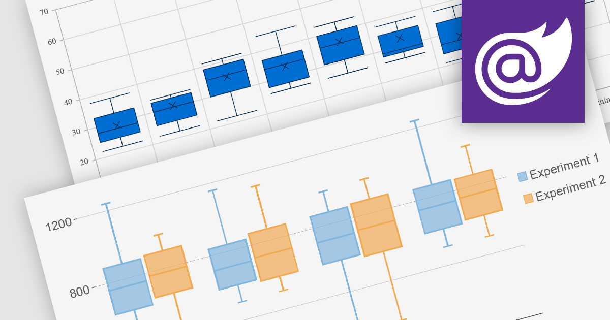
Box plots, also known as box-and-whisker plots, are used to display the distribution of a dataset. They show the median, quartiles, and extremes of the data, providing a quick visual summary of the data's central tendency and variability. This makes them particularly useful for statistical analysis and comparing data across categories.

Several Blazor chart controls offer Box plots including:

  • Syncfusion Blazor Chart (part of Syncfusion Essential Studio Enterprise) offers in-depth customization for box plots with quartile ranges, outlier styles, and box appearances.
  • ComponentOne Charts for Blazor (part of ComponentOne Studio Blazor Edition) simplifies box plot creation with notched whiskers and error bars for enhanced data insights.
  • TeeChart Blazor by Steema Software empowers you to visually explore data distribution through flexible box plot configurations and interactive zooming capabilities.
  • NOV Chart for .NET by Nevron delivers advanced box plot functionalities, enabling detailed analysis of data quartiles and outliers for deeper understanding.

For an in-depth analysis of features and price, visit our Blazor chart controls comparison.

Compare Blazor Chart Controls