


官方供應商
我們作為官方授權經銷商,直接提供超過200家開發廠家所發行超過1000個的產品授權給您。
請參閱我們所有的品牌。
繼續用英語閱讀:
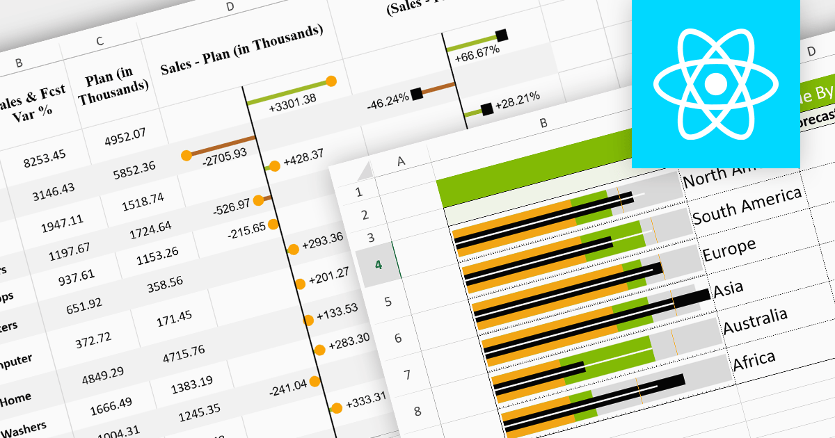
Sparklines are miniature charts embedded within the cells of a spreadsheet. Their compact size allows for dense visualizations, revealing trends and patterns in large datasets without sacrificing valuable screen space. Placed directly beside their corresponding data, they facilitate immediate comparisons and insights, enhancing understanding and communication. Their flexible nature allows for diverse chart types, from lines highlighting trends to columns showcasing comparisons, making them adaptable to various data presentations.
Here are some React spreadsheet controls that offer sparkline functionality:
For an in-depth analysis of features and price, visit our comparison of React spreadsheet controls.
聯繫電話: (888) 850 9911
傳真: +1 770 250 6199


