


官方供應商
我們作為官方授權經銷商,直接提供超過200家開發廠家所發行超過1000個的產品授權給您。
請參閱我們所有的品牌。
繼續用英語閱讀:
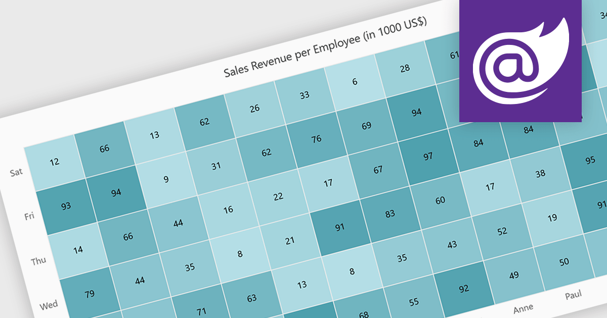
A heatmap is a data visualization tool that uses color intensity to represent magnitude within a dataset. This allows for quick identification of patterns and trends across two variables, depicted on the map's axes. Heatmaps are valuable for analyzing geographic data, user website interaction, and any other scenario where you need to visually grasp the distribution of data points.
Several Blazor chart controls offer Heatmaps including:
For an in-depth analysis of features and price, visit our Blazor chart controls comparison.
聯繫電話: (888) 850 9911
傳真: +1 770 250 6199


