


官方供應商
我們作為官方授權經銷商,直接提供超過200家開發廠家所發行超過1000個的產品授權給您。
請參閱我們所有的品牌。
繼續用英語閱讀:
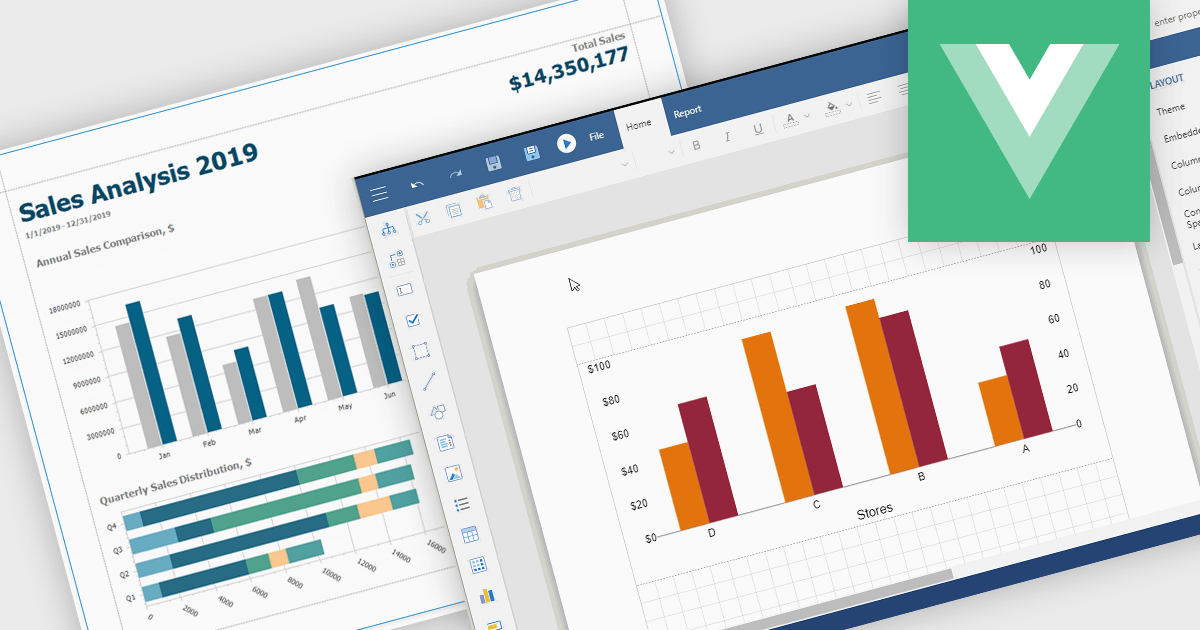
Charts in reports are graphical representations of data such as bar graphs, line charts and pie diagrams that are incorporated into business documents to illustrate key insights and trends at a glance. By converting numbers into intuitive visuals, charts improve clarity and make comparisons between categories or time periods effortless while drawing attention to critical metrics like sales growth, customer churn or budget variances. These visual tools streamline data interpretation, empower stakeholders to make faster more informed decisions, foster alignment across departments and tell a cohesive data driven story without wading through rows of figures.
Several Vue.js reporting components support charts including:
For an in-depth analysis of features and price, visit our Vue.js Reporting Components comparison.
聯繫電話: (888) 850 9911
傳真: +1 770 250 6199


