


官方供應商
我們作為官方授權經銷商,直接提供超過200家開發廠家所發行超過1000個的產品授權給您。
請參閱我們所有的品牌。
繼續用英語閱讀:
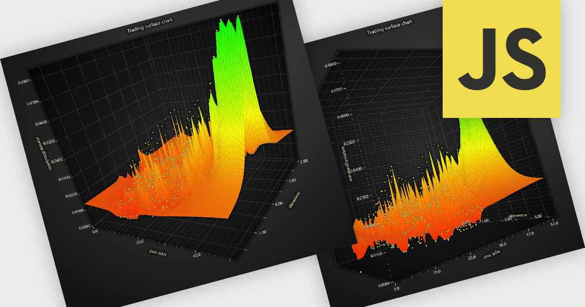
A surface chart is a powerful data visualization tool used to represent three-dimensional data, where the relationships between three numerical variables are plotted across a surface. By mapping values on the X, Y, and Z axes, and optionally applying dynamic color gradients to introduce a fourth variable, surface charts reveal patterns and correlations not easily detected in 2D charts. This makes them particularly valuable in fields such as engineering, scientific research, and finance. The ability to interpret multiple data dimensions simultaneously enables clearer insights and supports more informed, data-driven decisions.
Several JavaScript chart controls offer Surface Charts including:
For an in-depth analysis of features and price, visit our JavaScript chart controls comparison.
聯繫電話: (888) 850 9911
傳真: +1 770 250 6199


