


官方供應商
我們作為官方授權經銷商,直接提供超過200家開發廠家所發行超過1000個的產品授權給您。
請參閱我們所有的品牌。
繼續用英語閱讀:
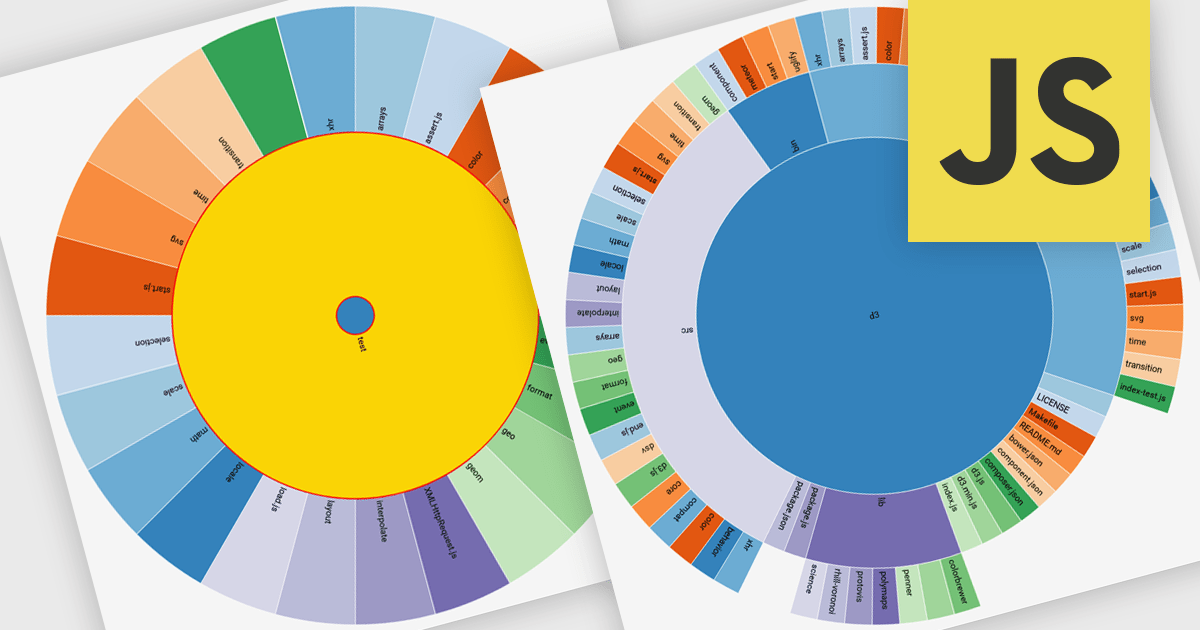
Radial charts are circular data visualizations used to represent hierarchical, proportional, or cyclical data. A key type is the sunburst chart, which displays multi-level hierarchies using concentric rings, where each ring represents a level and each segment shows a category or subcategory. This format helps users quickly grasp both structure and proportion. Sunburst charts are ideal for exploring complex data in a compact space and are commonly used for visualizing organizational charts, file systems, website structures, and product categories. Their interactive format allows users to drill into data for deeper insight without losing context.
Several JavaScript charting components provide you with radial charts, including:
For an in-depth analysis of features and price, visit our JavaScript chart components comparison.
聯繫電話: (888) 850 9911
傳真: +1 770 250 6199


