


官方供應商
我們作為官方授權經銷商,直接提供超過200家開發廠家所發行超過1000個的產品授權給您。
請參閱我們所有的品牌。
繼續用英語閱讀:
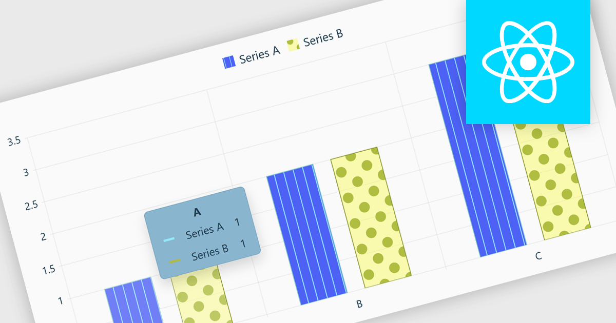
Chart tooltips in a charting component are interactive elements that display additional information about data points when users hover over or interact with a chart. They help software developers enhance data visualizations by providing detailed values, contextual insights, and comparisons on demand without cluttering the chart itself, improving usability, supporting more effective data analysis, and creating a more engaging user experience.
Several React chart controls offer tooltip support including:
For an in-depth analysis of features and price, visit our React chart controls comparison:
聯繫電話: (888) 850 9911
傳真: +1 770 250 6199


