


官方供應商
我們作為官方授權經銷商,直接提供超過200家開發廠家所發行超過1000個的產品授權給您。
請參閱我們所有的品牌。
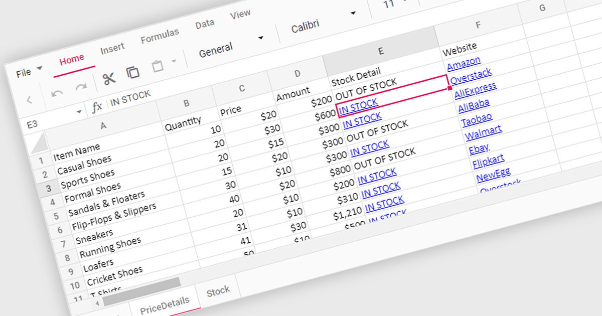
Hyperlink support in a spreadsheet control allows developers to integrate clickable links within cells. This functionality offers several advantages: users can seamlessly navigate to external web pages, reference internal documents within the spreadsheet itself (including across worksheets), and launch email compositions directly from specific cells. Hyperlink support enhances user experience by streamlining information access and promoting efficient data exploration within the spreadsheet.
Several React Spreadsheet controls offer Hyperlink support including:
For an in-depth analysis of features and price, visit our comparison of React Spreadsheet controls.
ONLYOFFICE Docs Enterprise Edition with Alfresco Connector combines an online document editor with a seamless integration for Alfresco Share, which is a content management platform that allows users to store, organize, and collaborate on documents and other digital assets. This integration allows teams to create, view, edit, and collaborate on spreadsheets, presentations, and text files online, directly within Alfresco Share using ONLYOFFICE editors, boosting efficiency and eliminating the need for file switching.
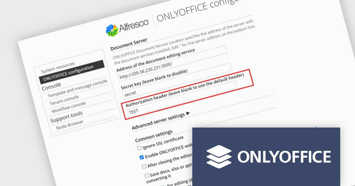
The ONLYOFFICE Alfresco Connector 7.0 update (available as part of ONLYOFFICE Docs Enterprise Edition with Alfresco Connector v8.0.1) adds advanced security options. It now uses JSON Web Token Secret and JSON Web Token Header to safeguard against unauthorized access, providing a higher level of protection. This release also gives administrators the flexibility to configure their own authorization headers directly on the editor's settings page, thereby offering a more tailored and secure document management experience.
To see a full list of what's new in ONLYOFFICE Docs Enterprise Edition v8.0.1 with Alfresco Connector 7.0, see our release notes.
ONLYOFFICE Docs Enterprise Edition with Alfresco Connector is licensed per server and is available as an annual license with 1 year of support and updates, or as a perpetual license with 3 years of support and updates. See our ONLYOFFICE Alfresco connector licensing page for full details.
For more information, see our ONLYOFFICE Alfresco connector product page.
ONLYOFFICE Docs Enterprise Edition with WordPress Connector combines an online document editor with a seamless integration for WordPress, which is a content management system for creating and managing websites. This allows teams to create, view, edit, and collaborate on spreadsheets, presentations, and text files online, directly within WordPress, boosting efficiency and eliminating the need for file switching.
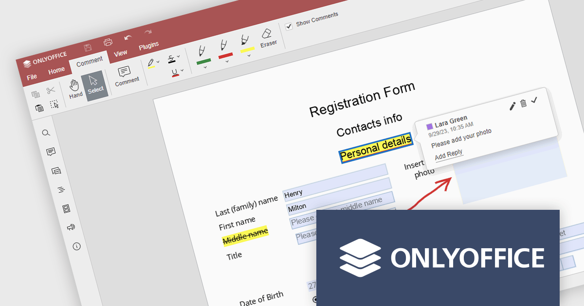
The ONLYOFFICE WordPress Connector 2.0.0 release (available as part of ONLYOFFICE Docs Enterprise Edition with WordPress Connector v8.0.1) brings the ability to open PDF files uploaded to your WordPress site directly within the admin dashboard for form filling and annotating using ONLYOFFICE Docs. You can fill out interactive fields, highlight, underline and strikethrough text, leave comments, and draw different objects and lines with the built-in drawing tools. By enabling seamless interactions with PDF documents directly within the platform and reducing the steps needed to edit or comment on PDF files, this capability streamlines document management workflows, optimizes productivity and eliminates the need for external software solutions.
To see a full list of what's new in ONLYOFFICE Docs Enterprise Edition v8.0.1 with WordPress Connector 2.0.0, see our release notes.
ONLYOFFICE Docs Enterprise Edition with WordPress Connector is licensed per server and is available as an annual license with 1 year of support and updates, or as a perpetual license with 3 years of support and updates. See our ONLYOFFICE WordPress connector licensing page for full details.
For more information, see our ONLYOFFICE WordPress connector product page.
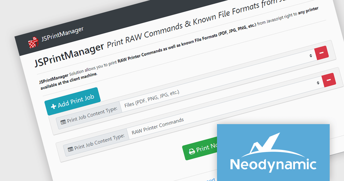
Neodynamic offers two JSPrintManager solutions for client-side printing and scanning in web applications. JSPrintManager for Any Web Platform allows you to integrate printing functionality into any website built with technologies like ASP.NET, PHP, or Blazor using pure JavaScript. Neodynamic also offers JSPrintManager for Blazor which enables you to seamlessly add printing capabilities to your Blazor server or WebAssembly projects with C# code. Both solutions empower you to print various data formats directly from the browser without requiring user interaction with print dialogs.
The Neodynamic JSPrintManager 7.0 releases add a new JS printerDeleteAllJobs function to delete all print jobs in a given printer queue. This enhances control over print queues directly from web applications, allowing developers to manage print jobs efficiently, particularly for scenarios where users might accidentally send multiple files or need to clear the queue before a critical print.
To see a full list of what's new in 7.0, see our release notes for JSPrintManager for Any Web Platform and JSPrintManager for Blazor.
Neodynamic JSPrintManager is licensed per Web App and Web server and is available as a Perpetual license which includes 1 year of free updates and priority support. See our Neodynamic JSPrintManager for Any Web Platform licensing page and Neodynamic JSPrintManager for Blazor licensing page for full details.
Learn more on our Neodynamic JSPrintManager for Any Web Platform and Neodynamic JSPrintManager for Blazor product pages.
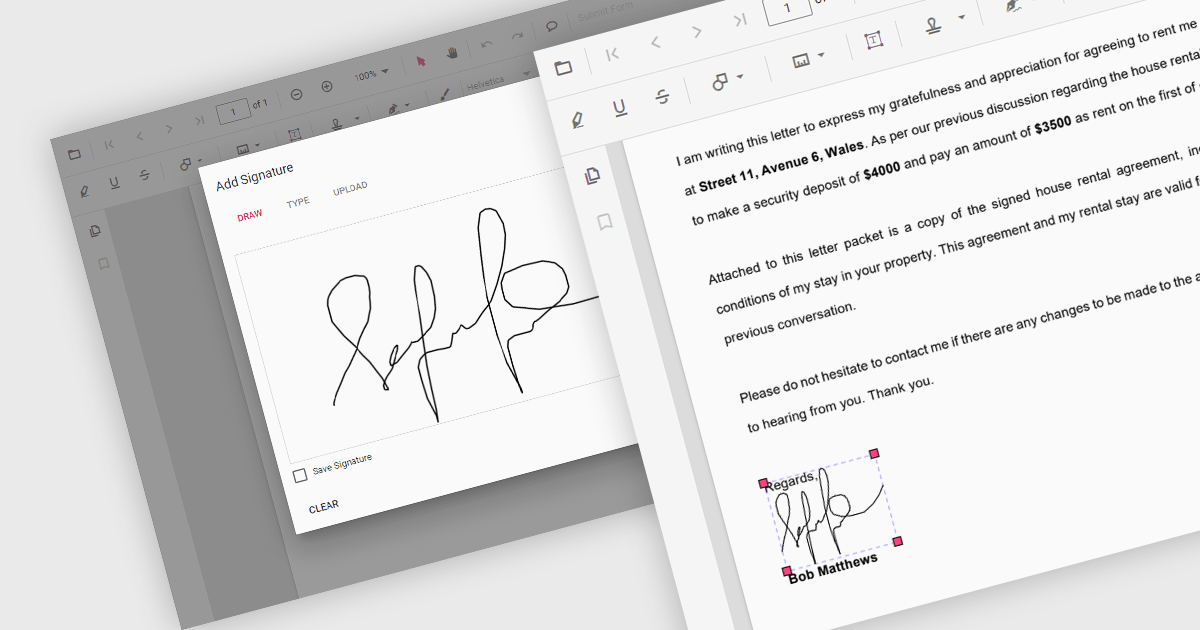
Handwritten signature support in React PDF viewers allows users to add their personal signatures directly onto PDF documents within applications built using the React framework. This functionality enhances document security, as it enables the verification of document authenticity and signer identity. It supports a seamless user experience, integrating easily with other digital processes, and adhering to legal standards that recognize electronic signatures, thus facilitating compliance with regulatory requirements.
Several React PDF Viewer components support handwritten signatures, including:
For an in-depth analysis of features and price, visit our comparison of React PDF Viewer components.
聯繫電話: (888) 850 9911
傳真: +1 770 250 6199


