


官方供應商
我們作為官方授權經銷商,直接提供超過200家開發廠家所發行超過1000個的產品授權給您。
請參閱我們所有的品牌。
SpreadJS is a complete enterprise JavaScript spreadsheet solution used to create financial reports and dashboards, budgeting and forecasting models, scientific, engineering, healthcare, education, science lab notebooks, and other similar JavaScript business applications. Leverage the high-speed calculation engine with over 500 Excel built-in functions in 19 languages, to deliver true Excel-like spreadsheet experiences with zero dependencies on Excel.
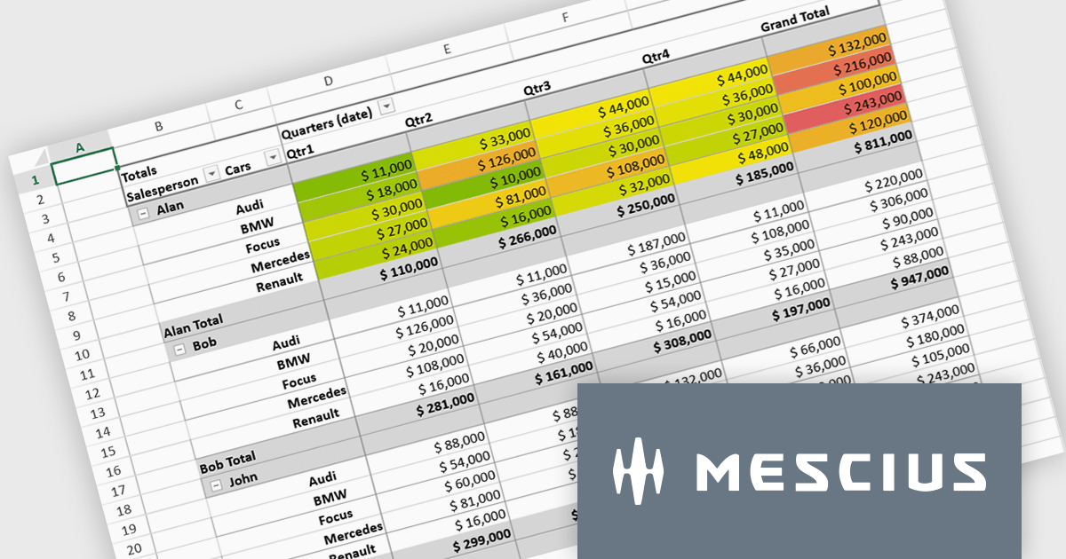
In this blog post, MESCIUS Product Marketing Specialist Mackenzie Albitz shows you the steps for integrating a Pivot Table directly into your Vue application using the SpreadJS Vue Spreadsheet component with its optional Pivot Table add-on. Steps include:
Detailed code is included and you can even download the sample app to get started.
Read the complete blog to get started creating and customizing powerful Vue Spreadsheet Pivot Tables.
SpreadJS is licensed per developer and includes 1 Year Maintenance (major and minor version releases and unlimited support phone calls). SpreadJS requires an Annual or Perpetual Deployment License. The optional Add-ons are available at an additional cost, and require a SpreadJS license. See our SpreadJS licensing page for full details.
For more information, visit our SpreadJS product page.
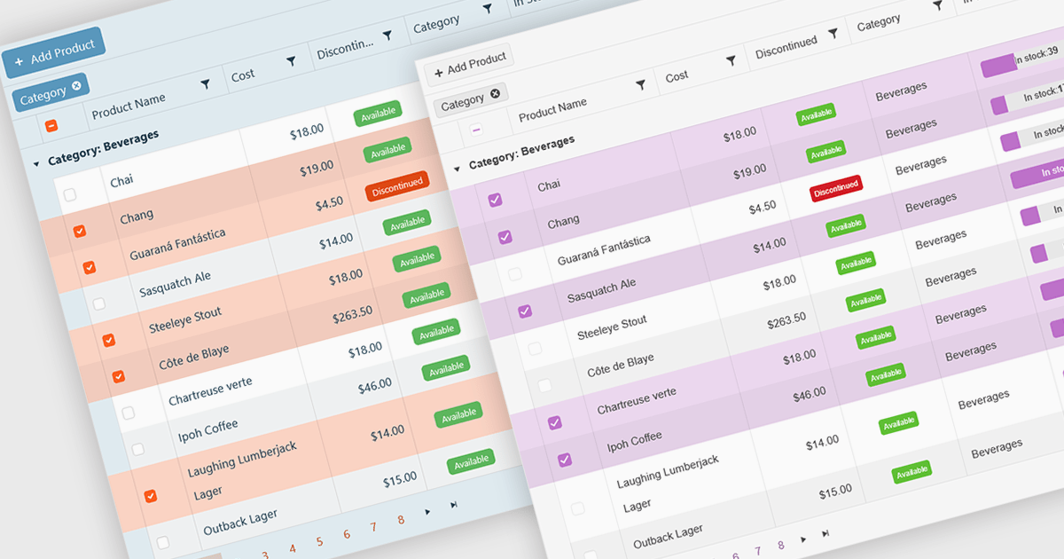
A checkbox cell type in a grid allows users to easily manage Boolean (true or false) data through a simple and visual interface. Instead of typing values manually, users can quickly toggle a checkbox to indicate states such as active or inactive, complete or incomplete, or enabled or disabled. This interaction reduces input errors and enhances data clarity, making it easy to scan and understand information at a glance. Checkbox cells improve productivity by supporting quick edits, bulk selections, and efficient filtering based on checked or unchecked values. Common use cases include task tracking, user permissions, product availability, and feature toggles where a binary choice improves workflow efficiency and usability.
Several Vue.js grid components offers checkbox cell type support, including:
For an in-depth analysis of features and price, visit our comparison of Vue.js grid components.
jQWidgets is a comprehensive JavaScript UI framework offering a robust collection of over 60 widgets, themes, and utilities for building professional-grade, cross-platform web applications. Built on jQuery, HTML5, and CSS, it provides extensive functionality including data grids, charts, navigation, input validation, and more. jQWidgets simplifies web development, ensuring your applications work seamlessly across desktop browsers, tablets, and smartphones.
The jQWidgets v24.0.0 update introduces a new Tailwind CSS-based theme that improves the process of styling and customizing user interfaces. By leveraging Tailwind’s utility-first framework, it enables flexible UI customization directly within markup, reducing the need for custom CSS and complex overrides. This integration ensures consistent design across components, promotes cleaner code, and aligns with modern front-end development practices. This release allows teams to deliver responsive, cohesive, and visually consistent applications with greater speed and precision.
To see a full list of what's new in v24.0.0, see our release notes.
jQWidgets is licensed per developer and is available as a Perpetual license 1 year support and maintenance. See our jQWidgets licensing page for full details.
Learn more on our jQWidgets product page.
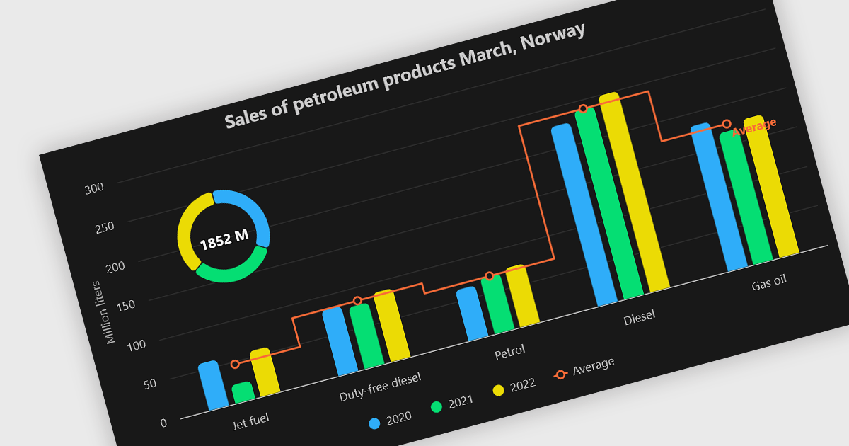
A combination chart or combo chart is a versatile type of data visualization that displays multiple chart types, such as columns, lines, or areas, to represent different data series within a single graphic. Combination charts are especially useful in scenarios where a single data type cannot fully convey the complexity of the dataset. By presenting different series types together, combination charts enhance the clarity and depth of insight available in a single view, be it on the same axis or across dual axes. This helps users to analyze complex relationships, trends and correlations between metrics more effectively than separate charts would allow.
Several Vue.js chart components allow you to combine series types on the same chart, including:
For an in-depth analysis of features and price, visit our comparison of Vue.js chart components.
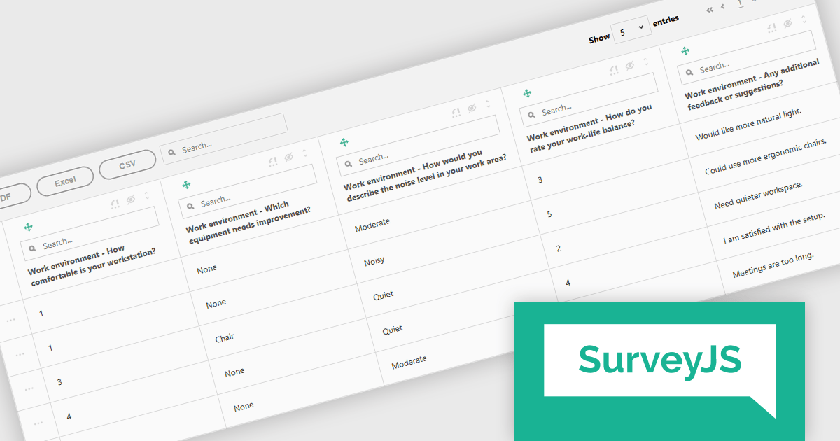
SurveyJS Survey Creator is a JavaScript library that enables developers to embed a drag-and-drop survey and form builder directly within their web applications. It provides a comprehensive UI for designing surveys with various question types, logic branching, and layout customization, generating JSON schemas that can be used by the SurveyJS Survey Library to render and process the surveys. This allows for the creation of dynamic and user-configurable data collection tools without requiring extensive custom development, streamlining the process of integrating survey functionality into applications.
The SurveyJS Survey Creator 2.3.9 update introduces support for specialized and composite question types within the Table View, enabling developers to efficiently display and analyze complex survey structures in a unified interface. This enhancement allows multiple question types such as numeric ratings, text responses, and categorical selections to be reviewed side by side, improving clarity and reducing the need for manual data consolidation. By supporting composite questions, the update simplifies the process of working with interrelated data points, helping developers deliver accurate reporting and improving survey analysis.
To see a full list of what's new in version 2.3.9, see our release notes.
SurveyJS Survey Creator is licensed per developer with a one-time payment for indefinite use. Access to updates and technical support is available through a subscription. See our SurveyJS Survey Creator licensing page for full details.
Learn more on our SurveyJS Survey Creator product page.
聯繫電話: (888) 850 9911
傳真: +1 770 250 6199


