


官方供應商
我們作為官方授權經銷商,直接提供超過200家開發廠家所發行超過1000個的產品授權給您。
請參閱我們所有的品牌。
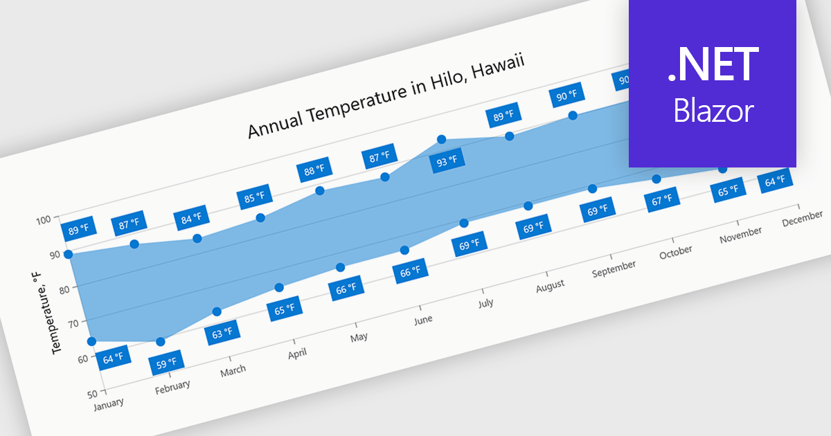
Range charts visualize the difference between minimum and maximum values for each data point using a filled area to represent variation. This makes it easier to understand fluctuations, compare ranges and identify patterns without the clutter of multiple lines. By focusing on value distribution rather than individual points, they improve readability and highlight trends and inconsistencies at a glance. They are useful for scenarios such as tracking temperature ranges, monitoring performance thresholds or comparing variations across datasets.
Several .NET Blazor charting components provide you with range charts, including:
For an in-depth analysis of features and price, visit our .NET Blazor chart controls comparison.
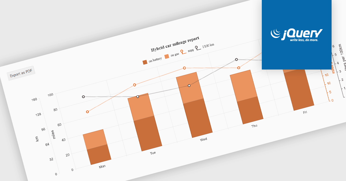
Exporting charts to PDF involves generating a static, portable document version of a chart that preserves its visual structure and data representation. This capability is valuable for reporting, compliance, and sharing insights in a consistent format that does not depend on a live application or browser environment. It allows teams to distribute visual data in a widely accepted file format, ensures layout stability across devices, and supports archival or print-ready use cases without requiring additional tooling.
Several jQuery chart components allow you to export to PDF, including:
For an in-depth analysis of features and price, visit our comparison of jQuery chart components.
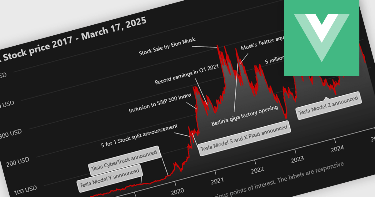
Annotation support in a Vue.js chart component refers to the capability to overlay additional contextual elements, such as labels, markers, lines, or regions, directly onto a chart to highlight specific data points, thresholds, or events. This feature enables developers to enrich visualizations with meaningful insights without altering the underlying dataset, making it easier to communicate key information such as trends, anomalies, or business rules within the UI.
Several Vue.js chart components support chart annotations, including:
For an in-depth analysis of features and price, visit our comparison of Vue.js charting components.
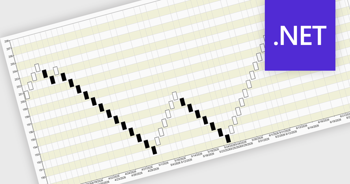
A Renko chart is a type of price chart used in technical analysis that focuses exclusively on price movement rather than time, displaying data as a series of uniform “bricks” that form only when the market moves by a predefined amount. This structure helps filter out minor price fluctuations, making trends and reversals easier to identify while reducing visual noise and improving clarity. As a result, traders can make more informed decisions, confirm trends with greater confidence, and simplify their analysis. Renko charts are commonly used in trend-following strategies, breakout trading, and support and resistance analysis, where a clear view of sustained price direction is more valuable than tracking every small market movement.
Several .NET Chart controls offer a Renko chart including:
For an in-depth analysis of features and price, visit our comparison of .NET Chart controls.
Syncfusion Essential Studio Enterprise provides a comprehensive collection of UI components and frameworks for building modern cross-platform applications. It offers over 1,800 components compatible with .NET WinForms, WPF, ASP.NET Core & MVC, WinUI, MAUI, JavaScript, Blazor, and more, enabling seamless application development across diverse devices and operating systems.
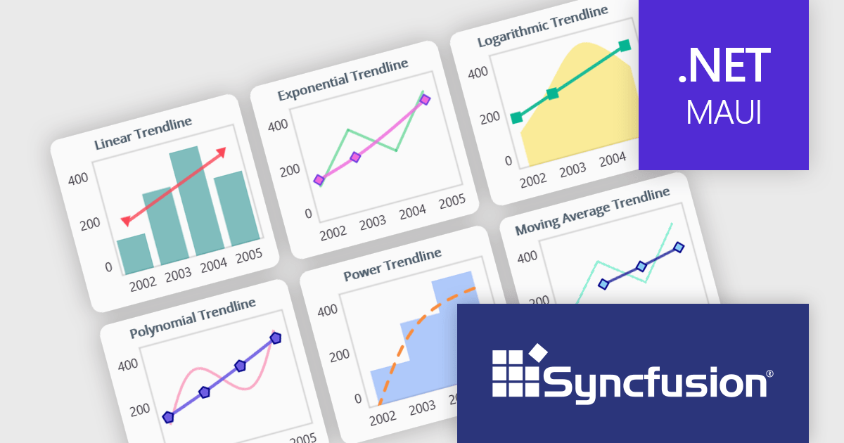
The Syncfusion Essential Studio 2026 Volume 1 update introduces trendline support to its MAUI charts, enabling developers to incorporate analytical context directly into data visualizations by applying linear, exponential, power, and polynomial models to chart series. This functionality allows applications to present clearer data patterns, support basic forecasting, and improve interpretability without requiring additional data processing logic or external tools, helping developers deliver more informative, insight-driven user experiences.
To see a full list of what's new in 2026 Volume 1 (33.1.44), see our release notes.
Syncfusion Essential Studio Enterprise is licensed per developer and is available as a 12 Month Timed Subscription License which includes support and maintenance. See our Syncfusion Essential Studio Enterprise licensing page for full details.
Learn more on our Syncfusion Essential Studio Enterprise product page.
聯繫電話: (888) 850 9911
傳真: +1 770 250 6199


