













官方供應商
我們作為官方授權經銷商,直接提供超過200家開發廠家所發行超過1000個的產品授權給您。
請參閱我們所有的品牌。
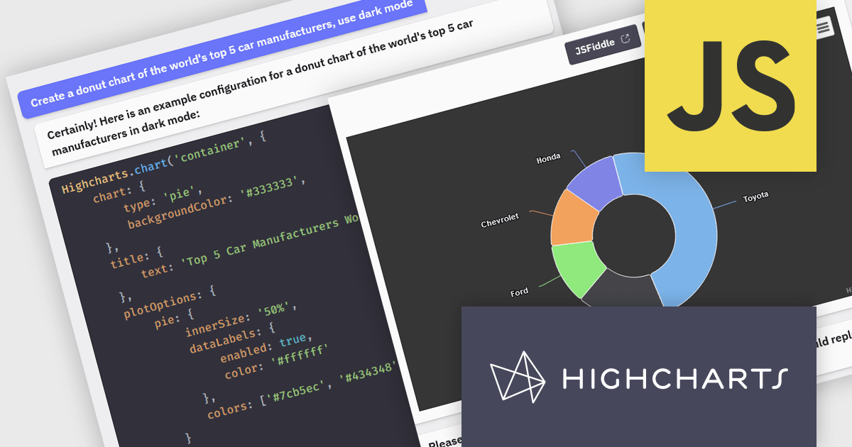
Highcharts is a JavaScript charting framework that allows web developers and data analysts to generate dynamic, visually appealing charts and graphs for websites and web applications. It can display a variety of chart types, including line, spline, area, column, bar, pie, scatter, and many more. Highcharts is well-known for its ease of use, rich documentation, and ability to handle huge datasets efficiently. Features include responsive design, accessibility support, and cross-browser compatibility. Its customization capabilities allow users to create bespoke data visualizations that increase engagement and provide insightful data presentations.
The Highcharts GPT add-on (powered by ChatGPT), and GitHub Copilot support in Highsoft products provide software developers with significant productivity enhancements by integrating AI-driven code assistance directly into their workflow. The Highcharts GPT add-on leverages natural language processing to generate and customize complex chart configurations, reducing the time and effort required for manual coding and enabling developers to focus on higher-level design and functionality. GitHub Copilot integration further streamlines development by offering intelligent code completions and suggestions, facilitating rapid prototyping and error reduction. Together, these Artificial Intelligence tools enhance coding efficiency, improve accuracy, and accelerate the development of sophisticated data visualizations.
For more information see the Highcharts GPT and Highcharts + Github Copilot blog posts.
Highcharts Core is licensed on an annual or perpetual basis, OEM licenses, and Advantage Renewals. It is licensed per Developer and has several license options including Internal, SaaS, SaaS+, and Self Hosted. See our Highcharts Core licensing page for full details.
Learn more on our Highcharts Core product page.
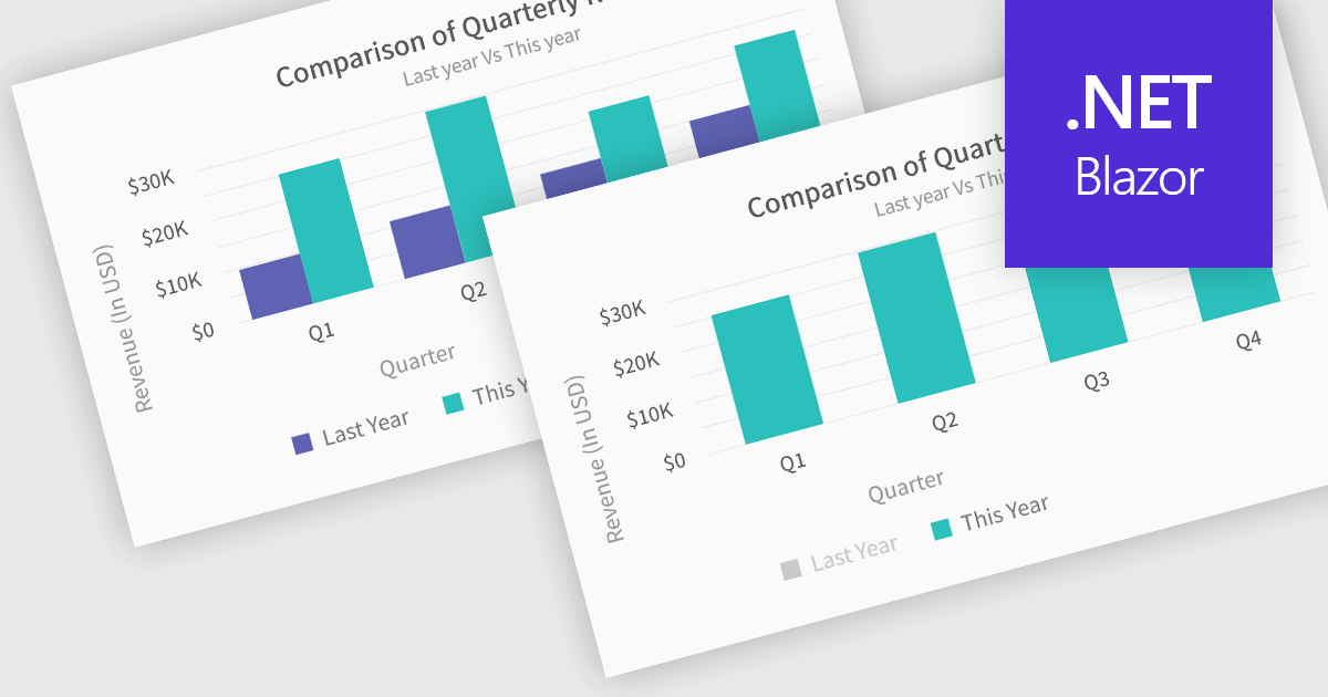
In chart controls, show/hide series functionality empowers developers to dynamically control the visibility of individual data sets. This allows users to focus on specific series, enhancing data comprehension and analysis. By selectively hiding irrelevant series, developers can declutter the chart, making it easier for users to identify trends and patterns within the data of interest.
Several .NET Blazor chart controls offer show/hide series support including:
For an in-depth analysis of features and price, visit our .NET Blazor chart controls comparison.
Syncfusion Essential Studio JavaScript, available as part of Syncfusion Essential Studio Enterprise, is a comprehensive UI library offering over 80 high-performance, lightweight, and responsive components to transform your web apps. Built from scratch with TypeScript, it boasts modularity and touch-friendliness, letting you pick and choose specific features while ensuring smooth mobile interaction. With rich themes, global accessibility features, and extensive documentation, it powers everything from basic buttons to interactive charts and data grids, simplifying front-end development across JavaScript, Angular, React, and Vue.
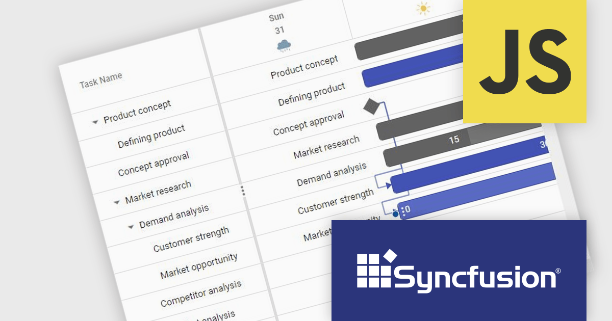
The Syncfusion Essential Studio JavaScript 2024 Volume 2 (26.1.35) release adds a new Timeline template feature to the Gantt control. This feature allows you to customize the appearance of timeline cells by using templates. You can now display images, buttons, or other custom content within timeline cells, making your Gantt chart more informative and visually appealing.
To see a full list of what's new in 2024 Volume 2 (26.1.35), see our release notes.
Syncfusion Essential Studio JavaScript is available as part of Syncfusion Essential Studio Enterprise which is licensed per developer starting with a Team License of up to five developers. It is available as a 12 Month Timed Subscription License which includes support and maintenance. See our Syncfusion Essential Studio Enterprise licensing page for full details.
Learn more on our Syncfusion Essential Studio JavaScript product page.
Syncfusion Essential Studio ASP.NET Core, available as part of Syncfusion Essential Studio Enterprise, empowers developers with a comprehensive suite of over 80 enterprise-grade UI components specifically designed for building modern and highly functional web applications. Leveraging the latest advancements in ASP.NET Core, it offers exceptional performance and scalability, streamlining development by eliminating the need for extensive custom coding. From data visualization tools like interactive charts and grids to sophisticated navigation elements and responsive layouts, Essential Studio equips developers with the building blocks to create rich user experiences, improve application efficiency, and accelerate time-to-market.
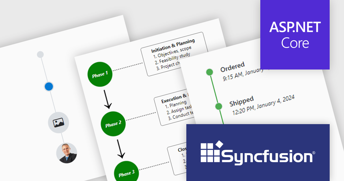
The Syncfusion Essential Studio ASP.NET Core 2024 Volume 2 (26.1.35) release introduces the production-ready Timeline component which displays a series of data in chronological order, providing a visually compelling and user-friendly experience. It can be used to showcase user activities, tracking progress, narrating historical timelines, and more. Built-in features include orientation, opposite content, item alignment, reverse timeline, and template customization.
To see a full list of what's new in 2024 Volume 2 (26.1.35), see our release notes.
Syncfusion Essential Studio ASP.NET Core is available as part of Syncfusion Essential Studio Enterprise which is licensed per developer starting with a Team License of up to five developers. It is available as a 12 Month Timed Subscription License which includes support and maintenance. See our Syncfusion Essential Studio Enterprise licensing page for full details.
Learn more on our Syncfusion Essential Studio ASP.NET Core product page.
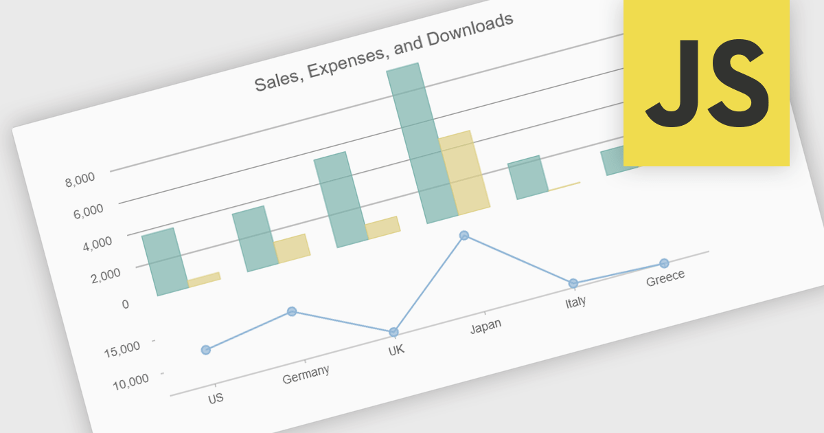
Combination charts (also known as combo charts) are visualizations that integrate multiple chart types, such as bar, line, and area charts, within a single display. This approach allows developers to show varied data sets and relationships in a cohesive, comprehensive manner, facilitating more nuanced data analysis and comparison. The primary benefits include their ability to convey complex information efficiently, their flexibility in showcasing different data trends simultaneously, and their enhanced readability for end-users who need to interpret diverse metrics at a glance. This versatility makes combination charts an invaluable tool for presenting multifaceted data insights in dynamic, interactive web applications.
Several JavaScript / HTML5 chart controls offer combination charts including:
For an in-depth analysis of features and price, visit our comparison of JavaScript / HTML5 Chart Controls.
聯繫電話: (888) 850 9911
傳真: +1 770 250 6199


