


官方供應商
我們作為官方授權經銷商,直接提供超過200家開發廠家所發行超過1000個的產品授權給您。
請參閱我們所有的品牌。
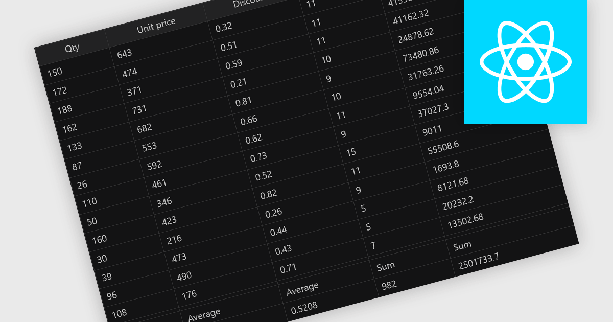
Aggregation in grid components allows users to automatically compute and display summary values, such as totals, averages, minimums, and maximums, across rows or columns of data. This feature enhances the analytical capability of a data grid by offering quick insights directly within the interface, reducing the need to export data for external processing. It is particularly valuable in business intelligence dashboards, financial applications, and administrative tools where on-the-fly data synthesis is essential.
Several React grid controls offer aggregation including:
For an in-depth analysis of features and price, visit our React grid controls comparison.
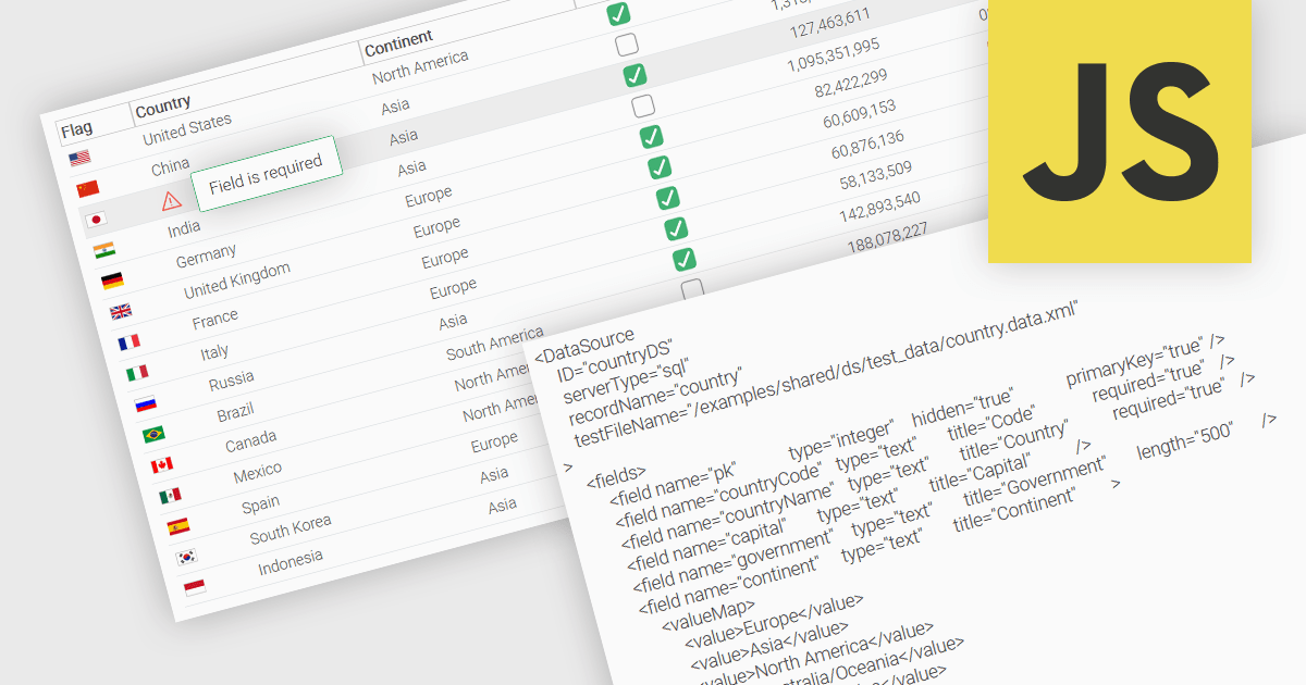
A fundamental feature in a data grid is the ability to specify that a column must be populated with values and cannot be left empty. By designating certain columns as mandatory, developers can enforce input rules that prevent users from leaving critical fields blank, such as user identifiers, product names, or timestamps. Required columns are typically enforced through validation rules that prevent the submission or processing of incomplete records, thereby ensuring the completeness and validity of data entries. This improves data integrity, reduces the likelihood of processing errors, and supports consistent business logic across applications that rely on structured datasets.
Several JavaScript grid controls allow you to set columns as required, including:
For an in-depth analysis of features and price, visit our comparison of JavaScript grid controls.
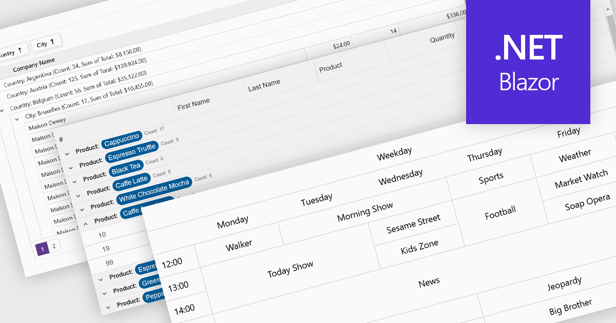
Data visualization and analysis features in grid components transform raw tabular data into structured, interpretable formats that support faster insights and decision-making. These features go beyond static display, offering dynamic ways to organize, summarize, and explore data directly within the grid interface, making it a powerful tool for both end-users and analysts.
Common features include:
For an in-depth analysis of features and price, visit our Blazor grid components comparison.
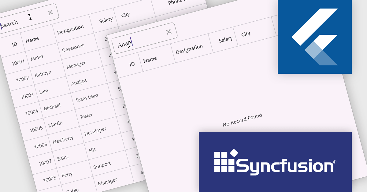
Syncfusion Essential Studio Flutter (available as part of Syncfusion Essential Studio Enterprise) is a powerful UI toolkit that enables you to build beautiful and performant mobile apps for Android and iOS using Flutter. It provides a rich suite of pre-built widgets for common design elements like charts, data grids, calendars, and PDF viewers. These widgets are highly customizable and allow you to quickly implement stunning visuals and advanced functionalities without spending time on repetitive coding.
Syncfusion Essential Studio Flutter includes placeholder support in the DataGrid component. This feature allows the display of custom widgets as placeholders when the data source is empty, providing a clear and informative interface during data loading or when no data is available. This enhancement not only improves the visual appeal of applications but also enhances user engagement by offering contextual information, thereby contributing to a more intuitive and responsive user experience.
Syncfusion Essential Studio Flutter is available as part of Syncfusion Essential Studio Enterprise which is licensed per developer starting with a Team License of up to five developers. It is available as a 12 Month Timed Subscription License which includes support and maintenance. See our Syncfusion Essential Studio Enterprise licensing page for full details.
Learn more on our Syncfusion Essential Studio Flutter product page.
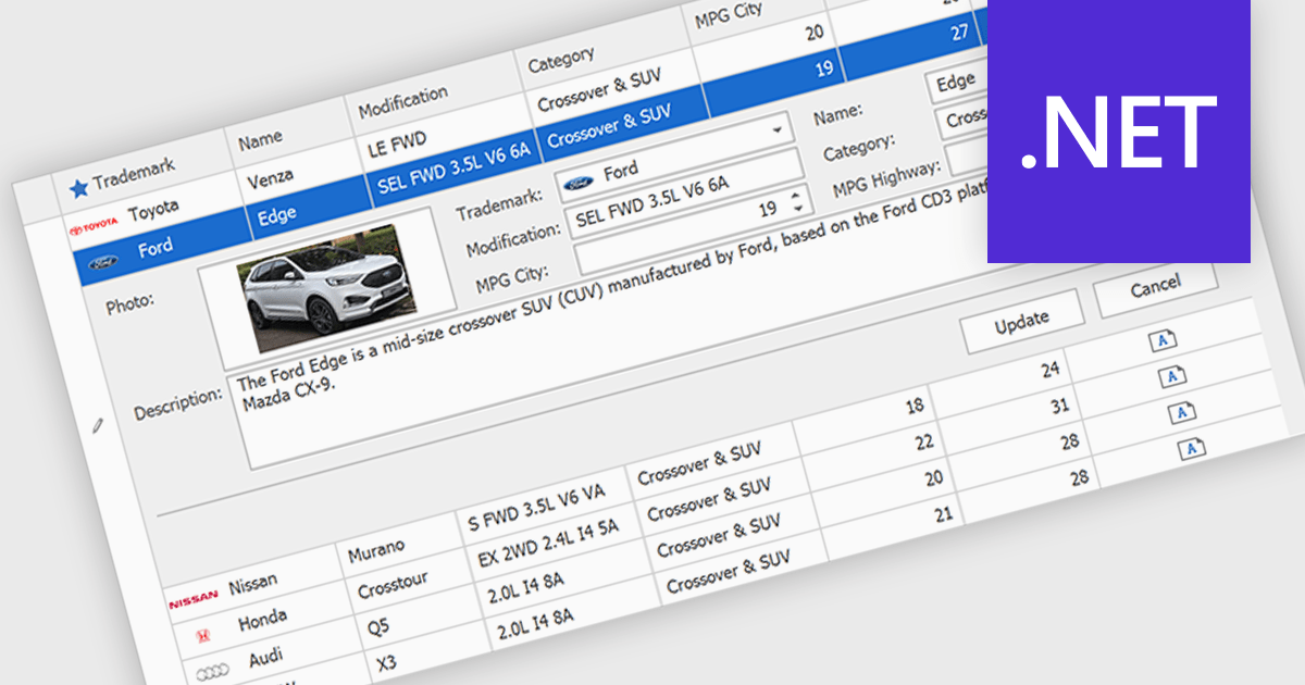
Customized Forms in .NET Grid components allow developers to tailor the structure and layout of data entry interfaces within grid-based controls, providing flexibility to match specific application requirements. These forms enable the addition of custom fields, validation logic, and user interface elements directly into the grid's editing workflow, enhancing the user experience and ensuring that data entry aligns with business rules. By offering control over how data is captured and displayed, customizable edit forms simplify complex data interactions, reduce the need for separate dialog windows, and support consistent, efficient data management within enterprise applications.
Many .NET Grid collections enable edit forms including:
For an in-depth analysis of features and price, visit our .NET grid controls comparison.
聯繫電話: (888) 850 9911
傳真: +1 770 250 6199


