






官方供應商
我們作為官方授權經銷商,直接提供超過200家開發廠家所發行超過1000個的產品授權給您。
請參閱我們所有的品牌。
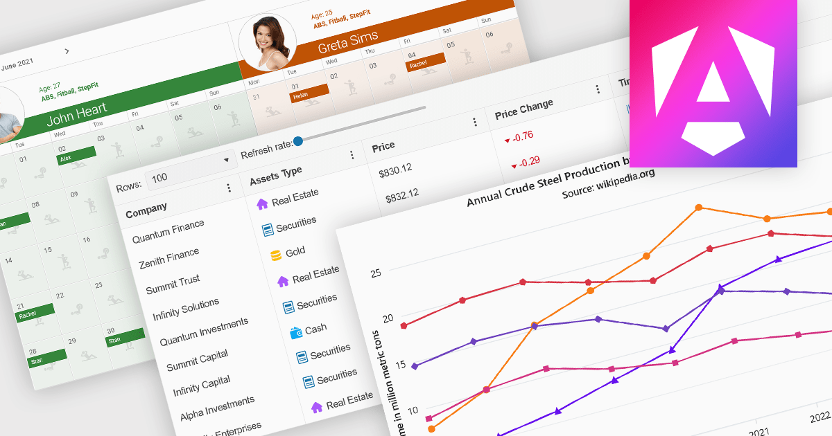
Angular UI controls are specialized components developed to integrate with applications built on the Angular framework. Typically offered as part of comprehensive UI suites, these controls help developers build highly interactive, data-rich web applications while maintaining performance and design consistency. By encapsulating complex behaviors into modular, reusable elements, Angular UI suites simplify the development process and support faster deployment of robust, enterprise-grade front ends.
Common controls include:
For an in-depth analysis of features and price, visit our Angular UI suites comparison.

Since 2022, ComponentSource has expanded global access to Blazorise’s high performance UI component library by offering it through their comprehensive catalog of developer tools. Blazorise’s modular architecture and seamless integration with Bootstrap, Bulma, AntDesign and Material perfectly complement ComponentSource’s mission to provide versatile, high-quality components for any project.
Over the past three years, this partnership has demonstrated a shared commitment to delivering feature rich Blazor UI solutions including theming, form validation, localization, data grids and charting that integrate seamlessly into modern web applications.
As they mark three years of working together, ComponentSource and Blazorise continue to support developers with a growing ecosystem of modern UI components, proactive feature enhancements, comprehensive documentation, and expert support that accelerate Blazor application development.
Blazorise is licensed per developer and is runtime royalty free. Licenses include a 1 year subscription for updates and premium support. Professional, Enterprise, and Enterprise Plus editions are available, each offering tailored levels of support and service to meet varying business needs. See our Blazorise licensing page for full details.
For more information, visit our Blazorise brand page.

ComponentSource has played a central role in broadening access to Sencha’s suite of development tools by making them more readily available to a global developer audience. Its distribution infrastructure has helped ensure that organizations - including many in the Fortune 100 - can obtain the tools they need to build and maintain complex, data-driven web applications across platforms.
For five years, ComponentSource has supported developers by providing a straightforward route to acquiring Sencha's products. This collaboration reflects a shared goal: to make software procurement simpler and more reliable, particularly for teams working on large-scale or multi-device applications.
Celebrating a successful 5-year journey, ComponentSource and Sencha look forward to further empowering development teams globally. This continued collaboration aims to enhance the availability and adoption of Sencha's tools, enabling even more organizations to build sophisticated web applications for diverse devices.
For more information, visit our Sencha brand page.
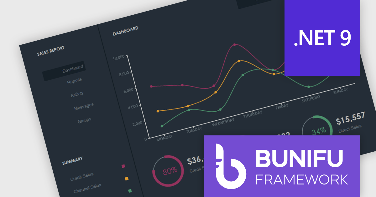
Bunifu Technologies is a leading provider of UI/UX components, design tools and data visualization components for developers building WinForms applications, and for integrating charting functionality. The Bunifu Ultimate Bundle offers a comprehensive suite of premium grids, charts, forms, and navigation components that make it easy to craft visually stunning, user-centric interfaces. By leveraging Bunifu’s expertise, developers can significantly improve the look and feel of their applications while reducing development time, ultimately delivering exceptional user experiences.
With support for Microsoft .NET 9, developers can use Bunifu UI WinForms and BuniCharts to create high quality applications that combine modern user interface elements with high-performance data visualization. This compatibility aligns these components with the latest advancements in the .NET ecosystem, allowing developers to deliver more modern, stable, and future-proof applications without compromising on design or performance.
Bunifu products are licensed per developer and are available in four plans, three of which are annual licenses while the other is perpetual. All plans come with free version updates and Premium support for the active license period. See our Bunifu Ultimate Bundle licensing page for full details.
For more information, see the following product pages:
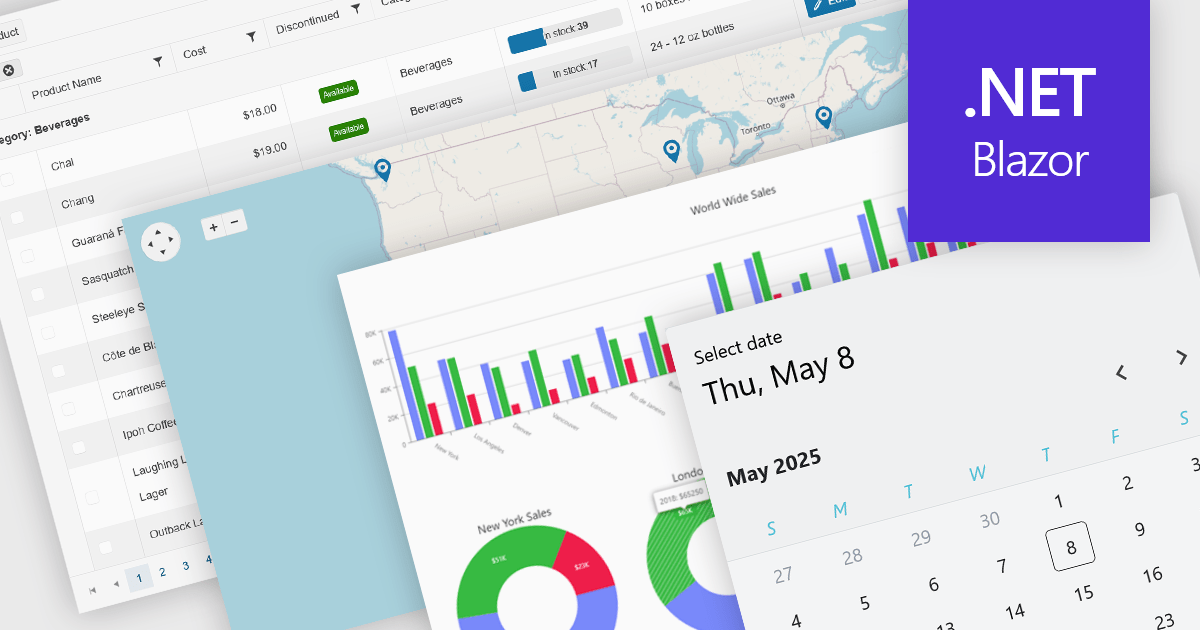
UI controls designed for use with Microsoft's Blazor framework, support full-stack development in C# and .NET, simplifying the creation of modern web applications. These controls are typically bundled into UI suites, providing developers with pre-built, customizable elements that improve the creation of rich, interactive web interfaces without needing JavaScript. By leveraging WebAssembly or server-side rendering, Blazor UI suites allow for an easy developer experience, consistent performance, and strong integration with existing .NET libraries and tooling.
Common controls include:
For an in-depth analysis of features and price, visit our Blazor UI suites comparison.
聯繫電話: (888) 850 9911
傳真: +1 770 250 6199


