


官方供應商
我們作為官方授權經銷商,直接提供超過200家開發廠家所發行超過1000個的產品授權給您。
請參閱我們所有的品牌。
Kendo UI by Telerik is a comprehensive suite of JavaScript UI components designed to accelerate web application development. Offering pre-built, customizable elements for grids, charts, schedulers, and more, it streamlines UI creation across popular frameworks like jQuery, Angular, React, and Vue. Key features include responsive design, accessibility, and high performance, enhancing user experience. Developers benefit from reduced development time, consistent UI patterns, and the ability to build feature-rich applications faster.
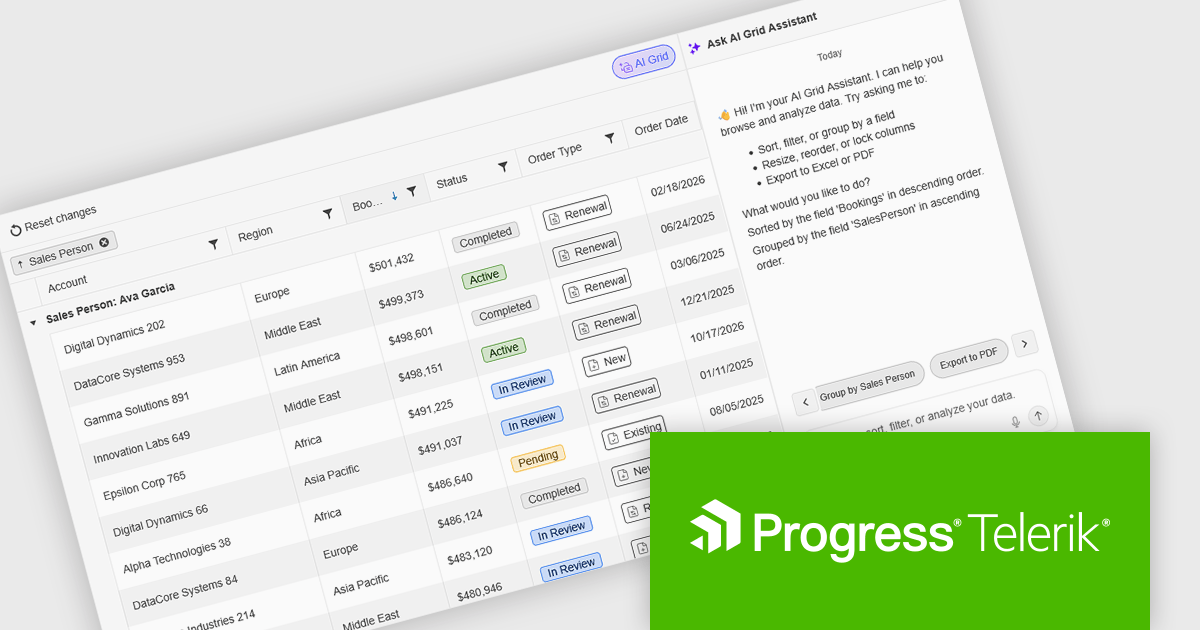
The Kendo UI for jQuery v2026 Q1 update introduces AI Chat integration for the Smart Grid, enabling developers to incorporate a conversational interface into data-driven web applications. End users can explore and query structured Grid data using natural-language input, while the integration leverages the Grid’s schema, configuration, and current view to generate precise, context-aware responses. This approach minimizes the need for complex filtering configurations and custom-built query tools, reduces user training requirements, and enhances overall usability. For development teams, it improves implementation while delivering a more efficient and accessible data exploration experience within existing jQuery applications.
To see a full list of what’s new in version 2026 Q1 (2026.1.212), see our release notes.
Kendo UI is licensed per developer and has two licensing models: an annual Subscription License and a Perpetual License. The Subscription license provides access to the latest product updates, technical support, and exclusive benefits for a flat annual fee, and must be renewed to continue using the software. The Perpetual license is a one-time purchase granting access to the current released version and includes a one-year subscription for product updates and technical support. After this initial period, users can choose to renew the subscription element to continue receiving updates and support; otherwise, they may continue using the installed version available during their active subscription term but will forgo future updates and support. See our Kendo UI licensing page for full details.
Kendo UI is also available to buy individually or as part of:

DevExpress and ComponentSource have worked together for 25 years, building a long-standing partnership focused on providing professional developer tools. DevExpress is known for its extensive range of UI controls, reporting tools, dashboards, and application frameworks across platforms including .NET, JavaScript, Blazor, WinForms, WPF, and ASP.NET. Together, the two companies support development teams creating desktop, web, and mobile applications.
At the center of this collaboration is DevExpress Universal, a flagship product available through ComponentSource, giving developers access to the full suite of DevExpress UI controls, reporting, and testing tools in a single subscription. This comprehensive offering helps teams standardize on one vendor while covering multiple platforms and project requirements.
This long-term partnership strengthens ComponentSource’s product portfolio by including one of the most widely used developer toolsets in the industry. It also enables ComponentSource to deliver DevExpress products to customers worldwide, supported by international sales teams, local currencies, and licensing expertise that simplify the purchasing process for organizations across different regions.
Learn more about DevExpress.

Using JSON (JavaScript Object Notation) as a data source for charts allows applications to bind structured, lightweight data directly to visualization components. JSON represents data as objects and arrays, making it well suited to defining categories, series, and individual data points in a format that aligns naturally with modern web development practices. Its widespread use in RESTful APIs and web services enables charts to consume live or remote datasets efficiently, while reducing the need for complex data transformation before rendering.
Several Vue.js chart components allow you to use JSON as a data source, including:
For an in-depth analysis of features and price, visit our comparison of Vue.js charting components.
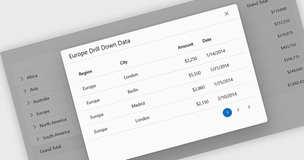
Drill-down support in a grid component allows users to move from summarized data to more detailed records within the same interface, often by expanding rows or selecting linked values that reveal related data. Instead of navigating to a separate page or view, users can access underlying information directly in context. For developers, this reduces the need for additional navigation and simplifies the presentation of hierarchical or related datasets. It also makes it easier to analyze data step by step, helping users inspect specific records or relationships without losing their place in the overall dataset.
Several React grid controls support drill-down features including:
For an in-depth analysis of features and price, visit our React grid controls comparison.
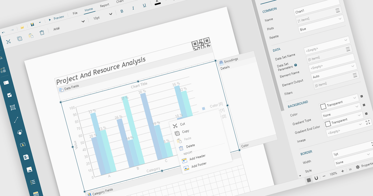
A Visual Report Designer is an application that enables users to create interactive, analytical, and print-ready reports using an intuitive, drag-and-drop interface. It supports fully customizable templates and data visualization components, helping teams present complex information clearly while maintaining consistent branding and layouts. Typical use cases include executive dashboards, financial and operational reports, customer analytics summaries, compliance documents, and branded client-facing reports.
Several JavaScript reporting components offer visual report designers including:
For an in-depth analysis of features and price, visit our JavaScript reporting comparison.
聯繫電話: (888) 850 9911
傳真: +1 770 250 6199


