


官方供應商
我們作為官方授權經銷商,直接提供超過200家開發廠家所發行超過1000個的產品授權給您。
請參閱我們所有的品牌。
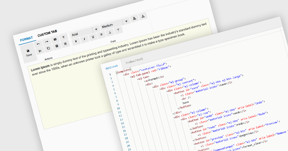
Ribbon bars are graphical user interface (GUI) patterns that organize commands and features into a series of tabs, each containing grouped controls such as buttons, dropdowns, and galleries. Widely adopted in modern software applications, ribbons present functionality in a structured and visually accessible layout to improve discoverability. This approach reduces reliance on deeply nested menus and toolbars, enabling users to locate relevant tools more quickly based on context.
Several Vue.js user interface suites provide ribbon functionality, including:
For an in-depth analysis of features and price, visit our comparison of Vue.js UI suites.

Gauge charts are data visualizations that display a single value within a defined range, making it easy to understand status or progress at a glance. Often styled like a speedometer, they show where a value sits between minimum and maximum thresholds, using color to indicate different levels. This provides clear, immediate insight without detailed analysis. Key benefits include quick understanding, intuitive design, and strong visual emphasis on limits or targets. Gauge charts are commonly used in dashboards to track KPIs, monitor targets, show completion percentages, or highlight key metrics in a simple and effective way.
Several React charting components also offer gauges, including:
For an in-depth analysis of features and price, visit our comparison of React chart components.
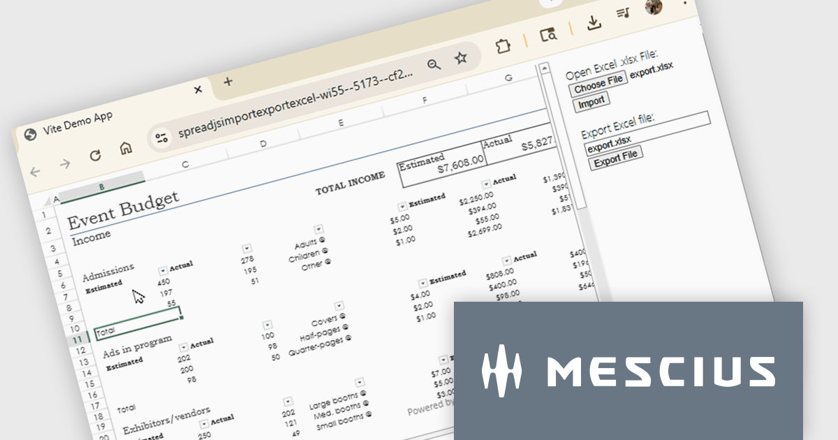
SpreadJS is a complete enterprise JavaScript spreadsheet solution used to create financial reports and dashboards, budgeting and forecasting models, scientific, engineering, healthcare, education, science lab notebooks, and other similar JavaScript business applications. Leverage the high-speed calculation engine with over 500 Excel built-in functions in 19 languages, to deliver true Excel-like spreadsheet experiences with zero dependencies on Excel.
In this online tutorial from MESCIUS, you will learn the critical steps allowing you to import/export XLSX files using JavaScript. Steps include:
Detailed sample code is included to help you along the way.
View the tutorial now and get started working with spreadsheet files in your JavaScript applications.
SpreadJS is licensed per developer and includes 1 Year Maintenance (major and minor version releases and unlimited support phone calls). SpreadJS requires an Annual or Perpetual Deployment License. The optional Add-ons are available at an additional cost, and require a SpreadJS license. See our SpreadJS licensing page for full details.
For more information, visit our SpreadJS product page.
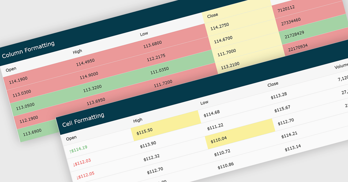
Conditional formatting in grids automatically applies visual styles such as colors or icons based on defined rules, making it easier to interpret large datasets at a glance. It improves readability, highlights patterns and outliers, and supports faster, more informed decision making by surfacing key insights in real time. Common use cases include flagging budget issues in financial reports, emphasizing top performing sales data, monitoring KPIs, and drawing attention to errors or critical statuses in operational tools.
Several JavaScript grid controls offer conditional formatting, including:
For an in-depth analysis of features and price, visit our comparison of JavaScript Grid controls.
Wijmo by MESCIUS is a comprehensive JavaScript library offering a suite of high-performance UI components and data grids specifically designed to streamline the development of modern enterprise applications. It emphasizes reduced development time and improved maintainability, along with a focus on performance through its efficient design and small module size. Wijmo integrates seamlessly with popular JavaScript frameworks like Angular, React, and Vue.js, and supports cutting-edge technologies like TypeScript, making it a versatile solution for building complex web applications.
The Wijmo 2026 v1 update introduces support for Angular 21, enabling developers to adopt the latest framework capabilities while maintaining full compatibility with Wijmo’s comprehensive component library. This support ensures smoother integration, improved application performance, and alignment with current Angular development standards. Developers can build more responsive and maintainable applications while benefiting from advanced features such as FlexGrid cell templates and a high performance Angular DataGrid, helping deliver modern user experiences more efficiently.
To see a full list of what's new in 2026 v1, see our release notes.
Wijmo is licensed per developer. Developer Licenses are perpetual and include 1 year Subscription which provides upgrades, including bug fixes and new features. See our Wijmo licensing page for full details.
Learn more on our Wijmo product page.
聯繫電話: (888) 850 9911
傳真: +1 770 250 6199


