


官方供應商
我們作為官方授權經銷商,直接提供超過200家開發廠家所發行超過1000個的產品授權給您。
請參閱我們所有的品牌。
DevExpress Reporting is a comprehensive suite of reporting tools that empowers developers to create visually stunning and highly customizable reports for various applications. With its rich feature set, including data binding, layout design, printing, and exporting capabilities, DevExpress Reporting enables the efficient creation of reports that meet the most demanding business requirements.
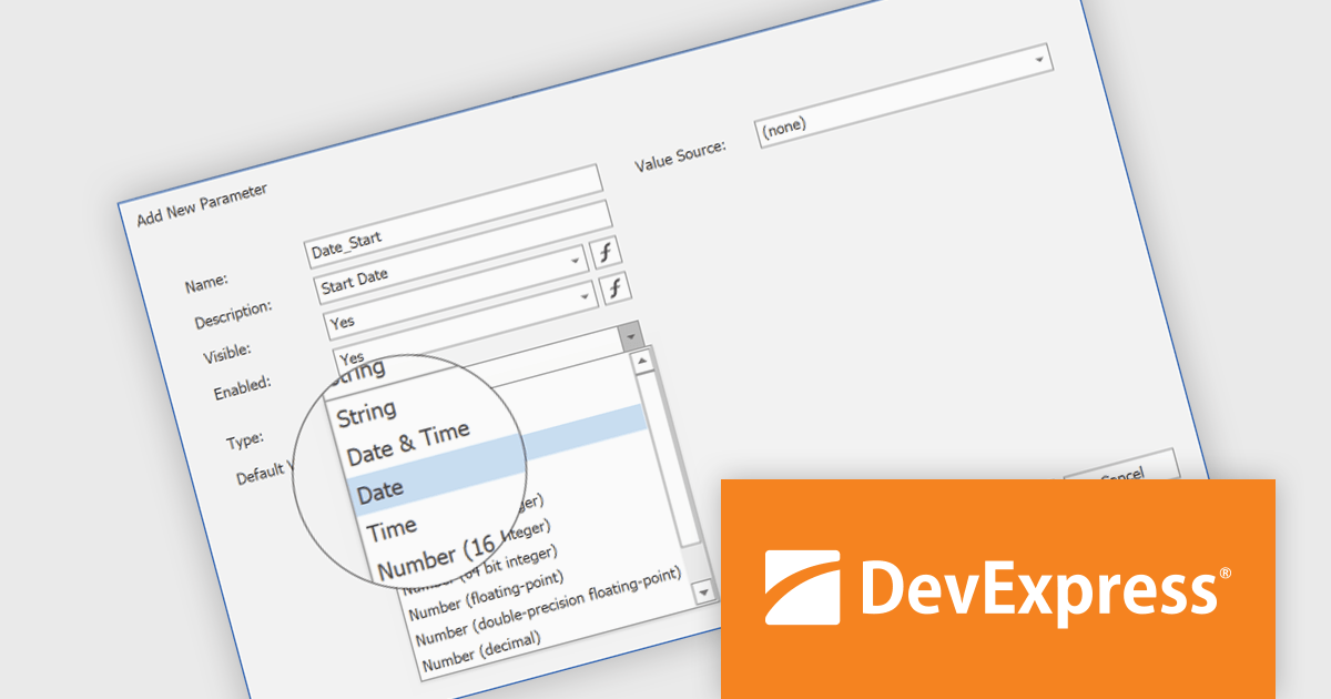
The DevExpress Reporting v24.2 update introduces DateOnly and TimeOnly support, enabling more precise data handling in reports. This enhancement allows developers to bind report controls to date or time values without unnecessary datetime components, improving accuracy in calculations, filtering, sorting, and grouping. By eliminating the need for manual conversions, it streamlines query execution and enhances performance when working with date- and time-specific data. With native support for these types, reports can now better align with modern data models, ensuring clarity and consistency across applications.
To see a full list of what's new in version 24.2, see our release notes.
DevExpress Reporting is licensed per developer and is available as a Perpetual License with a 12 month support and maintenance subscription. See our DevExpress Reporting licensing page for full details.
DevExpress Reporting is available to buy in the following products:
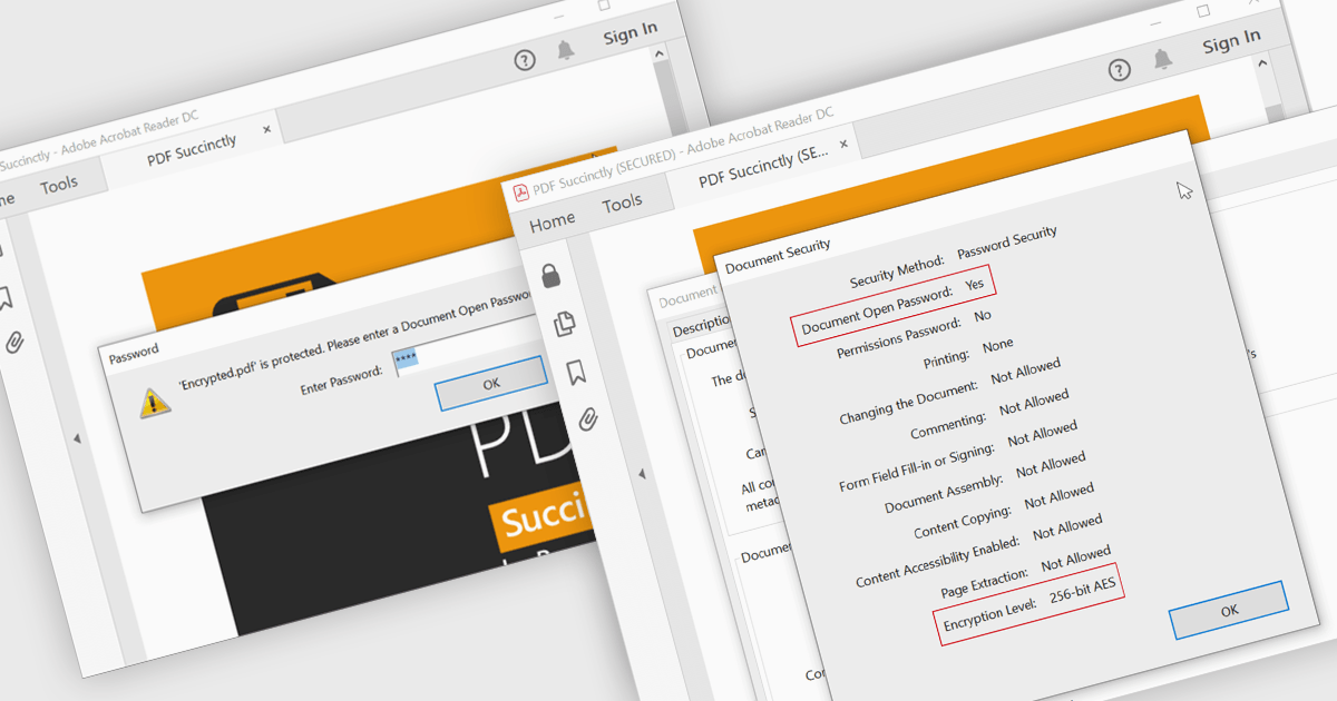
Encrypting and decrypting PDFs protect sensitive information by preventing unauthorized access, data breaches, and cyber threats. With strong encryption, password protection, and role-based access control, it ensures document confidentiality while allowing secure sharing and controlled modifications. Decryption enables authorized users to access protected files without compromising security. Essential for businesses, legal firms, and financial institutions, it safeguards contracts, financial records, and proprietary data while ensuring compliance with data protection regulations.
Several .NET WPF PDF controls offer encryption and decryption support including:
For an in-depth analysis of features and price, visit our .NET WPF PDF controls comparison.
TX Text Control .NET Server for ASP.NET is a server-side component that equips your web applications with a powerful, Microsoft Word-compatible document editor. This allows you to develop applications that generate and edit various document formats (RTF, DOCX, PDF, etc.) on the fly, using data from databases or files. It also boasts features like PDF generation and a browser-based editor with a familiar MS Word-inspired interface, ultimately enhancing the document processing capabilities of your ASP.NET web applications.
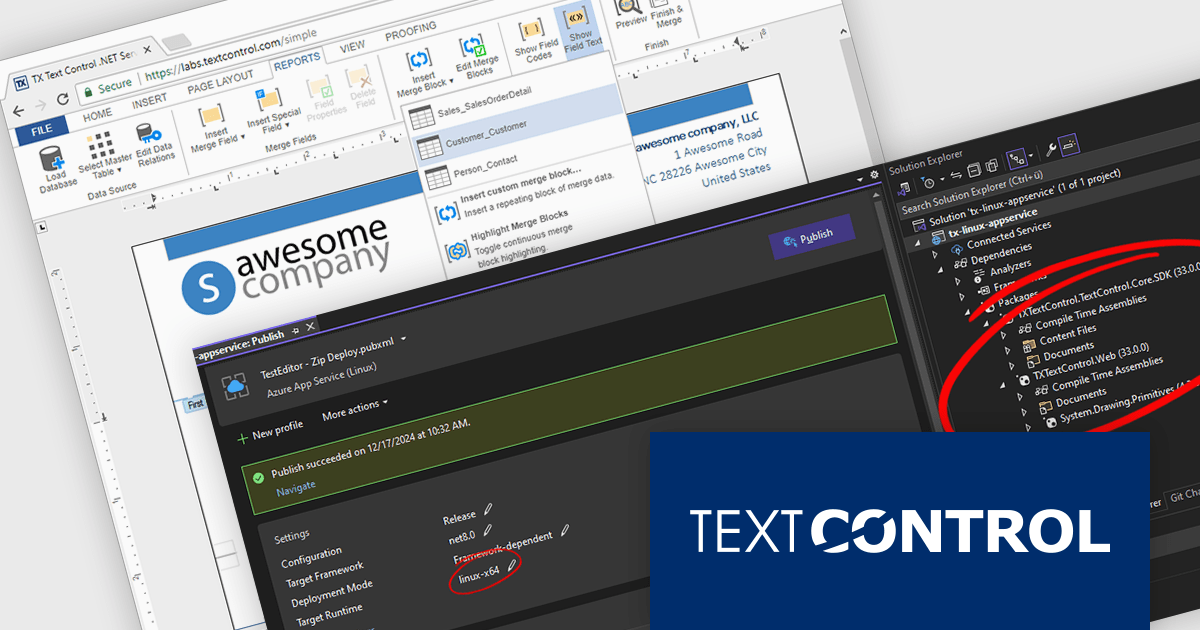
The TX Text Control .NET Server for ASP.NET 33.0 release introduces powerful and flexible document processing capabilities for Linux, allowing developers to seamlessly integrate advanced editing, viewing, and processing features into their applications. With a focus on cross-platform compatibility, the software has been carefully optimized to deliver high-quality rendering, robust performance, and a smooth user experience on Linux systems. This new capability ensures a consistent and reliable workflow, making it easier than ever to build sophisticated, document-driven applications across diverse operating environments.
For a full list of changes in TX Text Control .NET Server for ASP.NET 33.0, see our release notes.
TX Text Control .NET Server for ASP.NET is licensed per developer and is available as a Perpetual License with a 12 month support and maintenance subscription. Run time licenses are required for the deployment to production servers. See our TX Text Control .NET Server for ASP.NET licensing page for full details.
For more information, visit our TX Text Control .NET Server for ASP.NET product page.
PDF4NET is a .NET library for generating, importing, and manipulating PDF documents on the fly from any .NET application. It does not rely on any Adobe products for creating or importing PDF files. PDF4NET hides the complex structure of PDF files behind a simple object model that allows creation of complex PDF files with a few lines of code.
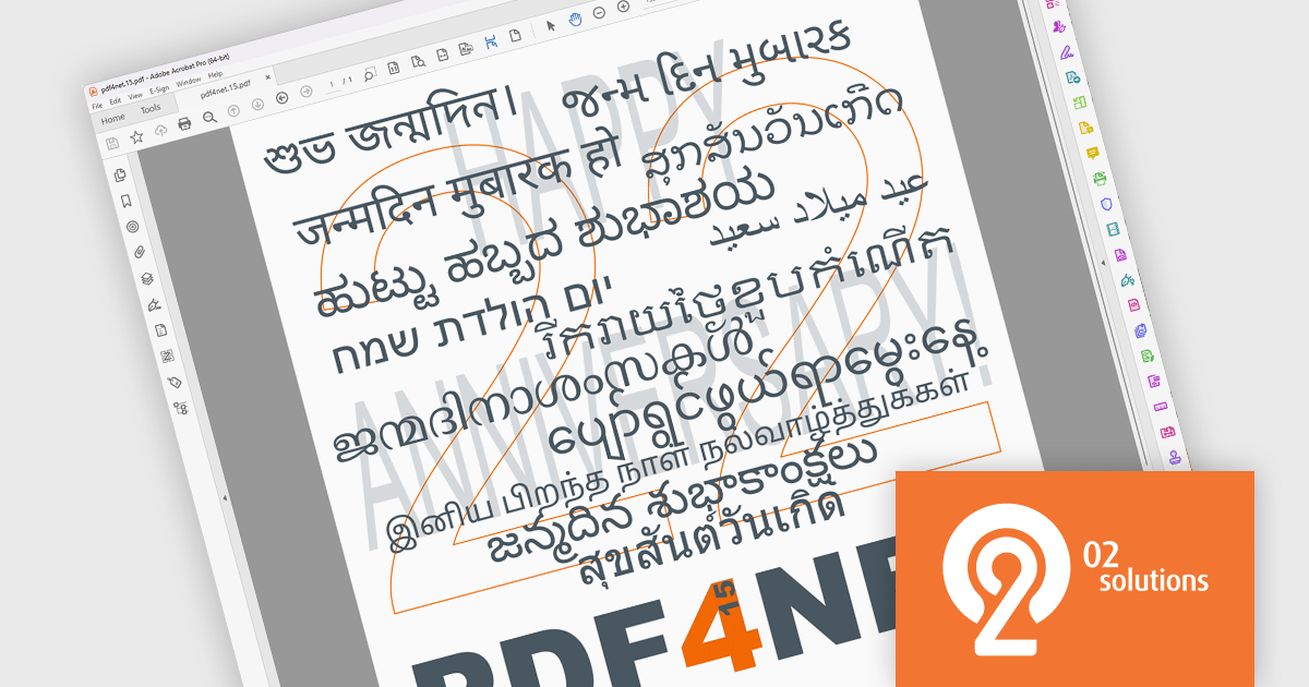
The PDF4NET 15.0.0 update enhances document processing by introducing support for complex scripts, including Arabic, Bengali, Devanagari, Hebrew, Khmer, Tamil, and Thai. This improvement ensures accurate text rendering, proper character shaping, and right-to-left script support, allowing developers to generate and manipulate PDFs with multilingual content more effectively. By enabling seamless integration of these scripts, the update enhances localization capabilities, improves accessibility, and ensures compliance with diverse linguistic requirements, making it easier to create globally compatible PDF documents without additional customization or external dependencies.
To see a full list of what's new in version 15, see our release notes.
PDF4NET is licensed per developer. All licenses include a 12 month subscription which provides all major and minor product updates and technical support. See our PDF4NET licensing page for full details.
PDF4NET is available individually or as part of PDFBundle4NET.
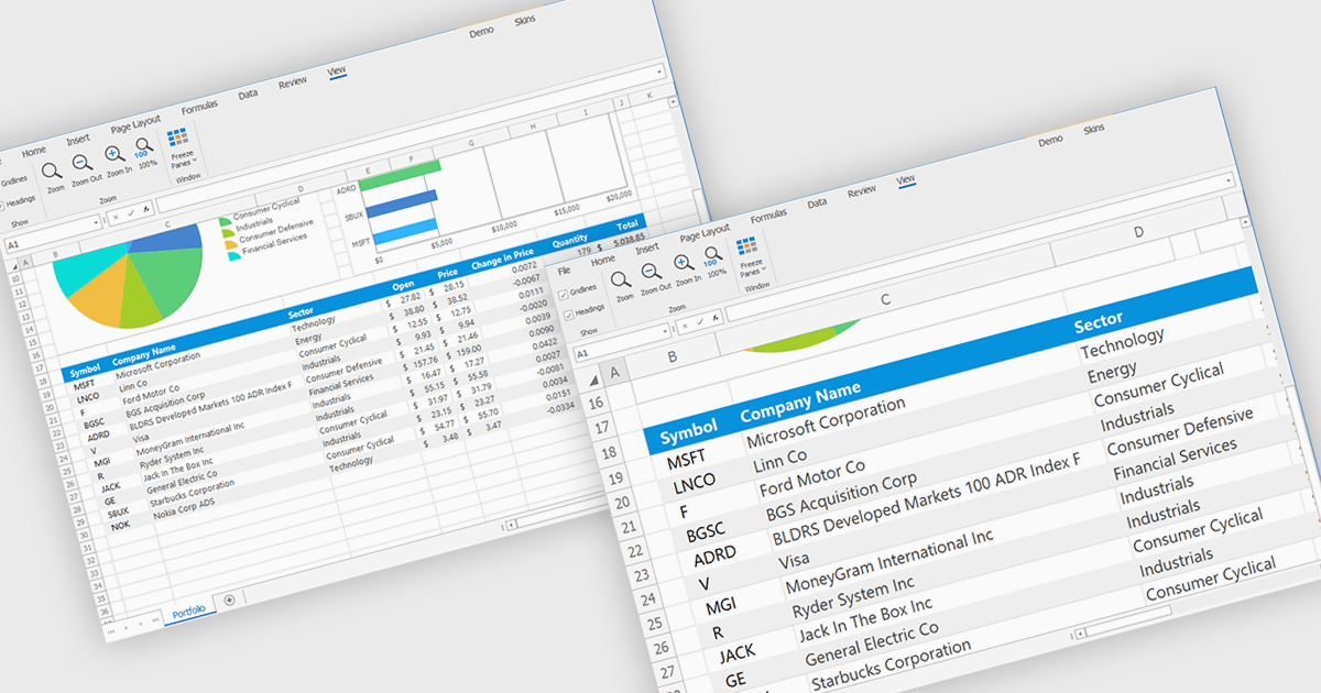
Zooming in a spreadsheet component refers to the ability to scale the displayed content, effectively increasing or decreasing the visible size of cells, data, and gridlines. This feature allows users to adjust the level of detail shown, enabling them to gain a broader overview or focus on specific data segments. Developers implement this to enhance user experience by providing flexibility in data visualization, improving accessibility for users with varying visual needs, and facilitating efficient data analysis through customized display levels.
Several WinForms spreadsheet controls offer support for zooming including:
For an in-depth analysis of features and price, visit our WinForms spreadsheets comparison.
聯繫電話: (888) 850 9911
傳真: +1 770 250 6199


