













官方供應商
我們作為官方授權經銷商,直接提供超過200家開發廠家所發行超過1000個的產品授權給您。
請參閱我們所有的品牌。
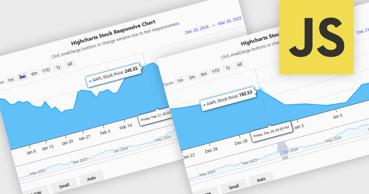
Responsive behavior in chart controls refers to the automatic adjustment of a chart’s layout, dimensions, and visual elements to fit the screen size or container in which it is rendered. This functionality ensures that charts remain readable and usable across a wide range of devices, from desktops to tablets and smartphones, without requiring manual configuration for each format. The benefits include reduced development overhead, improved user experience, and consistent presentation of data regardless of platform. Common use cases include dashboards in web applications, analytics platforms, and mobile-first reporting tools, where users expect seamless interaction and clear data visualization across multiple device types.
Several JavaScript chart controls support responsive behavior, including:
For an in-depth analysis of features and price, visit our JavaScript chart controls comparison.
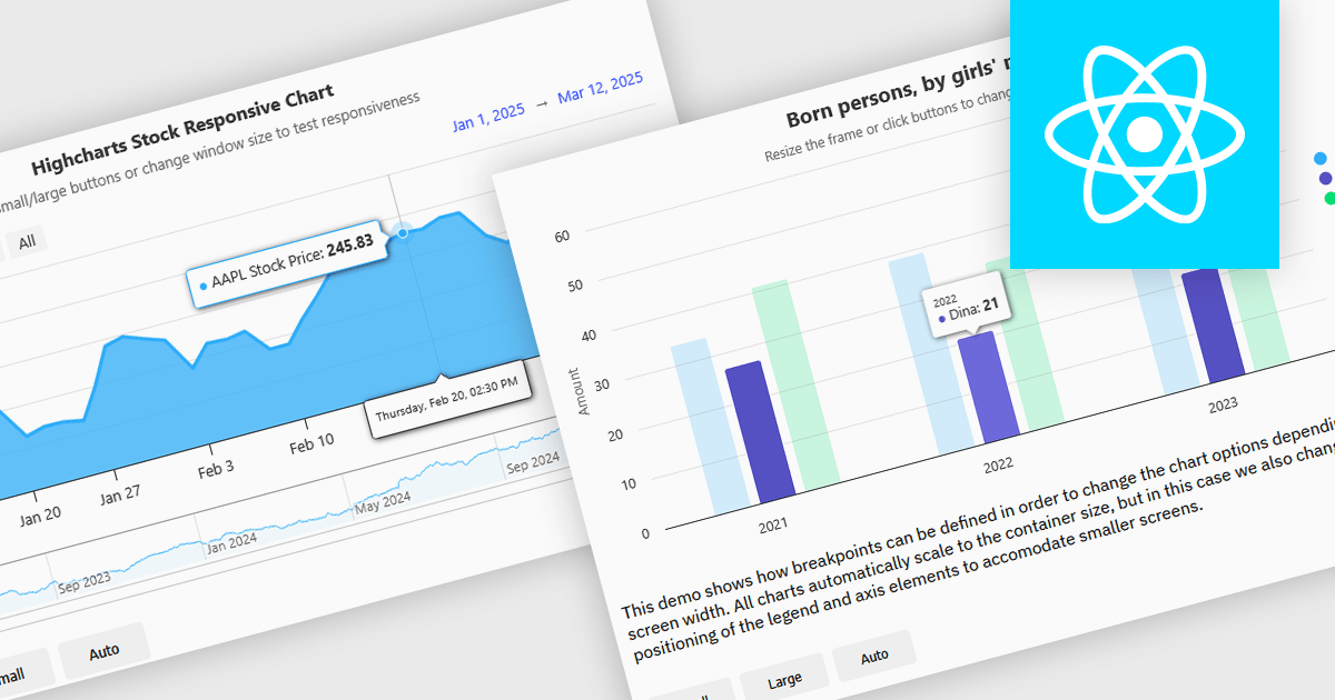
Responsive charts are dynamic data visualizations that automatically adjust to different screen sizes, resolutions, and devices, ensuring a seamless user experience across desktops, tablets, and mobile phones. By adapting elements such as labels, tooltips, legends, and axes, they enhance readability, improve accessibility, and maintain consistent data presentation. These charts optimize performance by efficiently rendering content and supporting interactive features like zooming, panning, and touch gestures. Developers use responsive charts in a wide range of applications, including financial reports, business intelligence dashboards, real-time monitoring systems, and interactive analytics tools, providing users with clear and accessible insights regardless of their device.
Several React charts offer responsive chart support, including:
For an in-depth analysis of features and price, visit our React chart comparison.
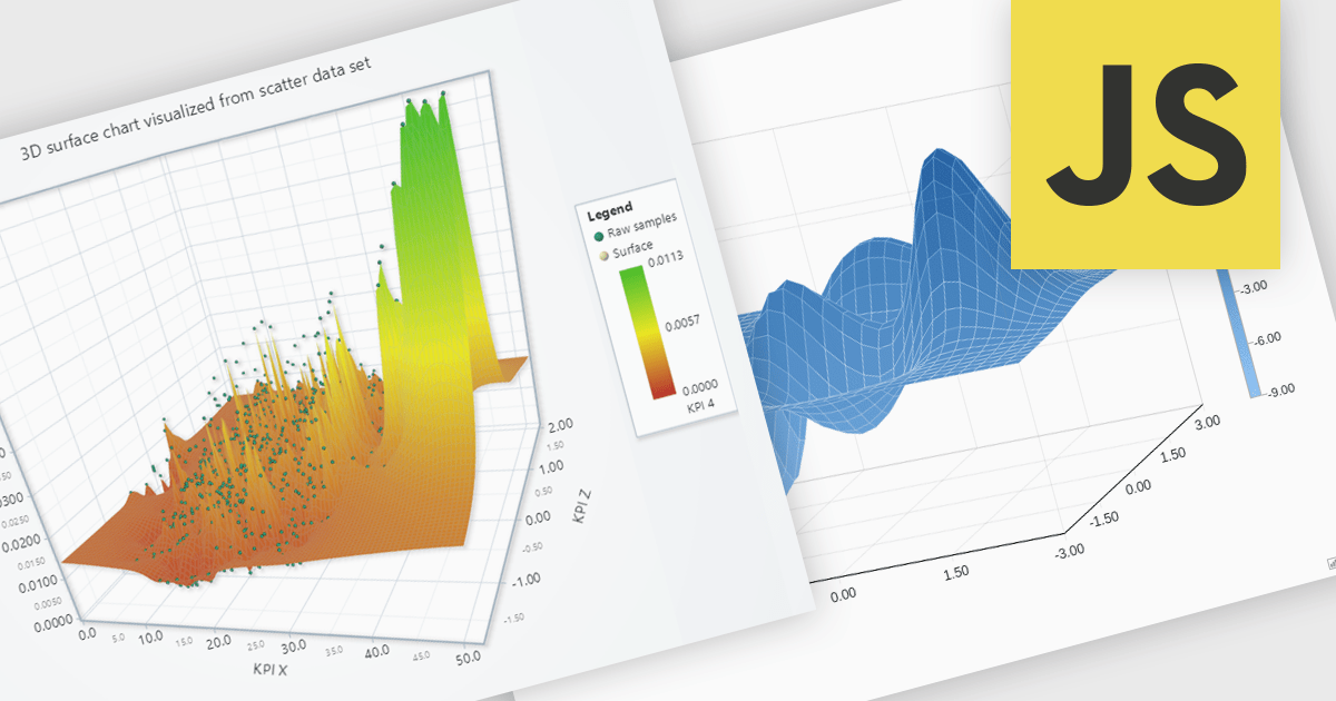
Surface charts are 3D visualizations that show relationships between three numerical variables as a continuous surface. They help identify trends and optimal values, making them useful in science, engineering, and business. Common uses include topographical mapping, financial modeling, and performance analysis. For example, businesses can use surface charts to analyze how price and demand affect revenue, helping them find the best price point. By displaying data in three dimensions, surface charts reveal insights that may not be clear in 2D charts.
Several JavaScript chart controls offer support for Surface charts, including:
For an in-depth analysis of features and price, visit our JavaScript chart controls comparison.
Highcharts is a JavaScript charting framework that allows web developers and data analysts to generate dynamic, visually appealing charts and graphs for websites and web applications. It can display a variety of chart types, including line, spline, area, column, bar, pie, scatter, and many more. Highcharts is well-known for its ease of use, rich documentation, and ability to handle huge datasets efficiently. Features include responsive design, accessibility support, and cross-browser compatibility. Its customization capabilities allow users to create bespoke data visualizations that increase engagement and provide insightful data presentations.
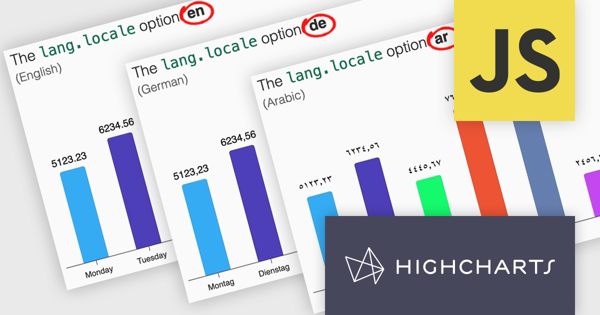
Highcharts v12 introduces the lang.locale option, enabling locale-aware formatting for dates and numbers in charts. This option allows you to define the locale for all charts on a page or set it individually per chart. If no locale is specified, the chart automatically defaults to the page’s or browser’s language settings. Utilizing the browser’s Intl object, lang.locale ensures that dates and numbers are formatted correctly, not only replacing elements like month and weekday names but also structuring entire date expressions according to the selected locale. For instance, American English (en-US) formats a date as January 1, 2025, while British English (en-GB) displays it as 1 January 2025.
To see a full list of what's new in v12, see our release notes.
Highcharts Core is licensed on an annual or perpetual basis, OEM licenses, and Advantage Renewals. It is licensed per Developer and has several license options including Internal, SaaS, SaaS+, and Self Hosted. See our Highcharts Core licensing page for full details.
Learn more on our Highcharts Core product page.
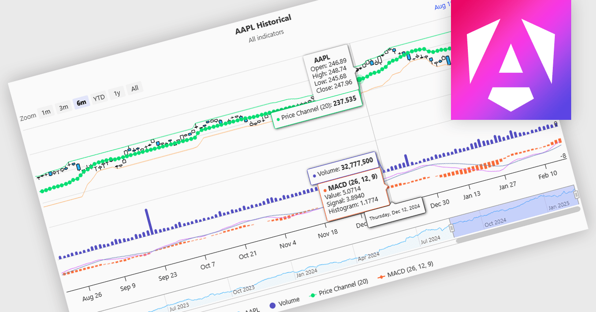
Indicators in a financial chart are mathematical formulas applied to market data, such as price and volume, to generate insights into trends, momentum, volatility, and trade opportunities. Indicators are visualized as lines, histograms, or overlays on the chart, providing dynamic analysis rather than static points. Moving averages track price trends with smooth lines, while oscillators like RSI appear as separate graphs to measure momentum. These tools help traders analyze patterns, confirm price movements, and support decision-making. For software developers, integrating indicators enhances data visualization, enables algorithmic trading strategies, and improves user experience by delivering clear, actionable insights.
Several Angular charting components provide support for indicators within financial charts, including:
For an in-depth analysis of features and price, visit our Angular chart components comparison.
聯繫電話: (888) 850 9911
傳真: +1 770 250 6199


