


官方供應商
我們作為官方授權經銷商,直接提供超過200家開發廠家所發行超過1000個的產品授權給您。
請參閱我們所有的品牌。
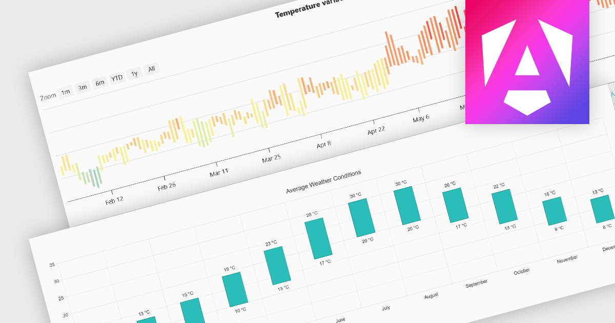
Range bar charts provide a way to visualize data that includes both minimum and maximum values. The bars displayed represent a value range, spanning between the minimum and maximum levels, rather than a single point. This type of chart makes it easier for users to compare variations across different categories or time periods, detect anomalies, and identify trends. This makes them particularly useful for scenarios where understanding variations within a range is important, such as stock price fluctuations, project timelines, or performance metrics. Their structured layout improves readability, making them a valuable tool in financial analysis, scheduling, and business intelligence applications.
Several Angular charting components provide you with range bar charts, including:
For an in-depth analysis of features and price, visit our Angular chart controls comparison.
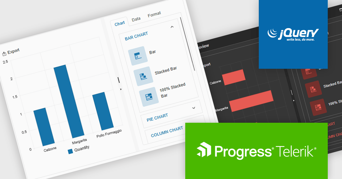
Kendo UI by Telerik is a comprehensive suite of JavaScript UI components designed to accelerate web application development. Offering pre-built, customizable elements for grids, charts, schedulers, and more, it streamlines UI creation across popular frameworks like jQuery, Angular, React, and Vue. Key features include responsive design, accessibility, and high performance, enhancing user experience. Developers benefit from reduced development time, consistent UI patterns, and the ability to build feature-rich applications faster.
The Kendo UI for jQuery v2025 Q1 update introduces the Chart Wizard, a streamlined tool that simplifies chart creation by allowing developers to generate data-driven visualizations directly from grids, data-bound components, or external sources. This feature reduces manual configuration, enhances workflow efficiency, and ensures a seamless integration process, enabling developers to quickly transform raw data into meaningful insights while maintaining full customization control.
To see a full list of what’s new in v17.1.0 (2025 Q1), see our release notes.
Kendo UI is licensed per developer and has two licensing models: an annual Subscription License and a Perpetual License. The Subscription license provides access to the latest product updates, technical support, and exclusive benefits for a flat annual fee, and must be renewed to continue using the software. The Perpetual license is a one-time purchase granting access to the current released version and includes a one-year subscription for product updates and technical support. After this initial period, users can choose to renew the subscription element to continue receiving updates and support; otherwise, they may continue using the installed version available during their active subscription term but will forgo future updates and support. See our Kendo UI licensing page for full details.
Kendo UI is also available to buy individually or as part of:
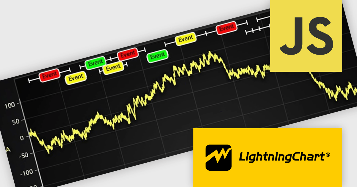
LightningChart JS is a JavaScript/TypeScript library developed by LightningChart that specifically targets the creation of financial and trading applications. It provides high-performance, 2D, 3D, and real-time charting controls and a comprehensive suite of visualizations including candlestick, bar, line, and various technical indicators and drawing tools. This library enables software developers to craft interactive technical analysis tools without the need for server-side setup as it runs completely on the client device.
The LightningChart JS v7.0.1 update introduces the Text Series API, providing a more efficient and flexible way to render text within ChartXY. This new approach enhances performance by optimizing text rendering, supports viewport clipping to maintain clean chart visuals, and offers precise control over text size and boundaries. Designed as a more seamless alternative to chart.addUIElement(), it simplifies development by integrating text elements directly within the chart while ensuring scalability for large datasets.
To see a full list of what's new in v7.0.1, see our release notes.
LightningChart JS is licensed per developer and is available as an annual license with 1 year support. See our LightningChart JS licensing page for full details.
For more information, see our LightningChart JS product page.
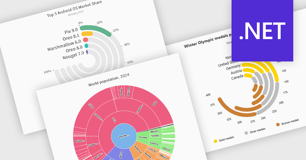
Radial charts provide an intuitive way to visualize hierarchical and categorical data. They display bars on a polar coordinate system instead of a cartesian system, which uses an x-y grid for positioning data. These charts represent values in a circular layout, making it ideal for comparing proportions and relationships between data points. Circular bar charts, a variation of the traditional bar chart, arrange data in a radial format for displaying comparisons between categories. They are particularly useful for visualizing periodic or cyclical data, such as time-based metrics. Sunburst charts break down hierarchical structures into concentric rings. The center of the chart typically represents the root category, while outer rings depict subcategories. These are used for visualizing part-to-whole relationships within a dataset. Many .NET charting components support these visualization types, allowing developers to create dynamic, interactive, and visually appealing dashboards in .NET applications.
Several .NET charting components provide you with radial charts, including:
For an in-depth analysis of features and price, visit our .NET chart components comparison.
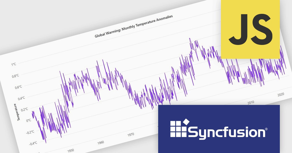
Syncfusion Essential Studio JavaScript is a comprehensive UI library offering over 80 high-performance, lightweight, and responsive components to transform your web apps. Built from scratch with TypeScript, it boasts modularity and touch-friendliness, letting you pick and choose specific features while ensuring smooth mobile interaction. With rich themes, global accessibility features, and extensive documentation, it powers everything from basic buttons to interactive charts and data grids, simplifying frontend development across JavaScript, Angular, React, and Vue.
The Syncfusion Essential Studio JavaScript 2024 Volume 4 update introduces a new toolbar feature that allows users to customize the position of the zoom toolbar within charts. With drag-and-drop functionality, this feature offers greater flexibility in interface design, enabling developers to optimize chart layouts for better usability and alignment with specific application requirements. By allowing the toolbar to be re-positioned anywhere within the chart area, this update enhances both user experience and chart readability, providing a more adaptable and professional solution for modern web applications.
To see a full list of what's new in 2024 Volume 4, see our release notes.
Syncfusion Essential Studio JavaScript is available as part of Syncfusion Essential Studio Enterprise which is licensed per developer starting with a Team License of up to five developers. It is available as a 12 Month Timed Subscription License which includes support and maintenance. See our Syncfusion Essential Studio Enterprise licensing page for full details.
Learn more on our Syncfusion Essential Studio JavaScript product page.
聯繫電話: (888) 850 9911
傳真: +1 770 250 6199


