


官方供應商
我們作為官方授權經銷商,直接提供超過200家開發廠家所發行超過1000個的產品授權給您。
請參閱我們所有的品牌。
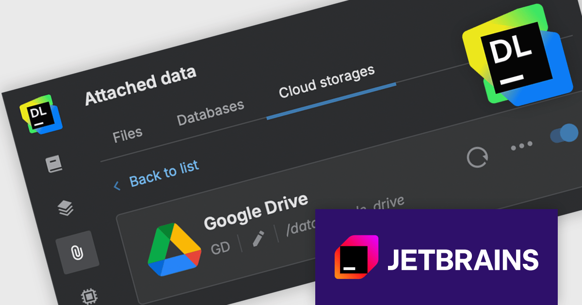
JetBrains Datalore is a collaborative data science platform that streamlines data exploration, analysis, and visualization through Jupyter-compatible notebooks. It empowers teams with features like automatic visualizations, pre-configured environments, interactive controls, and seamless collaboration functionalities. Datalore offers both cloud-based and self-hosted deployment options, catering to both individual and team-based data science workflows.
The Datalore 2025.4 update introduces Google Drive integration, making it easier to access and analyze data stored in the cloud. With this new connector, users can open and query files directly from their Google Drive folders without manually exporting datasets. This enables seamless data access from within the notebook environment, supporting languages including SQL, Python, Scala, Kotlin, and R. The integration significantly reduces friction in the data preparation process and supports more efficient, language-flexible processes.
To see a full list of what's new in version 2025.4, see our release notes.
Datalore is licensed per user, and is available as a commercial annual subscription license. See our Datalore licensing page for full details.
For more information, visit our Datalore product page.
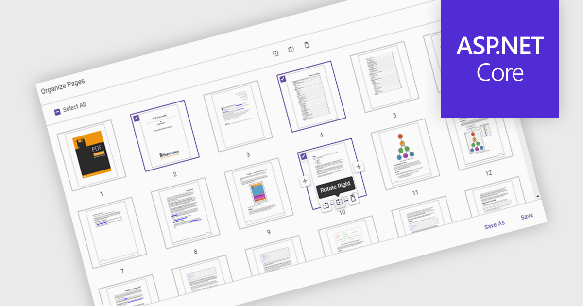
Moving pages in a PDF Viewer refers to the ability to change the order of pages within a document to better organize content, improve readability, or tailor the structure for specific purposes. This feature is especially useful when compiling reports, combining multiple documents, or correcting the sequence of scanned pages. By simply dragging and dropping pages into the desired order, users can streamline workflows without the need for re-creating or re-exporting files. Benefits include enhanced document clarity, improved presentation flow, and increased efficiency in content management. For example, a marketing team can reorder proposal sections for greater impact, or a legal department can organize case files by relevance.
Several ASP.NET Core PDF Viewer components allow you to move pages within a PDF file, including:
For an in-depth analysis of features and price, visit our comparison of ASP.NET Core PDF Viewer components.
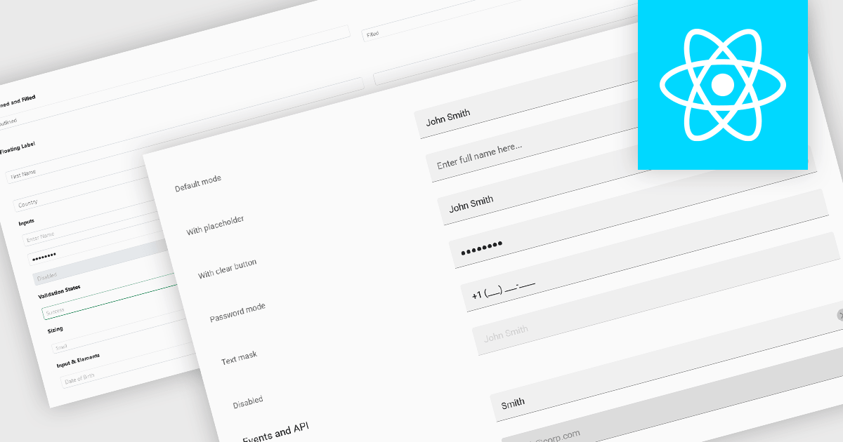
Text Box components in React Data Editors are interactive controls that allow users to input, edit, and manage textual data within a web interface. Designed to handle everything from single-line entries like names and titles to multi-line content such as comments or descriptions, these components are a core part of form-driven applications. They often include features like placeholder text, character limits, validation hooks, and integration with state management tools, which help ensure data quality and user-friendly interactions. Text Boxes are widely used in settings such as user registration forms, feedback systems, and content management interfaces, where accurate and flexible text input is essential to the application's functionality.
Several React data editor collections offer text box components including:
For an in-depth analysis of features and price, visit our React data editors comparison.
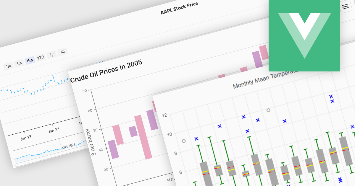
Financial chart components are used within software applications to visually represent complex financial data over time. They enable users, particularly those in trading, investment, and financial analysis, to interpret trends, compare performance, and make data-driven decisions more effectively. These components typically support a variety of chart types tailored to the unique requirements of financial datasets, allowing for granular analysis of price movements, market trends, and volatility.
Common features include:
For an in-depth analysis of features and price, visit our Vue.js Chart components comparison.

GitKraken is a suite of developer tools built around Git, a popular version control system. It offers a graphical user interface (GUI) that allows developers to interact with Git repositories visually instead of relying on the command line. This simplifies complex Git workflows like resolving merge conflicts and visualizing code history, making Git more accessible and efficient for developers of all experience levels.
The GitLens for VS Code V17.2 release (included in GitKraken) adds new AI commands (in preview) which can generate and rebase commits from working tree changes or from commits in an existing branch. With the Generate Commits with AI command, developers can now convert their uncommitted working tree changes into a series of meaningful, structured commits using AI. This reduces the need for manual staging and commit composition, helping developers maintain cleaner commit histories with better documentation. The new Rebase with AI feature enables developers to take existing commits from a branch and rework them into a fresh, AI-organized commit history on a new branch. This is particularly useful for cleaning up commit history before merging or sharing code, ensuring that changes are logically grouped and well-explained. Each generated commit is accompanied by a document explaining what was changed and why, offering transparency and traceability. For added safety, GitLens includes messaging to guide first-time users and an Undo option that attempts to revert the AI-generated changes, making the feature approachable and reversible.
To see a full list of what's new in V17.2, see our release notes.
GitLens for VS Code is part of GitKraken which is available as Cloud-based or On-Premise options, licensed per user as an annual license which includes free updates and technical support. See our GitKraken licensing page for full details.
Learn more on our GitKraken product page.
聯繫電話: (888) 850 9911
傳真: +1 770 250 6199


